Inter Milan
Mar 30 2021: gold-ringed FCIM monogram roundel replaced by minimal IM roundel (Bureau Borsche)
Inter Milan logo before and afterRefinement
BeforeUntil Mar 2021
Inter Milan logo via Wikimedia Commons (author: FC Internazionale Milano S.p.A.). Source: commons.wikimedia.org

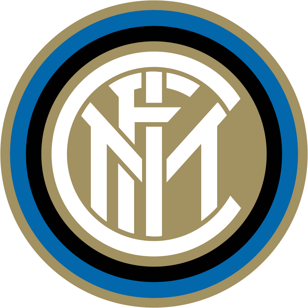

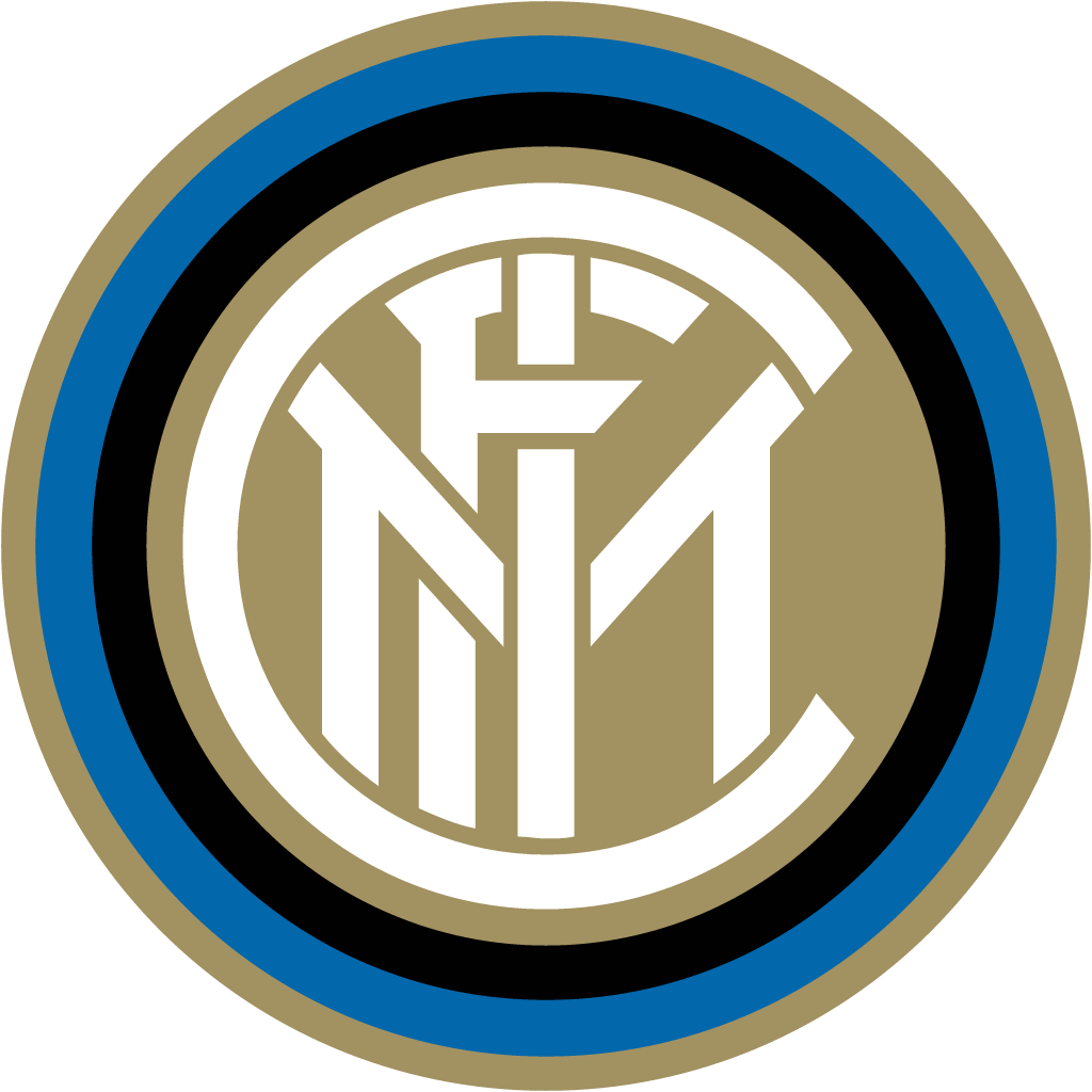
AfterSince Mar 2021
Inter Milan logo via Wikimedia Commons (author: FC Internazionale Milano S.p.A. / Bureau Borsche). Source: commons.wikimedia.org




Refinement: the mark keeps its form.
Key facts
Inter Milan launched a new logo in Mar 2021, designed by Bureau Borsche.
- Brand
- Inter Milan
- Launched
- Source: inter.it
- What changed
- Mar 30 2021: gold-ringed FCIM monogram roundel replaced by minimal IM roundel (Bureau Borsche).
- Why
- Inter's new crest was part of a strategy to raise the club's popularity worldwide.
Cite this Rebrand Log, "Inter Milan new logo (2021)", https://rebrandlog.com/rebrand/inter-milan-2021/, last updated .
The Inter Milan rebrand, explained
Inter's crest goes back to Giorgio Muggiani, who drew the original FCIM monogram in concentric circles in 1908, and it had survived with only brief variations since. In 2021, amid speculation that it might even rename itself Inter Milano, the club unveiled a new visual identity on 30 March, for use from the 2021/22 season. The name did not change.
Munich studio Bureau Borsche reduced the monogram to its two essential letters, I for Internazionale and M for Milano. The I stays at the centre and the M keeps its overhanging arms; the studio said the spacing between letters is about 90% unchanged and the overall area 96% the same. The gold accents went, leaving white letters on blue inside a thick black ring, and the blue became brighter and more modern. The launch played on the initials as the English I am, with a campaign, I am Milano, I am Inter, featuring famous figures from the club and city.
Inter called the identity innovative, minimalist, elegant and oriented to new generations. Its aim, per The Independent, was part of a strategy to raise the club's popularity worldwide; a Reddit user summarised the rationale reported by Vogue Italia as the old crest looking bad when small on Instagram.
Many fans were furious. On the club subreddit, top comments called it generic and forgettable, like something from a logo generator, and asked whether Inter was no longer a football club. Eurosport collected jibes that it looked like an unlicensed FIFA crest, and one Juventus fan said it was even worse than their J. Journalist and fan Enrico Mentana said a symbol cannot be thrown away like an old shoe; former defender Marco Materazzi defended it as intuitive, since abroad Milan means Inter.
The club's own statement was explicit about the audience. The revamp was meant to open Inter to an audience increasingly digital and sensitive to aesthetics, reach global targets and different age groups, and establish the club as an icon of culture as well as sport, with values of inclusion, style and innovation. The streamlined symbol, it said, was a better fit for the age of entertainment. That is honest, and it explains the fan backlash: a crest designed for people who are not yet fans will always feel like a loss to those who already are.
The irony is that the old crest was already one of the most minimal in football. The new one keeps the bones but loses the gold and the FC, and with them the luxury-monogram warmth. The I M wordplay is the smartest part, and Inter won the 2023/24 league title under it, which tends to settle these arguments.
In short: A careful reduction of a crest that was already simple, sold with a clever I am.
Sources
- 1. inter.ithttps://www.inter.it/en/news/2021-03-30-new-logo-inter
- 2. independent.co.ukhttps://www.independent.co.uk/sport/football/european/inter-milan-new-badge-logo-crest-b1824382.html
- 3. news.sportslogos.nethttps://news.sportslogos.net/2021/03/30/inter-milan-goes-back-to-basics-with-new-logo/soccer/