Fanta
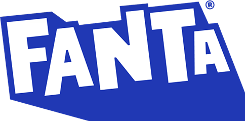
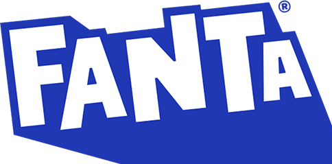
Apr 4 2023: first global Fanta identity (Coca-Cola Global Design + JKR): 2017 wordmark on orange roundel with green leaf replaced by flat blue-and-white wordmark with extended pointed shadow, no roundel/leaf
Fanta logo before and after
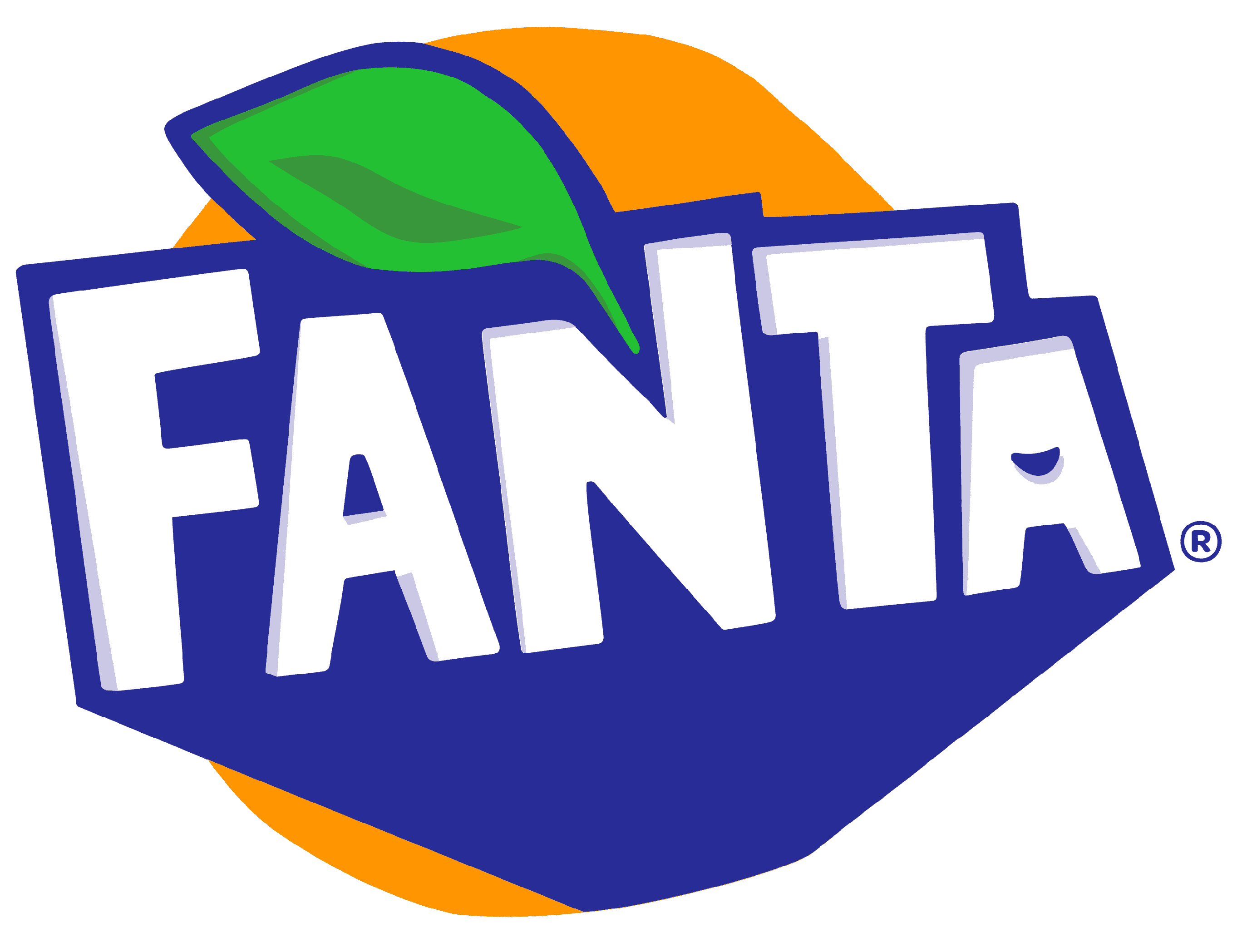
BeforeUntil Apr 2023
Fanta logo via Wikimedia Commons (author: Paul Nahverkehr). Source: commons.wikimedia.org
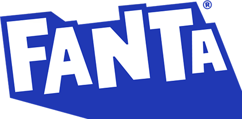
AfterSince Apr 2023
Logo: Fanta. Source: fanta.com (archived)
Key facts
Fanta launched a new logo in Apr 2023, designed by Jones Knowles Ritchie (JKR) and Coca-Cola in-house.
- Brand
- Fanta
- Launched
- Source: dezeen.com
- What changed
- Apr 4 2023: first global Fanta identity (Coca-Cola Global Design + JKR): 2017 wordmark on orange roundel with green leaf replaced by flat blue-and-white wordmark with extended pointed shadow, no roundel/leaf.
- Why
- Fanta's redesign aimed to make each element of the brand bold enough to stand the test of time.
Cite this Rebrand Log, "Fanta new logo (2023)", https://rebrandlog.com/rebrand/fanta-2023/, last updated .
The Fanta rebrand, explained
Key people: Rapha Abreu (Global vice president of design, The Coca-Cola Company) · Sue Murphy (Senior director of design, The Coca-Cola Company)
For years Fanta did not have one face. The US kept the rounded logo introduced in 2010, while the UK rebranded in 2017 with a more angular font, a green leaf and a coloured circle matched to the flavour, and most other markets followed the UK with local variations, Marketing Week reported. In 2023, after a similar global push behind Sprite, The Coca-Cola Company unified Fanta, its second-oldest brand, founded in 1940.
The work was led by Coca-Cola's global design team with Jones Knowles Ritchie. Global vice president of design Rapha Abreu told Dezeen that Fanta, though one of the most playful brands in the portfolio, needed some TLC and had come to feel geared to a younger audience, when the target was anyone playful at heart. The US, one of its largest markets, did not even share the identity.
The result is a stripped-back flat logo close to the 2017 UK version, with the same angular lettering and inverted blue and white. The lettering was neatened, shadows removed, and the smile inside the second A went. A lighter blue shadow was thickened and extended downwards into a point. The orange roundel and leaf were cut: Abreu said an orange was confusing when the range goes well beyond orange. Packaging News noted new custom typography, a colour system of identifiable flavour colours and illustrations by Brazilian artist Lucas Wakamatsu. Senior director of design Sue Murphy said the aim was to make each element bold enough to stand the test of time.
The identity went into stores and online immediately. Abreu said the biggest challenge was to stop Fanta's endless changes and stick with one identity for years.
Creative Review was right to call the wordmark a subtle evolution of the 2017 version. The letters are a little more even but still extruded and staggered, and the blue survives in a retuned shade. The real edit is subtraction: the orange motif and leaf are gone, presumably so the brand stops reading as a single flavour. The work of differentiation moves to an expanded colour palette and a set of fruit symbols on each can, backed by Lucas Wakamatsu's illustrations, which the magazine found strongest in motion. It is less a new logo than a container built to hold many flavours.
That is the right ambition. Losing the fruit was overdue, and the pointed shadow gives the wordmark a little bounce. But flattening away the smile also flattened some character; Fanta is now tidy, consistent and slightly less fun.
In short: One Fanta, minus the orange.
Sources
- 1. dezeen.comhttps://www.dezeen.com/2023/04/04/fanta-rebrand-global-identity-coca-cola-jones-knowles-ritchie/
- 2. marketingweek.comhttps://www.marketingweek.com/fanta-logo-first-global-identity/
- 3. designweek.co.ukhttps://www.designweek.co.uk/issues/3-april-7-april-2023/jkr-global-identity-fanta/
- 4. packagingnews.co.ukhttps://www.packagingnews.co.uk/design/new-packs/fanta-announces-first-ever-brand-revamp-in-partneship-with-jkr-04-04-2023