CardWorks Financial Group
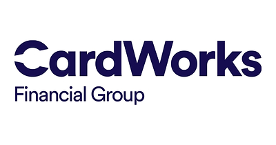
The Woodbury, New York credit and payments company renamed itself CardWorks Financial Group and replaced its navy serif CardWorks, framed by thin corner brackets, with a heavy geometric CardWorks in dark blue whose C is cut open like a camera aperture, over Financial Group in lighter type.
CardWorks Financial Group logo before and after

BeforeUntil May 2026
CardWorks logo (before 2026), official logo image from the company's PR Newswire release. Source: prnewswire.com
DownloadLightSVG not availablePNGDarkSVGPNGLight mode version adapted by Rebrand Log



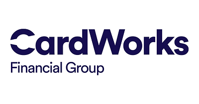
AfterSince 18 May 2026
CardWorks Financial Group logo (2026), official logo image from the company's PR Newswire release. Source: prnewswire.com
DownloadLightSVG not availablePNGDarkSVGPNGLight mode version adapted by Rebrand Log


Key facts
CardWorks Financial Group launched a new logo on 18 May 2026.
- Brand
- CardWorks Financial Group
- Launched
- Studio
- Not recordedAdd it
- What changed
- The Woodbury, New York credit and payments company renamed itself CardWorks Financial Group and replaced its navy serif CardWorks, framed by thin corner brackets, with a heavy geometric CardWorks in dark blue whose C is cut open like a camera aperture, over Financial Group in lighter type.
Cite this Rebrand Log, "CardWorks Financial Group new logo (2026)", https://rebrandlog.com/rebrand/cardworks-2026/, last updated .
The CardWorks Financial Group rebrand, explained
CardWorks announced the change through PR Newswire on May 18, 2026. The company, founded in 1987, works across the credit card business as a lender, servicer and merchant acquirer. The rebrand also brought refreshed brands for CardWorks Servicing and Carson Smithfield, following an earlier rebrand of Merrick Bank in 2026.
According to the release, the new logo is built around an "aperture-inspired" C, "symbolizing opportunity, access, and forward momentum." Shades of dark blue and electric blue connect the companies, with each business getting its own complementary colors. The old logo set CardWorks in a classic serif, in navy, between two thin corner brackets.
"We want a brand that reflects both who we are and how we operate in the market: Confident, trusted, and built for the future," said Crystal Wright, senior vice president of communications. She added that the new design system and voice "bring clarity to our story while reinforcing the strength and credibility behind our platform."
The company frames the brand around the idea of an "Everyday Champion" for clients and consumers. The rollout covers all digital platforms, including a redesigned website. The release does not name a design agency.
In short: CardWorks became CardWorks Financial Group and swapped a navy serif wordmark for a heavy geometric one with an aperture-like C.
Quote
“We want a brand that reflects both who we are and how we operate in the market: Confident, trusted, and built for the future,”
Press
Sources
- 1. prnewswire.comhttps://www.prnewswire.com/news-releases/cardworks-inc-rebrands-as-cardworks-financial-group-unifying-its-businesses-under-a-new-visual-identity-302773772.html
- 2. cardworksfinancialgroup.comhttps://cardworksfinancialgroup.com/