Cabify (2021)
New logo and identity.
Cabify logo before and after
BeforeUntil Sep 2021
Logo: Cabify. Source: cabify.com (archived)




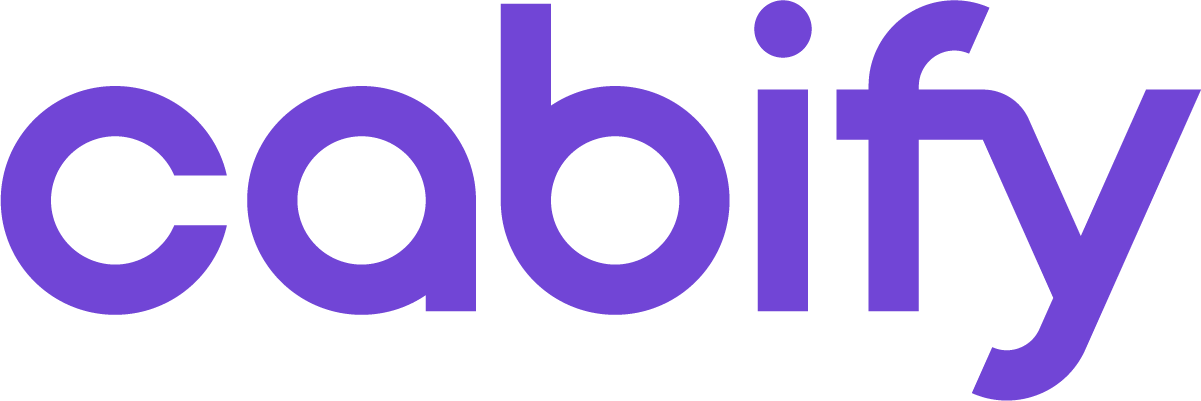
AfterSince Sep 2021
Cabify logo via Wikimedia Commons (Cabify-Logo-Moradul-RGB.png). Source: commons.wikimedia.org
Key facts
Cabify launched a new logo in Sep 2021, designed by Cabify in-house.
- Brand
- Cabify
- Launched
- Source: underconsideration.com
- Studio
- In-house at Cabify
- What changed
- New logo and identity.
- Why
- Cabify said its business strategy was evolving toward sustainable, efficient urban mobility and its brand had to be aligned with that goal.
- Sources
- forbes.co, graffica.info
- Logo history
- 2 rebrands
Cite this Rebrand Log, "Cabify new logo (2021)", https://rebrandlog.com/rebrand/cabify-2021/, last updated .
The Cabify rebrand, explained
Cabify, the Spanish multimobility company, turned ten in 2021 and used the anniversary to reposition. Gràffica reported that it wanted to present itself as one platform with multiple sustainable mobility options rather than an app connecting passengers and drivers, and Forbes Colombia said the change aligned the brand with a business strategy aimed at efficient solutions. Global head of brand Natalia Ruda put it in the company's terms: the business strategy was evolving toward mobility with the least possible impact, and the brand had to be aligned to achieve it.
The work was done inside the company. Gràffica reported that the strategic repositioning was led by Ruda's team with the consultancy BrandFor, while the visual identity was developed entirely by Cabify's 25 person design team under vice president of design Carlos Tallón, who also presented it to Forbes Colombia.
The main visible change, Forbes Colombia noted, was that the logo lost the distinctive geolocation dot that had accompanied the name, and the new mark would replace six logo versions approved for use over the previous four years, rolling out progressively. Gràffica described the rest. The purple stays, adjusted slightly so it reproduces consistently, since the old one looked vibrant on screens but very different elsewhere. The wordmark gains more curves to suggest a journey, set in an exclusively licensed adaptation of Lineto's Circular with a modified lowercase a. The team kept that a despite a possible loss of legibility at small sizes because perception studies showed that in 99 percent of cases customers did not read the word but recognised it. The app was redesigned almost completely, and photography gained ground on the brand's familiar illustration.
Forbes Colombia also quoted a skeptic. Midori Ikeda, a marketing professor at UPC in Peru, observed that the simplified lettering does not quite communicate the breadth of service toward other vehicle types.
Collapsing six logos into one is the real achievement here, and keeping the purple was wise. But removing the geolocation dot strips out the only element that said mobility, which is odd for a company whose whole pitch is moving around the city. Justifying a less legible a because people do not read the word is clever, and a little complacent.
In short: One logo instead of six.
Press
Sources
- 1. underconsideration.com · paywalledhttps://www.underconsideration.com/brandnew/archives/new_logo_and_identity_for_cabify_done_in_house.php
- 2. graffica.infohttps://graffica.info/logo-cabify/
- 3. forbes.cohttps://forbes.co/2021/09/09/actualidad/cabify-la-estrategia-detras-de-la-evolucion-de-su-marca/