Burger King
Jan 7 2021: glossy bun with blue swoosh replaced by flat bun-and-wordmark in custom 'Flame' type, a return to the 1969-99 form (Jones Knowles Ritchie)
Burger King logo before and after
BeforeUntil Jan 2021
Logo: Burger King. Source: bk.com (archived)


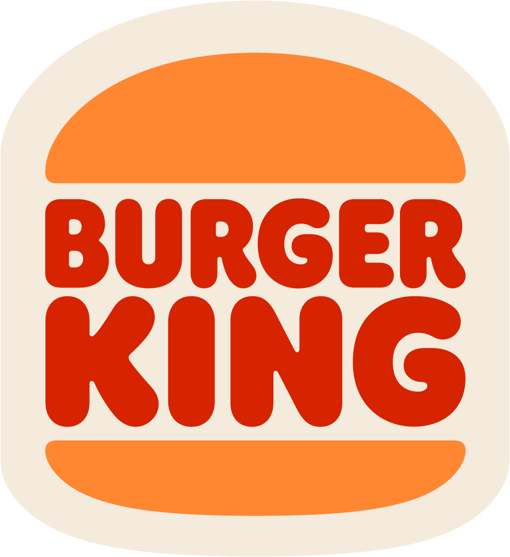
AfterSince Jan 2021
Logo: Burger King. Source: bk.com (archived)


Key facts
Burger King launched a new logo in Jan 2021, designed by Jones Knowles Ritchie (JKR) and Burger King in-house.
- Brand
- Burger King
- Launched
- Source: businesswire.com
- Studio
- Jones Knowles Ritchie (JKR) and in-house at Burger KingAll rebrands by Jones Knowles Ritchie (JKR)
- What changed
- Jan 7 2021: glossy bun with blue swoosh replaced by flat bun-and-wordmark in custom 'Flame' type, a return to the 1969-99 form (Jones Knowles Ritchie).
- Why
- Burger King said the aim of its rebrand was to modernise a classic and make it timeless.
- Sources
- itsnicethat.com, designweek.co.uk, warc.com
Cite this Rebrand Log, "Burger King new logo (2021)", https://rebrandlog.com/rebrand/burger-king-2021/, last updated .
The Burger King rebrand, explained
Key people: Raphael Abreu (Global Head of Design, Restaurant Brands International) · Lisa Smith (Executive Creative Director, JKR)
Burger King's January 2021 identity was its first complete rebrand in more than 20 years. Its 1999 logo had slanted the wordmark, made the buns subtly 3D and wrapped everything in a blue crescent. Meanwhile the company had spent years removing artificial preservatives, colours and flavours from its food, and it wanted a brand that looked like the food rather than like convenience.
The work took almost two years and was designed by Burger King's in-house creative team with Jones Knowles Ritchie in New York. JKR executive creative director Lisa Smith told Design Week the team asked when Burger King had looked its best, and landed on 1969 to 1994, before the swoosh and highlight arrived. Raphael Abreu, global head of design at parent Restaurant Brands International, told It's Nice That the aim was to modernise a classic and make it timeless.
The new logo returns to the bun-and-wordmark sandwich, with the bun shapes and proportions adjusted to look more like real burgers and the rounded lettering streamlined. The blue is gone. Colophon Foundry drew Flame, a bold, rounded family inspired by the food and by the Cooper Black-style faces in the archive; Abreu said the team wanted a font that made people want to take a bite. The palette uses food names, Fiery Red, Flaming Orange and BBQ Brown, with Mayo Egg White, Melty Yellow and Crunchy Green as secondaries. Macro food photography, hand-drawn illustration, packaging, uniforms and restaurant designs followed, with rollout planned over several years.
It was a hit. The agency's award entry reported 1.1 billion impressions in five days and 98 percent positive sentiment. The work won Gold at Cannes Lions, a Grand LIA for design and a One Show Gold Pencil.
Adweek tied the identity to the company's recent message about food quality, notably the Moldy Whopper campaign, which had collected numerous awards and more than eight billion organic impressions while promoting transparency about ingredients. The new logo, colours and typeface took close to two years to develop, were the first full refresh in 20 years, and were set to appear across packaging, merchandise, uniforms and restaurant interiors.
Nostalgia rebrands often feel lazy. This one does not, because the 1969 logo was genuinely better than what replaced it, and the redraw is careful enough that it reads as new. It set a high bar for any brand tempted to mine its archive.
In short: The benchmark retro rebrand: go back to your best era, then draw it better.
Sources
- 1. businesswire.comhttps://www.businesswire.com/news/home/20210107005111/en/Burger-King%c2%ae-Evolves-Visual-Brand-Identity-Marking-the-First-Complete-Rebrand-in-Over-20-Years
- 2. fastcompany.comhttps://www.fastcompany.com/90591634/burger-king-unveils-its-first-major-rebrand-in-20-years
- 3. designweek.co.ukhttps://www.designweek.co.uk/issues/4-10-january-2021/burger-king-rebrand/