Bolt (2023)
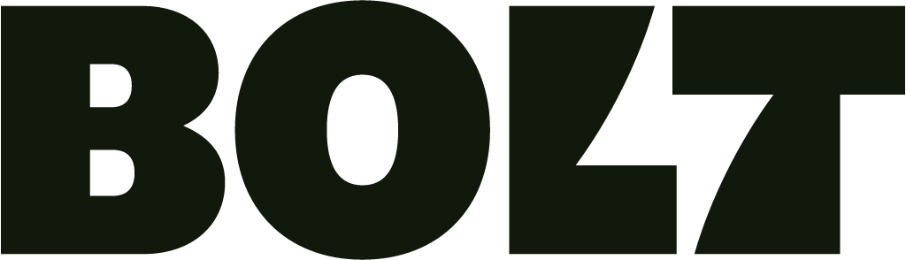
Wordmark with a lightning bolt in negative space, lightning yellow replacing blue, custom type, motion and sound
Bolt logo before and after
BeforeUntil Jan 2023
Logo: Bolt. Source: bolt.com (archived)




AfterSince Jan 2023
© Bolt, via the company's website (archived). Source: bolt.com (archived)

Key facts
Bolt launched a new logo in Jan 2023, designed by Koto.
- Brand
- Bolt
- Launched
- Studio
- KotoAll rebrands by Koto
- Typeface
- Custom Bolt typography
- What changed
- Wordmark with a lightning bolt in negative space, lightning yellow replacing blue, custom type, motion and sound.
- Sources
- creativereview.co.uk, itsnicethat.com
- Logo history
- 3 rebrands
Cite this Rebrand Log, "Bolt new logo (2023)", https://rebrandlog.com/rebrand/bolt-checkout/, last updated .
The Bolt rebrand, explained
Bolt, founded in 2014, offers one-click checkout for more than 300 retailers and had raised enough money to be valued as a 'decacorn', worth over $10 billion, Creative Review reported. Its old identity used a friendly blue, typical of financial services. Going into 2023, it hired Koto to help it stand out from e-commerce competitors, It's Nice That and Creative Review reported.
Koto's creative director told Creative Review the sector was full of somewhat bland sans-serif wordmarks, because brands that prioritise feeling safe all end up feeling the same; you do not need to be bland to feel trustworthy. Bolt's chief executive wrote that there had never been more competition or more sameness in the industry. The strategy centred on the company's promise of 'shockingly simple' checkout.
The design takes the name literally. The lightning bolt symbol survives, but it is now unified with the wordmark, hidden in the negative space between the L and the T. The bolt shape reappears in slanted currency signs, exclamation marks, forward slashes, percentage signs and even the tail of the @, across 15 'electrified' glyphs in a bespoke typeface, chosen as the characters users see most often. The blue was replaced by a highlighter shade called Lightning Yellow, with snappy motion for speed and character illustrations of shopping carts and products that play with proportion.
Creative Review noted that design Twitter quickly pointed out similarities with other brands built on the same idea, including the sports app Buzzer and Volt TV. Koto's answer was that the work is simple and direct, and that is why it works.
Creative Review gave the business backdrop: founded in 2014, Bolt offered one-click payments for more than 300 retailers and had raised enough to become a decacorn. The agency's creative director argued that most payment brands want to look secure, but you do not need to be bland to feel trustworthy; by prioritising feeling safe, they all feel the same. The magazine noted the lightning motif runs through the @ sign and 15 electrified glyphs, and that design Twitter had spotted similarities with other sports and broadband brands. The argument is right, though a bolt for a company called Bolt is a literal answer, which is why the lookalikes were inevitable.
It does work, and it is the obvious answer, which is both its strength and its weakness. A name like Bolt practically writes its own brief; the hidden bolt is neat, the yellow is loud, and the comparison to other electric brands was always going to come.
In short: Bolt by name, bolt by nature.
Identity · 15 images
Bolt / Koto, image from koto.com · © Bolt (checkout) / Koto, via koto.com
Rationale
Built on "Shockingly Simple" and "Electric Dynamism" to convey speed, trust and simplicity for one-click checkout.
Press
Reactions
- Itamar Medeiros@designative on XBolt’s controversial #rebrand is a good reminder of why clichés exist in the first place. #Branding #Marketing #GraphicDesign #Logos #BadDesign1 Feb 2023 · 0 likes
- Anthony Hobday@hobdaydesign on XPeople have noticed @bolt's new logo, but don't miss the on-brand motifs through their website. Excellent attention to detail. All of these echo the bolt logo. 1) These tabs at the top of the website have angled sides.20 Jan 2023 · 1,054 likes
- Koto@studiokoto on XBolt by name. Bolt by nature. Bolt’s shockingly simple checkout means no more abandoned carts, and way more lightning-fast shopping. Check out our energetic new brand for @bolt now!19 Jan 2023 · 1,232 likes
- Komando@komandostudio on XBolt's new logo? A lightning bolt between the L and the T. Genius.👏 @studiokoto20 Jan 2023 · 3 likes
- COLLINS@wearecollins on XWe can continue to talk about @bolt's new logo (which we like) from @studiokoto. Or, we can talk about the more interesting conversation it’s uncovered– We can talk about originality. @FastCompany invited…1 Feb 2023 · 34 likes
- Jesse Tyler@jessebtyler on XBolt rebrand commentary has gone too far lol. I think it’s neither genius nor malicious. The choices were all low hanging fruit. Many designers could (and did) independently come up what bolt’s new logo is.22 Jan 2023 · 17 likes
Sources
- 1. koto.comhttps://koto.com/projects/bolt
- 2. itsnicethat.comhttps://www.itsnicethat.com/news/koto-bolt-graphic-design-230123
- 3. creativereview.co.ukhttps://www.creativereview.co.uk/bolt-rebrand-koto/