Barilla
Jan 2022: double-outline oval simplified to single deeper-red oval with refined lettering and 'Dal 1877' (Robilant)
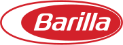
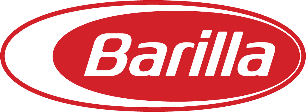
Barilla logo before and after
BeforeUntil Jan 2022
Barilla logo via Wikimedia Commons (author: Original uploader was MantisEars). Source: commons.wikimedia.org
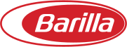
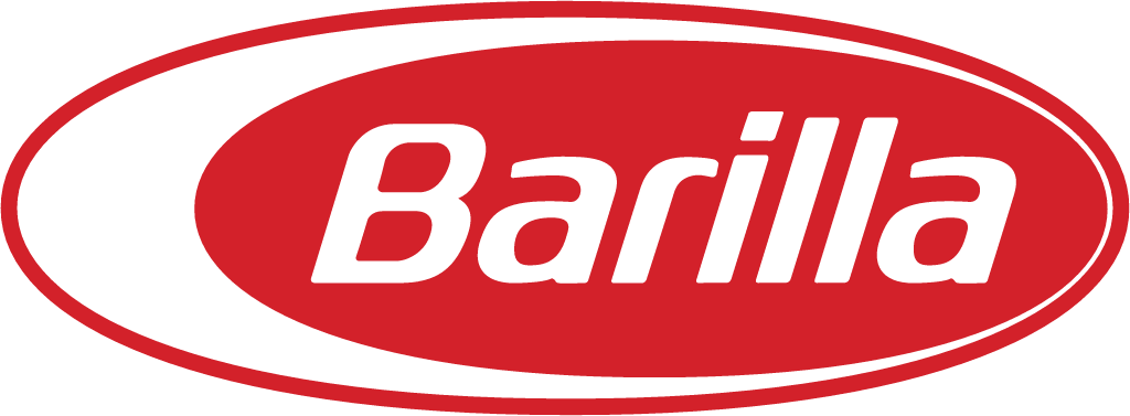
AfterSince Jan 2022
Barilla logo via Wikimedia Commons (author: Barilla). Source: commons.wikimedia.org
Key facts
Barilla launched a new logo in Jan 2022, designed by Robilant Associati.
- Brand
- Barilla
- Launched
- Source: barillagroup.com
- What changed
- Jan 2022: double-outline oval simplified to single deeper-red oval with refined lettering and 'Dal 1877' (Robilant).
- Sources
- adcgroup.it, engage.it, pack.ly
Cite this Rebrand Log, "Barilla new logo (2022)", https://rebrandlog.com/rebrand/barilla-2022/, last updated .
The Barilla rebrand, explained
Key people: Gianluca Di Tondo (CMO, Barilla)
Barilla turned 145 in 2022 and used the occasion to give the brand a single global positioning for the first time, signed Un Gesto d'Amore, or A Sign of Love. Chief marketing officer Gianluca Di Tondo introduced it with a line reported by both ADC Group and Engage: great brands do not change, they evolve.
The work took two years. Publicis Groupe handled positioning and communication, while Robilant Associati redesigned the logo and packaging. The logo it updated was designed in 1956 by the Parma graphic designer and architect Erberto Carboni.
Di Tondo explained the changes. The logo loses its double oval, the historic reference to egg pasta that Engage described as the metaphor of a hard-boiled egg cut in half. The red becomes more intense and premium, and the brand's founding date, Dal 1877, now sits above the classic lettering. The logo then becomes the heart of the blue box, which he called a true icon.
In Italy that box returned to deep blue after two years of lighter blue packs introduced in 2020 to highlight the switch to 100 percent Italian wheat. Engage added that from the second half of 2022 the Barilla Classica packs would be made only of cardboard, without the plastic window. A new bronze-drawn line launched alongside, in all-over red.
Engage.it put a number on the cardboard switch: dropping the plastic window avoids 126 tonnes of plastic a year, which the marketing chief called a concrete gesture of love for the planet. Packs in Italy, which had moved to light blue in 2020 to signal 100 per cent Italian wheat, returned to a more elegant blue. Tying the new slogan to a tangible packaging change gives a sentimental line something solid underneath, and it matters more than any change to the logo itself.
Removing the egg is the bold move here, and the right one. The white oval was a symbol most people could no longer read, and it made the mark busy on shelf. A stronger red and a date give the logo heritage without the clutter. The classic lettering survives, which is exactly where the respect should go.
In short: Hold the egg.
Sources
- 1. barillagroup.comhttps://www.barillagroup.com/it/sala-stampa/comunicati-stampa/barilla-rivela-la-sua-nuova-immagine/
- 2. adcgroup.ithttps://www.adcgroup.it/adv-express/news/industry/industry/la-nuova-immagine-barilla-.html