Aston Martin
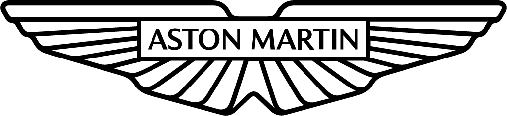
Peter Saville redrew the wings. The outline got cleaner and the edges softer, the feathers became fewer, simpler lines, and the name in the centre bar was reset with more room to breathe.
Aston Martin logo before and after
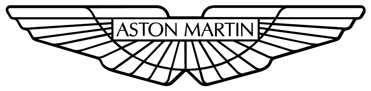

BeforeUntil Jul 2022
Logo: Aston Martin. Source: astonmartin.com (archived)
DownloadLightSVG not availablePNGDark mode version adapted by Rebrand Log
AfterSince 20 Jul 2022
Aston Martin wings from the official website astonmartin.com (site SVG sprite). Source: astonmartin.com

Key facts
Aston Martin launched a new logo on 20 Jul 2022, designed by Peter Saville.
- Brand
- Aston Martin
- Launched
- What changed
- Peter Saville redrew the wings. The outline got cleaner and the edges softer, the feathers became fewer, simpler lines, and the name in the centre bar was reset with more room to breathe.
Cite this Rebrand Log, "Aston Martin new logo (2022)", https://rebrandlog.com/rebrand/aston-martin-2022/, last updated .
The Aston Martin rebrand, explained
Aston Martin's winged badge dates back to 1927, Creative Review notes, when it was more of a wing-shaped wordmark. By 1932 it had taken the scarab-inspired shape it has kept ever since, with smaller revisions in the 1950s, the 1980s and the early 2000s. The 2022 version, the company said, was "the first major update to the marque since 2003 and only the eighth time in Aston Martin's 109-year history that it has been significantly adjusted."
The redesign was part of a new brand strategy built around the line Intensity. Driven., aimed at new buyers; Creative Review reported that over 60% of sales were coming from people new to the brand. The wings were redrawn by Aston Martin's design team with Peter Saville, best known for his Factory Records album sleeves.
Side by side, the change is quiet. The outline is simpler and the edges softer, the feather lines are fewer and cleaner, and the Aston Martin name in the centre bar has more space around it. Saville called it "a classic example of the necessary evolution of logotypes of provenance" and explained that "Subtle but necessary enhancements not only keep forms fresh, but allow for new technologies, situations and applications to be accommodated in the future."
The physical badge is hand-enamelled by Vaughtons, the 203-year-old Birmingham silversmiths the release credits with crafting the Football Association Cup, and the new wings first raced on the Aston Martin F1 car at the French Grand Prix that weekend, while the team ran its original 1922 button logo on the nose for the occasion.
Reaction was respectful, as it tends to be when the name on the brief is Peter Saville. One design studio on X summed it up: "Looks good to me." Creative Review was less sure about the launch film, calling it "somewhat overblown", but not about the wings.
In short: A Saville redraw you can only spot side by side.
Quotes
“Subtle but necessary enhancements not only keep forms fresh, but allow for new technologies, situations and applications to be accommodated in the future”
“a classic example of the necessary evolution of logotypes of provenance”
Press
Reactions
Sources
- 1. astonmartin.comhttps://www.astonmartin.com/en/our-world/news/2022/7/19/aston-martin-takes-off-into-new-era-with-brand-repositioning-and-new-iconic-wings-logo
- 2. creativereview.co.ukhttps://www.creativereview.co.uk/aston-martin-peter-saville/
- 3. wallpaper.comhttps://www.wallpaper.com/transport/peter-saville-aston-martin-wings-logo-redesign