Aegon
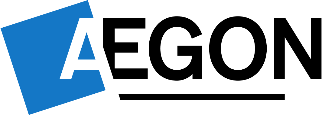
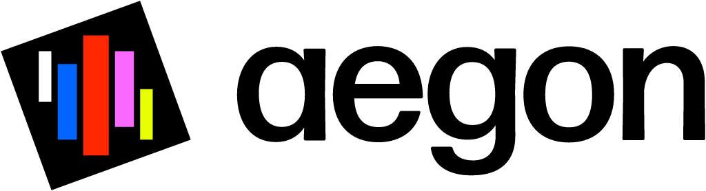
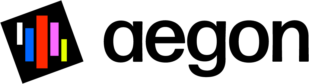
Jun 22 2023 (Capital Markets Day): tilted blue square with white A + Aegon caps replaced by tilted dark square with coloured stripes + lowercase aegon
Aegon logo before and after
BeforeUntil Jun 2023
Aegon logo via Wikimedia Commons (author: Unknown authorUnknown author). Source: commons.wikimedia.org
AfterSince Jun 2023
Logo: Aegon. Source: aegon.com (archived)


Key facts
Aegon launched a new logo in Jun 2023, designed by Total Design.
- Brand
- Aegon
- Launched
- Source: sec.gov
- What changed
- Jun 22 2023 (Capital Markets Day): tilted blue square with white A + Aegon caps replaced by tilted dark square with coloured stripes + lowercase aegon.
- Why
- Aegon said the updated logo reflected its shift from an integrated financial services group to an active holding company and its purpose of helping people live their best lives.
- Sources
- nieuws.nl, marketingreport.nl
Cite this Rebrand Log, "Aegon new logo (2023)", https://rebrandlog.com/rebrand/aegon-2023/, last updated .
The Aegon rebrand, explained
Aegon's logo dated from 1983 and had barely changed in forty years. In June 2023 the company finally touched it, and the timing was not cosmetic. As ANP reported via nieuws.nl, the insurer was about to complete the sale of its Dutch insurance business to ASR and used its investor day on 22 June to set out a growth plan centred on its American arm, Transamerica, alongside a new logo for the change.
The structural story explains the design brief. Marketing Report laid it out: once ASR took over Aegon Nederland on 4 July 2023, ASR would become the leading brand in the Netherlands, with the Aegon name there expected to be phased out around 2026, while the businesses not sold, in the UK, Brazil, Spain, Portugal, China and India, would carry on as Aegon. The new identity was meant to signal the shift from an integrated financial services group to an active holding company. Chief communications officer Nanne Bos said the 1983 logo had strong foundations but had not evolved, and that the update built on the iconic identity, brought it into the 21st century, reflected the purpose of helping people live their best lives, and underlined the transformation into an active holding with a diverse portfolio of leading businesses.
The changes, as ANP described them, are restrained. The mark is still a slightly tilted square beside the company name, but the square is now black with several coloured stripes, and the name is set in a rounder typeface. The visual identity was by Total Design, whose executive creative director Eddy Wegman said keeping and even exploiting the distinctive tilted square built on the heritage while pushing it toward a more purpose driven brand. The brief, per Marketing Report, was a group level brand that stood apart in the market while acting as a connecting entity for the businesses beneath it.
The plan around it was concrete: Aegon wanted to grow Transamerica's adviser network from 70,000 to 110,000 and push further into US retirement services.
For a holding company whose operating brands are often called something else, a quietly upgraded symbol is the right weight. The stripes add movement and a hint of plurality, fitting a group of different businesses, and the tilt keeps forty years of recognition. It is not exciting, but it is not supposed to be.
In short: A 1983 square, finally allowed to move.
Sources
- 1. sec.govhttps://www.sec.gov/Archives/edgar/data/769218/000119312523171727/d501442d6k.htm
- 2. nieuws.nlhttps://nieuws.nl/economie/aegon-wil-met-nieuw-logo-inzetten-op-groei-in-verenigde-staten