JLR
The corporate name went from Jaguar Land Rover to JLR, and the two car badges side by side gave way to a thin, all-black JLR monogram with a descending j and an R missing its upright.
JLR logo before and after
BeforeUntil Jun 2023
Logo: JLR. Source: jaguarlandrover.com (archived)
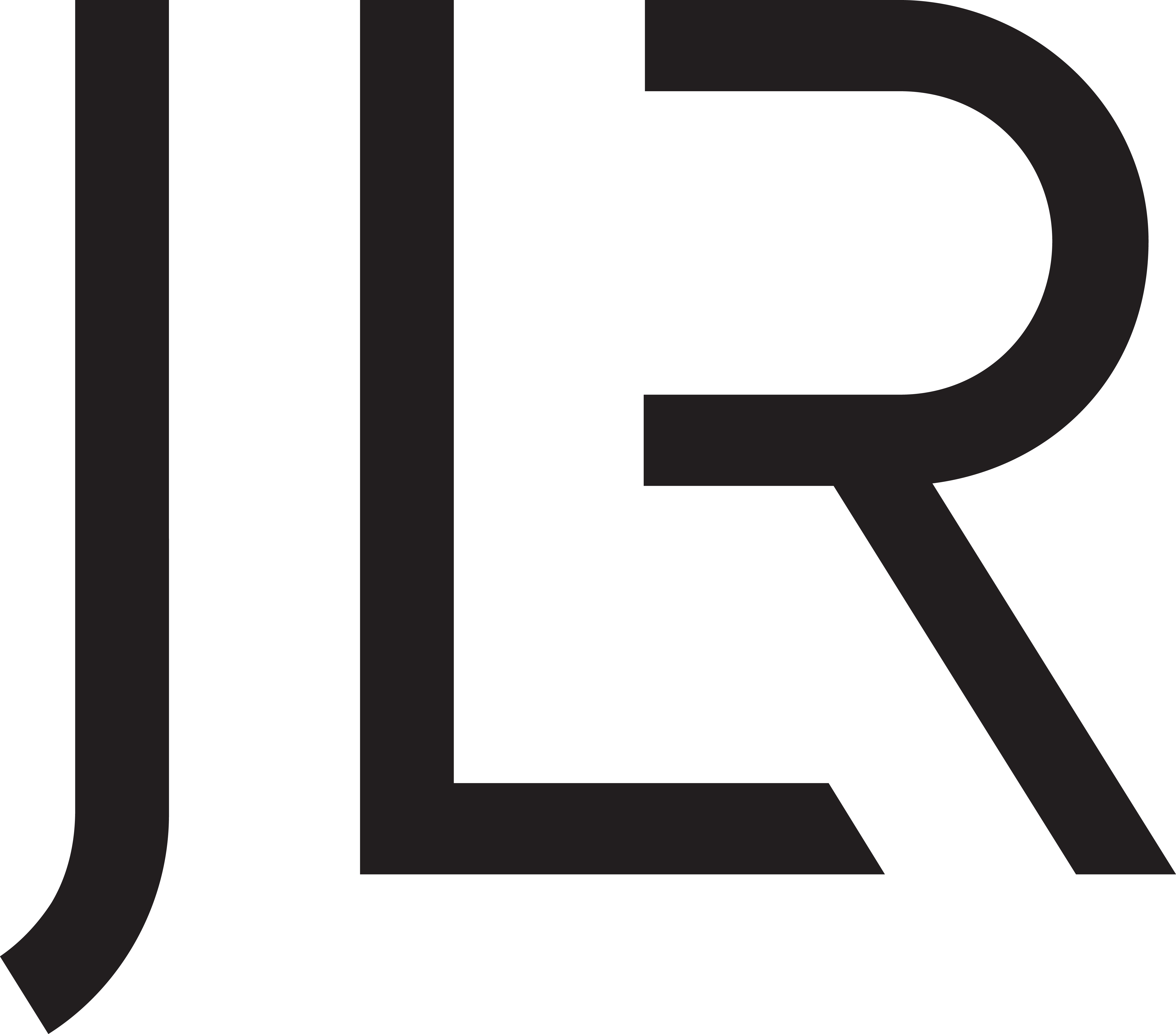
AfterSince 1 Jun 2023
JLR logo, official JLR Media logo pack (Black primary logo JPG). Dark mode shows a vectorised white version adapted by Rebrand Log. Source: media.jlr.com
DownloadLightSVG not availablePNGDark mode version adapted by Rebrand Log
Key facts
JLR launched a new logo on 1 Jun 2023.
- Brand
- JLR
- Launched
- Studio
- Not recordedAdd it
- What changed
- The corporate name went from Jaguar Land Rover to JLR, and the two car badges side by side gave way to a thin, all-black JLR monogram with a descending j and an R missing its upright.
- Why
- On 1 June 2023, in Gaydon, it unveiled a new corporate identity as part of a move to what it calls a House of Brands, with Range Rover, Defender, Discovery and Jaguar as the four brands customers see.
- Sources
- media.jlr.com, creativebloq.com, autocar.co.uk
Cite this Rebrand Log, "JLR new logo (2023)", https://rebrandlog.com/rebrand/jlr-2023/, last updated .
The JLR rebrand, explained
Jaguar Land Rover, owned by Tata Motors, had always presented itself with two logos side by side: the Jaguar leaper and wordmark next to the green Land Rover oval. On 1 June 2023, in Gaydon, it unveiled a new corporate identity as part of a move to what it calls a House of Brands, with Range Rover, Defender, Discovery and Jaguar as the four brands customers see.
The company itself became JLR. Its new logo is a single monogram in thin black strokes, and the release explains the details: "The descending j aspires to add elegance, while the lighter weight of the emblem illustrates the step change to refinement and modernity." The R has no upright, a trick that reminded several people of the new Kia and Nokia logos. Chief creative officer Gerry McGovern called the identity "a unifier for our four distinct British brands."
JLR also had to explain what was not changing. The new logo is for the company, its website and its press releases, not for the cars. Land Rover, the release said, "continues as a world-renowned and important heritage mark, remaining on vehicles, websites, social media and retail sites."
That message did not get through to everyone. Creative Bloq collected some of the replies: one called it "Worthless. It’s either a Jaguar, Range Rover or a Land Rover", another said it looked "Almost like the name of an aftershave you see at duty-free," and a third thought it was "Nice for a firm of accountants, which of course the company actually is." Creative Bloq's own view was kinder: the change replaced "a terribly long-winded name" and ended the need to show two logos side by side.
As corporate identities go, JLR is a reasonable answer to a real problem. It was simply introduced to an audience that cares a great deal about badges, and it does not look like one.
In short: Three letters, no badge, a lot of aftershave jokes.
Quotes
“The descending j aspires to add elegance, while the lighter weight of the emblem illustrates the step change to refinement and modernity.”
“It looks so generic. Almost like the name of an aftershave you see at duty-free”
Press
Reactions
- MotorOctane@MotorOctane on XJaguar Land Rover reveals new logo for JLR rebrand Like the new logo?2 Jun 2023 · 207 likes
- SiViWE@SiV_S4 on X@peterjobes I think you're mistaken, this logo is for the Jaguar Land Rover company. Land Rover as a brand will still exist. The JLR logo will benefit the company because it's shorter than Jaguar Land Rover. People…5 Jun 2023 · 0 likes
Sources
- 1. media.jlr.comhttps://media.jlr.com/corporate/news/2023/06/jaguar-land-rover-unveils-new-jlr-corporate-identity-it-accelerates-modern-luxury
- 2. creativebloq.comhttps://www.creativebloq.com/news/jaguar-land-rover-jlr-logo
- 3. autocar.co.ukhttps://www.autocar.co.uk/car-news/new-cars/jaguar-land-rover-reveals-new-logo-jlr-rebrand