UEFA Europa League
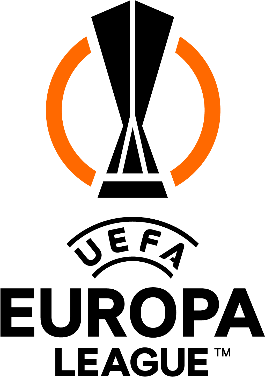
Jun 2021: black outlined trophy mark (2015) replaced by a bolder angular orange-and-black trophy with an "energy wave" ring (Turquoise Branding), from 2021-22 alongside the new Conference League.
UEFA Europa League logo before and after
BeforeUntil Jun 2021
UEFA Europa League logo via Wikimedia Commons (author: UEFA Europa League). Source: commons.wikimedia.org
AfterSince Jun 2021
UEFA Europa League logo via Wikimedia Commons (author: UEFA). Source: commons.wikimedia.org

Key facts
UEFA Europa League launched a new logo in Jun 2021, designed by Turquoise.
- Brand
- UEFA Europa League
- Launched
- Source: designweek.co.uk
- What changed
- Jun 2021: black outlined trophy mark (2015) replaced by a bolder angular orange-and-black trophy with an "energy wave" ring (Turquoise Branding), from 2021-22 alongside the new Conference League.
- Why
- UEFA rebranded the Europa League to tell it apart from, and tie it to, the new Europa Conference League.
- Sources
- designweek.co.uk, uefa.com
Cite this Rebrand Log, "UEFA Europa League new logo (2021)", https://rebrandlog.com/rebrand/uefa-europa-league-2021/, last updated .
The UEFA Europa League rebrand, explained
Key people: Gareth Mapp (Creative director, Turquoise)
For 2021-22 UEFA restructured its second-tier club competition. The Europa League, in its current form since 2009, was cut from 48 to 32 teams, and a new third tier, the Europa Conference League, was created for another 32. Both needed branding that told them apart and tied them together.
London studio Turquoise, which had worked with UEFA before, won a competitive pitch. Creative director Gareth Mapp said the Europa League had to feel more competitive with fewer teams, while its new sibling had to express a more open, inclusive character.
The shared device is the energy wave, introduced to the Europa League in 2015 to represent the noise of fans chanting; Mapp said the team wanted to avoid generic footballs and footballers. The two logos split along the lines of their trophies: angular geometry for the Europa League, curved for the Conference League, whose trophy is more fluid. The Europa League's orange was kept but tidied, after too many variants had crept in, and the Conference League took a bright green. The typefaces Europa Title and Europa Nuova were retained for cohesion, the existing anthem was extended to the new competition, and the logotypes were simplified and made bolder to work as on-screen bugs and social avatars.
Design Week published the work on 23 June 2021, ahead of rollout across broadcast graphics, perimeter boards, merchandise and social media from the new season.
Design Week laid out the logic. The Europa League was shrinking from 48 teams to 32 and gaining a third tier sibling, so one brand had to feel more competitive and the other more open. Both share the energy wave introduced in 2015 to suggest fans chanting, while the logos take their geometry from the trophies: angular for the Europa League, curved for the Conference League. Orange was refined, the newcomer got bright green, and the logotypes were simplified to work as on screen bugs and social avatars. A family built on trophy shapes rather than footballs is a welcome restraint.
It is disciplined system design rather than a statement. Deriving each logo from its trophy is a neat, defensible idea, and the bolder logotypes fix a real broadcast problem. The cost is personality: the Europa League still looks like the Champions League's younger sibling, which, to be fair, is exactly what it is.
In short: Two trophies, two shapes, one tidy system.
Sources
- 1. designweek.co.ukhttps://www.designweek.co.uk/issues/21-27-june-2021/uefa-europa-league-rebrands-alongside-new-conference-league-launch/
- 2. uefa.comhttps://www.uefa.com/news-media/video/01f1-0e6622079d26-45a142e9d97c-1000--uefa-europa-league-branding/
- 3. tqbranding.comhttps://tqbranding.com/case_studies/uefa-europa-league-rebrands-alongside-new-conference-league-launch/