Ligue 1
16 Aug 2024: the Hexagoal-trophy symbol beside 'Ligue 1 Uber Eats' replaced by a 'L1' monogram (an L cut into a 1) with 'Ligue 1' and the McDonald's arches (Leroy Tremblot), with a proprietary typeface and electric-blue palette; announced 27 Mar 2024.
Ligue 1 logo before and after
BeforeUntil Aug 2024
Logo: Ligue 1. Source: ligue1.com (archived)




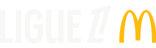
AfterSince Aug 2024
Logo: Ligue 1. Source: ligue1.com (archived)
Key facts
Ligue 1 launched a new logo in Aug 2024.
- Brand
- Ligue 1
- Launched
- Source: lfp.fr
- Studio
- Not recordedAdd it
- What changed
- 16 Aug 2024: the Hexagoal-trophy symbol beside 'Ligue 1 Uber Eats' replaced by a 'L1' monogram (an L cut into a 1) with 'Ligue 1' and the McDonald's arches (Leroy Tremblot), with a proprietary typeface and electric-blue palette; announced 27 Mar 2024.
- Why
- The French league said its new logo opened a new marketing cycle aimed at making Ligue 1 a more iconic and emotional brand, closer to its fans.
- Sources
- news.sportslogos.net, lfp.fr, leparisien.fr
Cite this Rebrand Log, "Ligue 1 new logo (2024)", https://rebrandlog.com/rebrand/ligue-1-2024/, last updated .
The Ligue 1 rebrand, explained
The French football league unveiled a new Ligue 1 logo on 27 March 2024, soon after announcing a naming rights deal with McDonald's from the following season. SportsLogos.Net reported that the mark would go into full use in stadiums, broadcasts and digital applications from 16 August 2024, in time for the 2024 to 2025 season.
The design is an L inside an italicised number 1. The top of the L is cut at the same angle as the top of the 1, and Ligue 1 is spelled out underneath in a new custom typeface. The league's release explained that the symbol highlights the 1 associated with the L, played in counterform, and that L1 is a term widely used by fans, so the logo offers two levels of reading.
The release called it a more modern and iconic symbol and a unifying emblem, part of a modular identity that clubs and fans could make their own, with a proprietary typeface, a new colour palette and a new graphic system to be presented later. The league's president framed it as another step in making Ligue 1 a more iconic brand. A Ligue 2 logo was promised for mid April.
Le Parisien summed up the package as a new logo, a refreshed brand and a new trophy.
The league's own announcement explained the reading it intended. The new symbol plays the L inside the 1 as a counterform, echoing L1, the shorthand fans already use, so the mark works on two levels. It was the first piece of a modular identity, with a proprietary typeface, palette and graphic system to follow, meant to let clubs and fans make it their own and to make Ligue 1 a more emotional, more iconic brand at home and abroad. Vincent Labrune framed it as a further step in a plan to elevate French competitions. It is a neat monogram; iconic has to be earned on the pitch.
The L1 idea is smart because it is already how the competition is spoken about. A monogram that fans use anyway beats a lion or a ball. The counterform trick is neat, and the matched angles give the mark speed. The weakness is that league logos increasingly look like app icons, interchangeable across sports. Ligue 1's version is cleaner than most, but it relies on the number to be French football rather than any image of France.
In short: L inside 1.
Sources
- 1. lfp.frhttps://www.lfp.fr/article/un-nouveau-logo-pour-la-ligue-1-a-compter-de-2024-2025
- 2. leparisien.frhttps://www.leparisien.fr/sports/football/ligue-1/nouveau-logo-marque-rafraichie-et-nouveau-trophee-la-ligue-1-change-son-identite-visuelle-27-03-2024-JDC3G3XNUREARBJRBJAVJXGKRM.php