Imperial College London
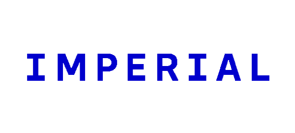
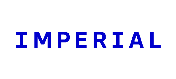
The two-line navy "Imperial College London" logotype in a humanist sans was replaced by a single word, "Imperial", in widely spaced capitals with a distinctive serifed I, set in a new bright Imperial Blue.
Imperial College London logo before and after
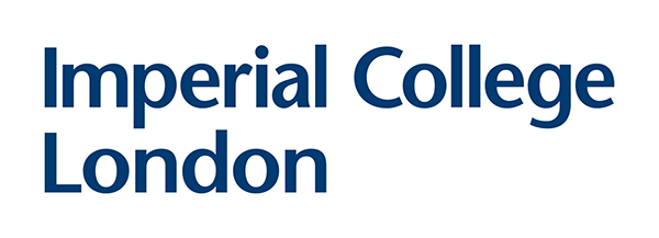
BeforeUntil Feb 2024
Logo: Imperial College London. Source: imperial.ac.uk (archived)
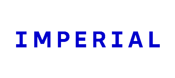
AfterSince Feb 2024
Logo: Imperial College London. Source: imperial.ac.uk (archived)
Key facts
Imperial College London launched a new logo in Feb 2024, designed by Pentagram.
- Brand
- Imperial College London
- Launched
- What changed
- The two-line navy "Imperial College London" logotype in a humanist sans was replaced by a single word, "Imperial", in widely spaced capitals with a distinctive serifed I, set in a new bright Imperial Blue.
Cite this Rebrand Log, "Imperial College London new logo (2024)", https://rebrandlog.com/rebrand/imperial-2024/, last updated .
The Imperial College London rebrand, explained
Imperial's previous identity dated from the 1990s and, according to Pentagram, never had a fully developed brand proposition. Pentagram partner Domenic Lippa led the new identity, with brand strategy by Simple Revolution and a bespoke typeface family, Imperial Sans, by NaN.
The biggest change was the name. The full institutional name stays Imperial College London, but "Imperial" became "the official visual shorthand" in the logo, which Pentagram compared to Oxford, Cambridge, Harvard and Stanford. The wordmark features "a distinctive serifed letter 'I'" that recurs across the identity, in a new colour called Imperial Blue.
The reaction was fierce. Times Higher Education reported a student petition that passed 2,800 signatures within days, citing the logo's "empire connotation" and the loss of "London", and the UCU branch raised concerns about accessibility and cost. Felix later reported the petition had passed 8,000 signatures.
Freedom of information responses showed the brand project cost £434,801.47, covering agencies, the bespoke font, signage and promotional material. Imperial said it had worked with a specialist agency to check the identity's inclusivity and accessibility.
In short: College London dropped from the logo, and students pushed back.
Quotes
“We have developed a visual and verbal identity, rooted in our science heritage, that is modern, confident and expressive, articulating Imperial's purpose, vision, strengths and impact, and which differentiates us in a crowded and competitive landscape.”
“Many (if not most) students dislike the new logo; the new colour and font look almost cartoonish and it is not a good representation of the college.”
Press
Sources
- 1. timeshighereducation.comhttps://www.timeshighereducation.com/news/pushback-against-ugly-new-imperial-college-london-logo
- 2. felixonline.co.ukhttps://felixonline.co.uk/articles/imperial-spent-nearly-half-a-million-pounds-on-brand-refresh-and-logo/
- 3. pentagram.comhttps://www.pentagram.com/work/imperial