Rostelecom
New logo and identity.
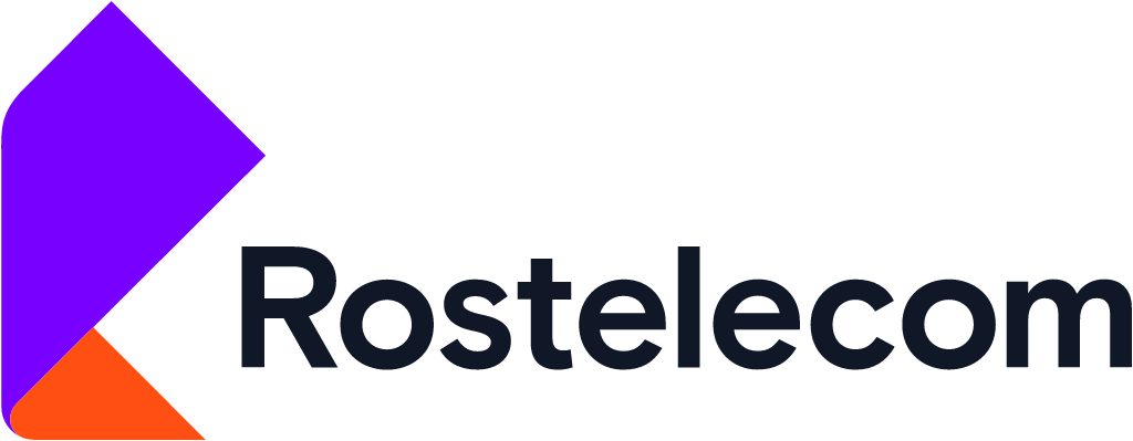
Rostelecom logo before and after
BeforeUntil Oct 2018
Rostelecom logo via Wikimedia Commons (Logo rostelecom.png). Source: commons.wikimedia.org
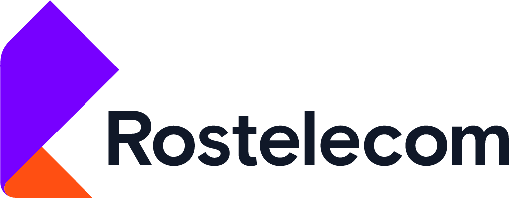
AfterSince Oct 2018
Rostelecom logo via Wikimedia Commons (Rostelecom logo English 2018.svg). Source: commons.wikimedia.org


Key facts
Rostelecom launched a new logo in Oct 2018, designed by Saffron Brand Consultants.
- Brand
- Rostelecom
- Launched
- Source: underconsideration.com
- What changed
- New logo and identity.
- Why
- Rostelecom said the new brand reflected its shift from telecoms operator to digital company, putting people's needs ahead of technology.
- Sources
- company.rt.ru, adindex.ru
Cite this Rebrand Log, "Rostelecom new logo (2018)", https://rebrandlog.com/rebrand/rostelecom-2018/, last updated .
The Rostelecom rebrand, explained
On 26 September 2018 Russia's national telecoms operator announced a repositioning and rebrand, alongside new digital services and tariffs. AdIndex reported that the new logo shows a folded two colour ribbon, and that the company was deliberately moving away from the image of a business that only provides phone service, which is why it dropped the old logo known as the ear.
The strategy behind it was spelled out in Rostelecom's release. Its Strategy 2022 set out a transformation from telecoms operator into an IT company serving consumers, businesses and the state, and digital and content services, internet access, pay TV, cloud, data centres and cybersecurity already brought in more than half of revenue. A senior executive said what mattered was no longer technology but how it was applied to make life more comfortable and safe, and that the company was no longer focused on new subscriptions but on whole areas of life and ecosystems of services.
The brand was meant to express that shift. According to the company, its mission was to reflect a fundamental change in approach to products and clients, putting people's needs, experience and emotions first. The diversity of graphic solutions and colours was meant to echo the range of opportunities Rostelecom was creating for people, businesses and the country, from gamers to government. The identity was developed with Saffron Brand Consultants and a partner agency, and AdIndex reported a development cost of 35 million roubles. The new services launched with it included the Wink TV platform, the Rostelecom Lyceum education platform and tariffs named after needs, such as For peace of mind and Gaming. The first campaign in the new style was set for 1 October.
The ribbon is an elegant answer to the brief. A folding band suggests movement and flexibility, and it reads as a symbol rather than a piece of hardware, which is exactly what a company trying to stop being seen as a phone line needed. The multicolour system is ambitious for a state backed operator, and keeping it disciplined across so many services is the hard part. Still, retiring the ear was overdue, and the replacement looks like a company that wants to sell more than calls.
In short: The ear is retired; a ribbon takes over.
Press
Sources
- 1. underconsideration.com · paywalledhttps://www.underconsideration.com/brandnew/archives/new_logo_and_identity_for_rostelecom_by_saffron.php
- 2. company.rt.ruhttps://www.company.rt.ru/en/ir/news_calendar/d445920/
- 3. adindex.ruhttps://adindex.ru/news/marketing/2018/09/26/174537.phtml