Papa Johns
Nov 2021: "Better by Design" rebrand
Papa Johns logo before and after
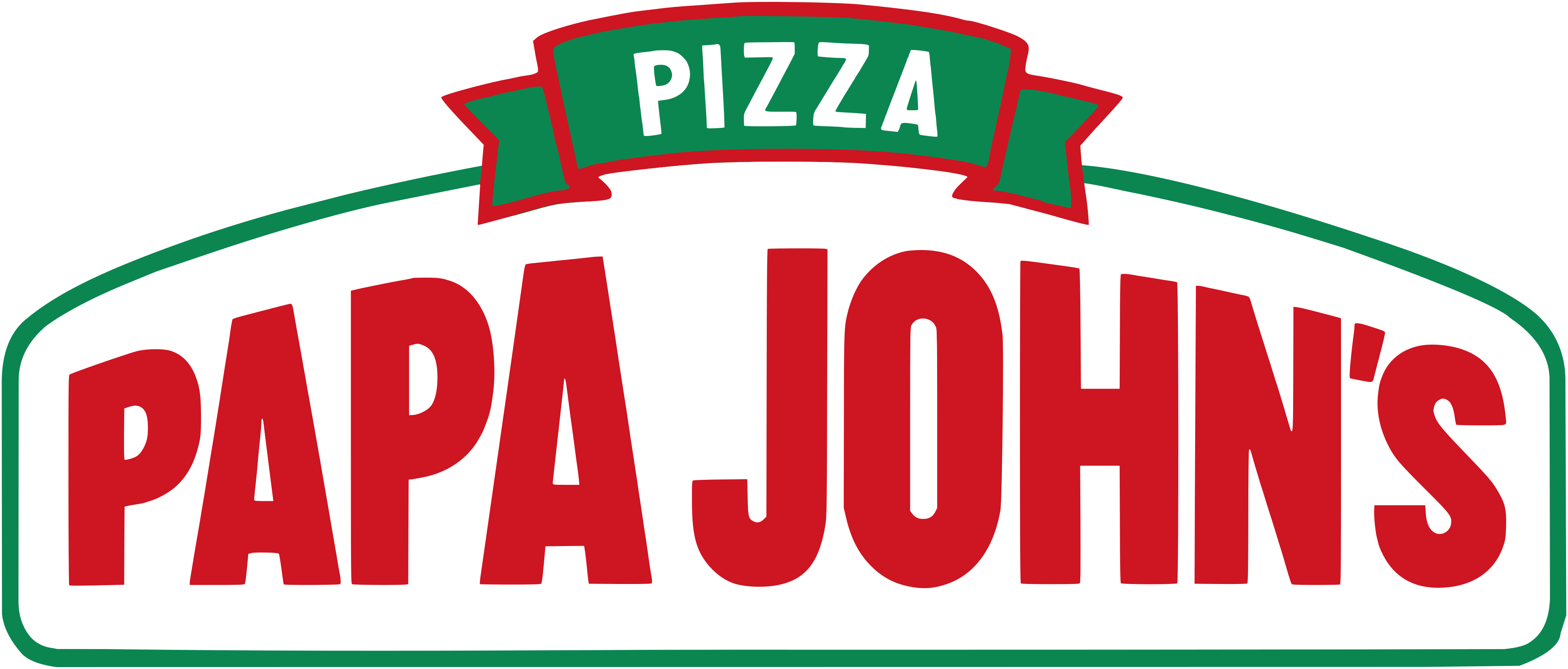
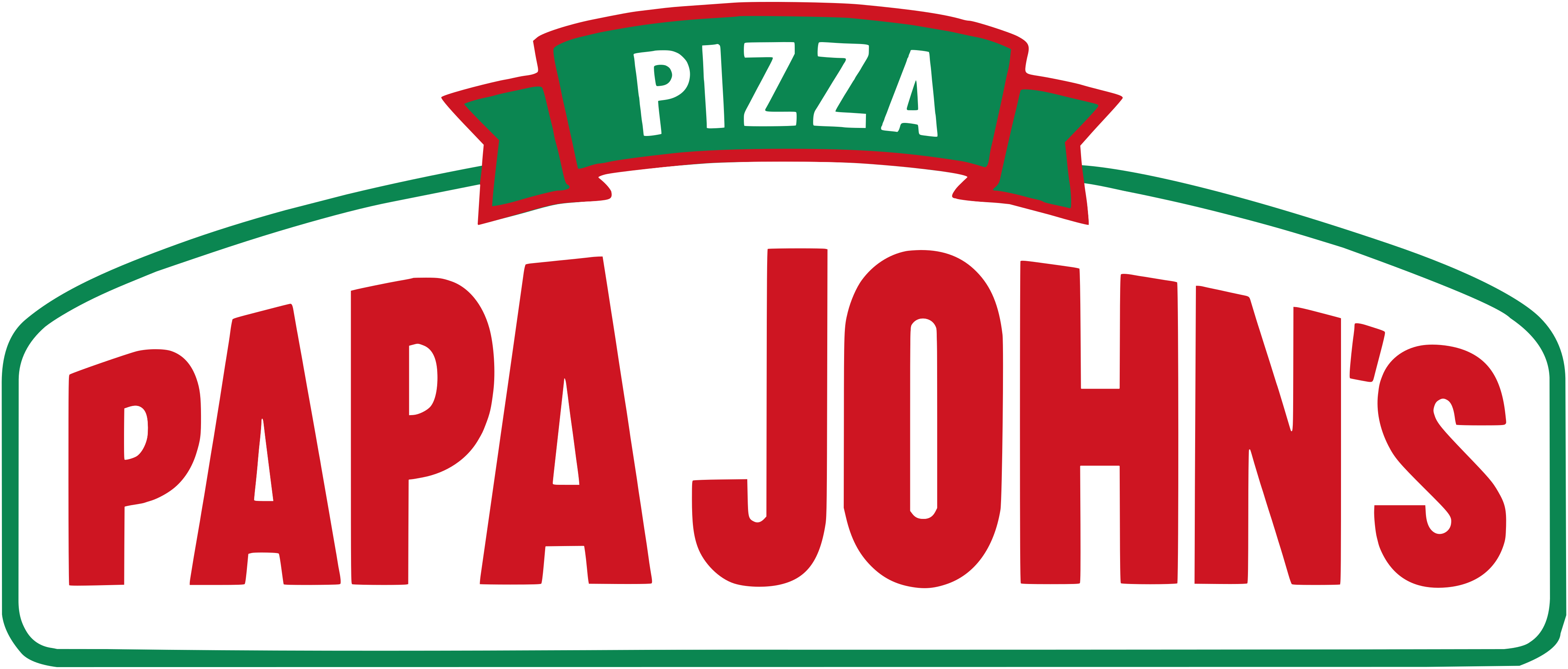
BeforeUntil Nov 2021
Papa Johns logo via Wikimedia Commons (author: Tucrack). Source: commons.wikimedia.org
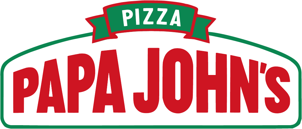
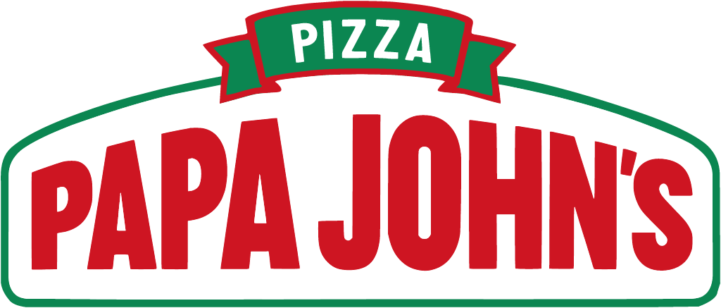
AfterSince Nov 2021
Papa Johns logo via Wikimedia Commons (author: Papa Johns). Source: commons.wikimedia.org




Key facts
Papa Johns launched a new logo in Nov 2021, designed by Su Mathews Hale Design and forpeople.
- Brand
- Papa Johns
- Launched
- Source: ir.papajohns.com
- Studio
- Su Mathews Hale Design and forpeopleAll rebrands by Su Mathews Hale DesignAll rebrands by forpeople
- What changed
- Nov 2021: "Better by Design" rebrand.
- Why
- Papa Johns said its new logo reflected a bold, simple, fun and clean tone, with updated colours to stand out online and in person.
- Sources
- ir.papajohns.com, restaurantdive.com, adage.com
Cite this Rebrand Log, "Papa Johns new logo (2021)", https://rebrandlog.com/rebrand/papa-johns-2021/, last updated .
The Papa Johns rebrand, explained
Key people: Rob Lynch (CEO, Papa Johns) · Max Wetzel (Chief Commercial Officer, Papa Johns)
In November 2021 Papa John's announced a new restaurant design, a new logo and a new visual identity, under the banner Better by Design. The most talked-about detail was the smallest: the apostrophe disappeared, and the chain became Papa Johns.
The company described the new logo as a reflection of a bold, simple, fun and clean tone. The signature red and green were updated to help the brand stand out both online and in person. The restaurant design took its cue from the ingredients, with an open floor plan, a dedicated space for team members to add the pepperoncini and garlic sauce to each box, and smoother pickup for customers.
Restaurant Business, which interviewed chief commercial officer Max Wetzel, added the detail. The rebrand effort had started two years earlier; the logo is stackable so it stays readable from a billboard to a phone screen, and as Wetzel put it, it has to be as strong on the outside of the restaurant as on the app. He called dropping the possessive consistent with how many brands evolve, and said it had been a long time since the logo changed. The palette keeps the original red and green but adds tones such as light purple and a bright yellow-green, which the company's release named Tangy tomato, Fresh basil, Fluffy dough, Punchy garlic and Pickled pepperoncini. A custom typeface was inspired by the way fresh dough stretches, and an illustration style called hand drawn happiness was added. Above the counter of the new stores runs the line Welcome to the dough show, and the design was to appear first as franchisees opened new locations, in what the release called a phased rollout.
Papa Johns did not credit an outside design agency in its announcement.
Chief executive Rob Lynch later explained the apostrophe in exactly those terms: the brand belonged collectively to its franchisees and stakeholders rather than to one founder. That founder, John Schnatter, had left the company after a string of controversies, and much of the public read the change as distance-taking. Distractify reported confusion over whether the name had actually changed.
Removing the possessive also quietly loosens the link between the brand and one man, Papa John himself. Restaurant Dive's headline led with the apostrophe for good reason. As a logo, it is a modest, competent refresh. As a signal, it says more than the colours do.
In short: The apostrophe was the real redesign; the rest is polish.
Sources
- 1. ir.papajohns.comhttps://ir.papajohns.com/news-events/news-releases/detail/65/papa-johns-delivers-new-brand-experience-to-match-its-premium-products
- 2. restaurantdive.comhttps://www.restaurantdive.com/news/papa-johns-fires-up-brand-overhaul-drops-apostrophe-from-logo/610128/
- 3. adage.comhttps://adage.com/article/marketing-news-strategy/papa-johns-has-new-logo/2380406/