OLX
New logo and identity.
OLX logo before and after
BeforeUntil May 2020
OLX logo via Wikimedia Commons (OLX Logo.jpg). Source: commons.wikimedia.org
DownloadLightSVG not availablePNGDarkSVG not availablePNGDark mode version adapted by Rebrand Log
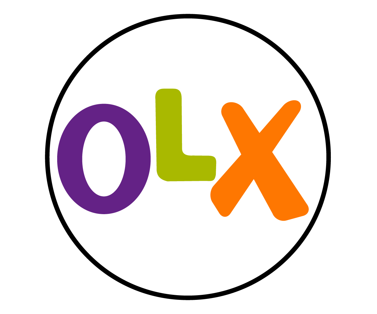
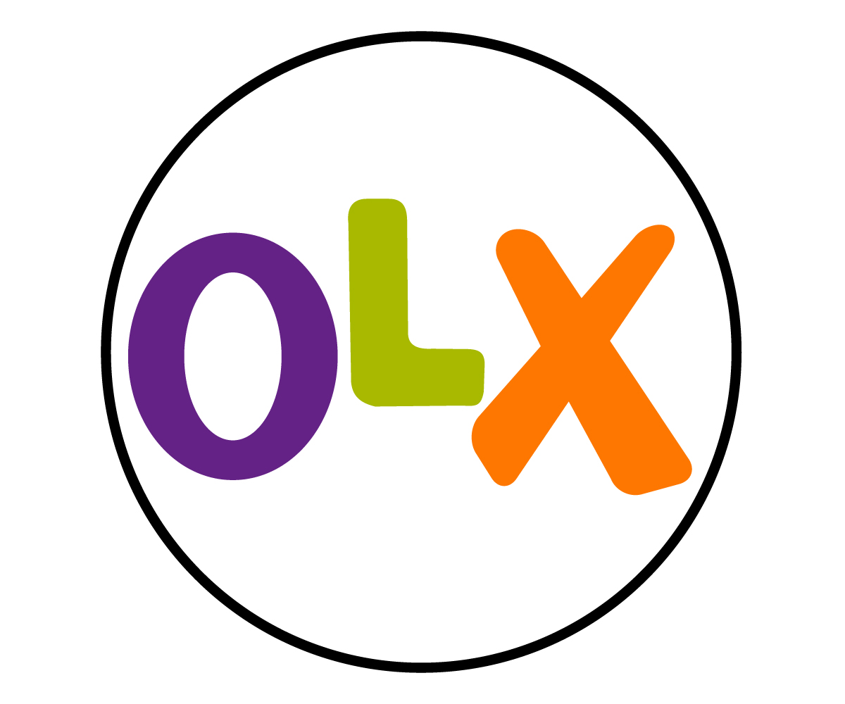
AfterSince May 2020
OLX logo via Wikimedia Commons (OLX New Logo.png). Source: commons.wikimedia.org
Key facts
OLX launched a new logo in May 2020, designed by DesignStudio.
- Brand
- OLX
- Launched
- Source: underconsideration.com
- What changed
- New logo and identity.
- Why
- OLX rebranded because its old logo felt dated and it wanted a brand that unified its markets and went beyond classifieds.
Cite this Rebrand Log, "OLX new logo (2020)", https://rebrandlog.com/rebrand/olx-2020/, last updated .
The OLX rebrand, explained
Key people: Elise Santangelo (Design director, DesignStudio) · Michał Malewski (General manager, OLX Poland)
OLX, short for On Line eXchange, was founded in India in 2006 and grew into one of the world's largest classifieds platforms, owned by the Amsterdam-based OLX Group and available in more than 35 countries and over 50 languages. By 2020 its old logo had started to feel dated, and the company wanted a brand that would unify its markets, set it apart globally and go beyond classifieds.
London's DesignStudio began with the stigma around buying second hand, framing it as savvy and eco-friendly. The strapline 'Making second hand the smart choice' guided the strategy and design. Design director Elise Santangelo told Design Week that the O and the X flex and shift, symbolising the choices users pick from, while the L sits in the middle as a 'maybe'. In the logo animation the letters shift weight and size to suggest variety. The toolkit included custom typography, a vibrant colour palette, photography guidelines featuring confident local users and an attitudinal tone of voice. OLX said it wanted a system that was dynamic, confident and bursting with energy.
The rollout was gradual and market by market. In Poland, OLX's blog announced on 5 May 2020 a more modern, single-colour logo, a new palette of lively pastels led by graphite, coral, cornflower blue and yellow, new category icons and a redesigned app. General manager Michał Malewski said the team had worked on it long and carefully; the launch was tied to a donation of up to 100,000 zlotys to a fund supporting Polish healthcare against Covid-19.
OLX's Polish blog presented the change to users in practical terms: a more modern single-colour logo, a palette of graphite, coral, cornflower blue and yellow, new category icons, a bottom bar for faster access to messages, saved ads and settings, and the ability to view images sent in messages. General manager Michał Malewski said he hoped users would quickly get used to the new look. The relaunch also came with a pledge of up to 100,000 złoty for the Siepomaga.pl foundation's fundraiser for Polish health services fighting COVID-19. Shipping the logo inside an app update with useful features is the least painful way to rebrand a marketplace.
The logo idea is genuinely clever: a wordmark that behaves like a decision. It also solved a practical problem, collapsing a set of local looks into one. The risk is that the meaning of an O, an X and a 'maybe' L lives mostly in the case study. On a phone, most users just see three bold letters in nicer colours, which may be all a classifieds app needs.
In short: A logo that cannot make up its mind, on purpose.
Press
Sources
- 1. underconsideration.com · paywalledhttps://www.underconsideration.com/brandnew/archives/new_logo_and_identity_for_olx_by_designstudio.php
- 2. designweek.co.ukhttps://www.designweek.co.uk/issues/11-17-may-2020/designstudio-olx-rebrand/
- 3. blog.olx.plhttps://blog.olx.pl/2020/05/05/pssst-olx-ma-nowe-logo/