Trivago
New logo and identity.
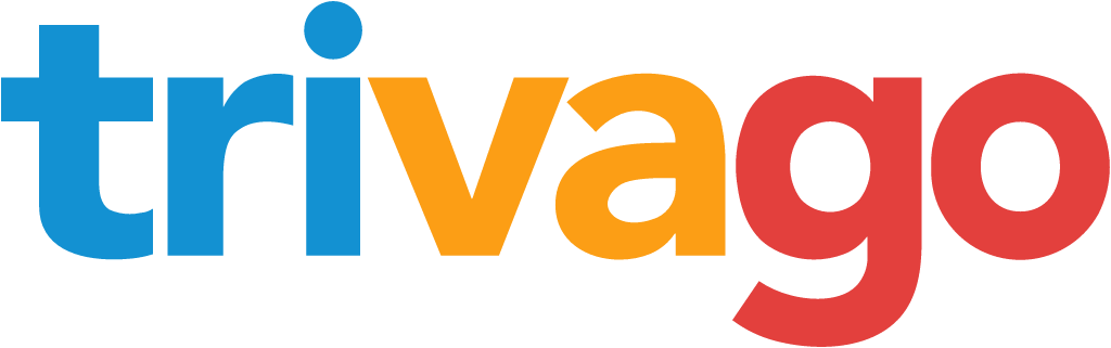
Trivago logo before and after
BeforeUntil Jan 2024
Logo: Trivago. Source: trivago.com (archived)

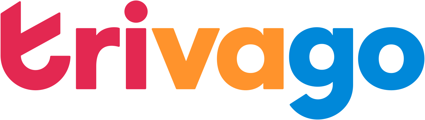
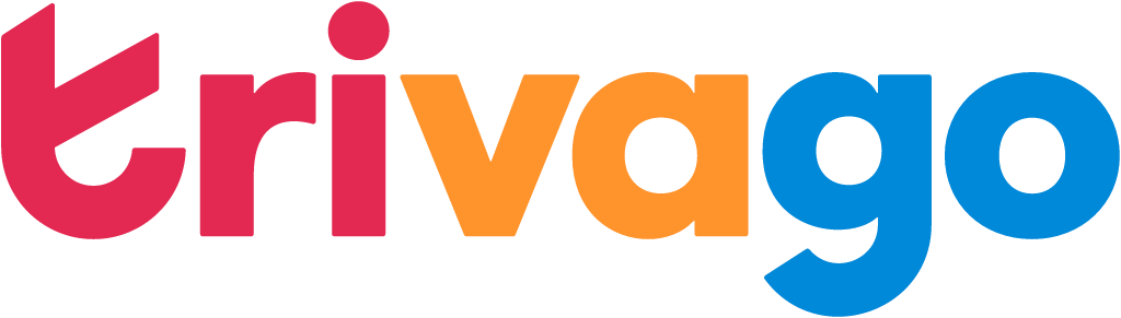
AfterSince Jan 2024
Trivago logo via Wikimedia Commons (author: Trivago). Source: commons.wikimedia.org
Key facts
Trivago launched a new logo in Jan 2024, designed by DesignStudio.
- Brand
- Trivago
- Launched
- Source: underconsideration.com
- What changed
- New logo and identity.
- Why
- Trivago's rebrand aimed to clarify its proposition so people chose and returned to the site, and to restore the charming spirit the brand had lost.
- Sources
- designweek.co.uk, life.trivago.com
Cite this Rebrand Log, "Trivago new logo (2024)", https://rebrandlog.com/rebrand/trivago-2024/, last updated .
The Trivago rebrand, explained
Trivago began preparing a brand update in 2022 and, after a pitch, brought in DesignStudio in June 2023, its own blog said. Its brand lead explained that the brand had historically been guided by the product, which constrained the creative team and left it without tools to make the brand memorable. The brief was evolution, not revolution, keeping the wordmark but adding the symbol it lacked.
Design Week reported in December 2023 that DesignStudio aimed to clarify the proposition and messaging so people chose and returned to the hotel comparison site, and to restore some of the unique and charming spirit the brand had lost over time. The new tone of voice is meant to be assured and upbeat, unfussy and uncomplicated, witty and relatable.
The new shorthand symbol forms a lowercase t from a checkmark and a smile, matching the promise 'Search savvy. Feel super.': the check for a smart search, the smile for how the result feels. A custom typeface, Savvy Grotesk, made with an outside type studio, supports several hundred languages, according to Design Week. Hand-drawn illustrations by Barcelona studio Niceshit often feature Hank, a door-hanger mascot who welcomes and guides users. Photography works on three levels, hotel lifestyle, memory details and destinations, and destination-inspired colours widen the palette. Trivago said the logo swap alone involved a channel of more than 50 stakeholders. The rollout began on TV and online.
A door hanger as a mascot is the best idea here, a hotel object with a built-in personality that nobody else in travel owns.
Design Week quoted DesignStudio's leads on the details. Strategy director Chloe Jensen said the studio wanted a more defined and memorable experience and a warm and inviting voice. Executive creative director Vinay Mistry said the photography should capture the feeling of finding a great deal, that the new hues were vibrant and expressive, and that Hank adds further personality by welcoming, guiding and informing users. The goal, he said, was a brand people not only recognise but connect with on a personal level. That is the standard agency ambition, and the mascot is the only part of this system with a real chance of meeting it.
The check-smile t is tidy but generic; plenty of brands have had the same thought. Trivago's real problem was never a missing symbol but a brand known mostly for its ads, and Hank does more to fix that than the logo.
In short: A check, a smile, a door hanger.
Press
Sources
- 1. underconsideration.com · paywalledhttps://www.underconsideration.com/brandnew/archives/new_logo_and_identity_for_trivago_by_designstudio.php
- 2. life.trivago.comhttps://life.trivago.com/experience/how-the-new-trivago-logo-and-brand-identity-came-to-life.html
- 3. designweek.co.ukhttps://www.designweek.co.uk/issues/11-december-15-december-2023/designstudio-trivagos-identity/