Nickelodeon
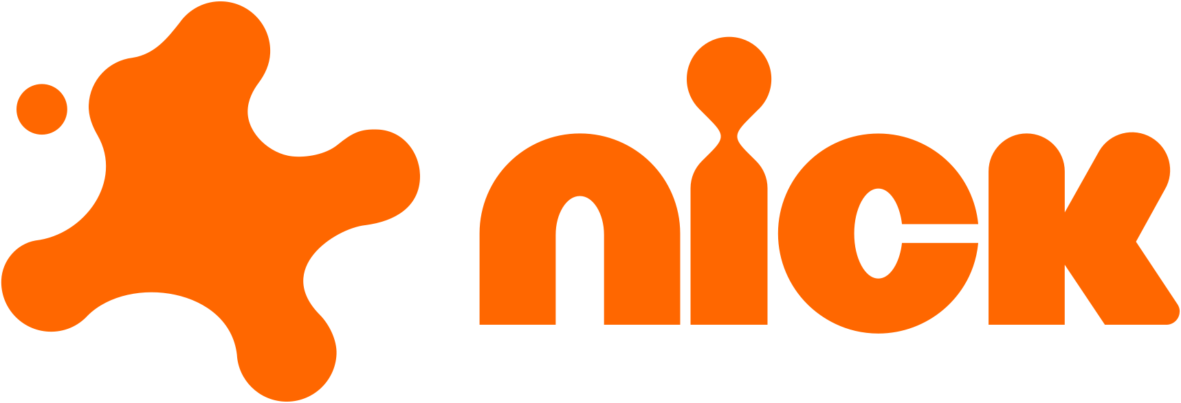
Mar 2023 (US on-air May 2023, global through 2023): first refresh in 14 years: 2009 lowercase wordmark alone replaced by orange splat symbol + redrawn wordmark
Nickelodeon logo before and after
BeforeUntil Mar 2023
Nickelodeon logo, official source. Source: nick.com (archived)
AfterSince Mar 2023
Nickelodeon logo, Wikimedia Commons. Source: commons.wikimedia.org
Key facts
Nickelodeon launched a new logo in Mar 2023, designed by Roger and Nickelodeon in-house.
- Brand
- Nickelodeon
- Launched
- Source: adweek.com
- What changed
- Mar 2023 (US on-air May 2023, global through 2023): first refresh in 14 years: 2009 lowercase wordmark alone replaced by orange splat symbol + redrawn wordmark.
- Sources
- adweek.com, nickalive.net, designweek.co.uk
Cite this Rebrand Log, "Nickelodeon new logo (2023)", https://rebrandlog.com/rebrand/nickelodeon-2023/, last updated .
The Nickelodeon rebrand, explained
In 2009 Nickelodeon dropped the orange Splat and switched to a plain lowercase wordmark. After 14 years of what It's Nice That called a more mature logo, the network brought the Splat back. It was teased at the Kids' Choice Awards in March 2023 and rolled out on air from there.
The Splat was redrawn with rounded edges and now sits alongside a redrawn wordmark. It is no longer confined to the logo: a circular grid generates a secondary family of splat shapes for the wider system. Nickelodeon's signature orange stays, joined by purples and pinks that give the idents more depth. Type pairs ROC Grotesk, picked for its subtle irregularity, with Neue Plak, and 3D animation lets the Splat behave like an object rather than a sticker.
The identity was created by design studio Roger with Nickelodeon's in-house team. Its films were made with collaborators including Yonk and Max Siedentopf; one spot shows a bored kid at a family dinner who notices an orange splat on the ceiling.
Design Week framed it as the network's first rebrand in 14 years, and Creative Bloq simply called it so much fun. Fans on Reddit's nostalgia forum welcomed the mix of 90s memory and modern design; others felt it was more corporate than the anarchic original, and several hoped the logo would come with better programming.
Adweek's Brand Rewind traced the Splat back to 1989, when it became the network's first on-air branding a decade after Nickelodeon launched in 1979. The channel had drifted away from it in favour of a plain wordmark, and its return, in the first refresh in 14 years, was built by six US and international agencies working on a Portal to Fun campaign and a new on-air look. The aim was explicitly nostalgic: to reconnect with parents who grew up with the Splat while speaking to today's children.
Bringing back a retired mark is usually a nostalgia play aimed at parents, and this one partly is. But the system earns it. The grid of secondary splats and the 3D treatment give the old idea far more range than it had before, and the network finally looks like a place for kids again.
In short: The Splat comes home, with a system strong enough to justify the nostalgia.
Sources
- 1. adweek.comhttps://www.adweek.com/convergent-tv/nickelodeon-refreshes-brand/
- 2. nickalive.nethttps://www.nickalive.net/2023/03/the-splat-is-back-nickelodeon-debuts.html