Kroger
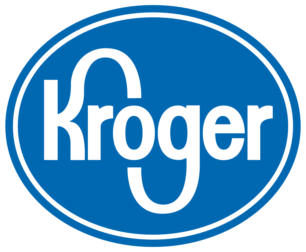
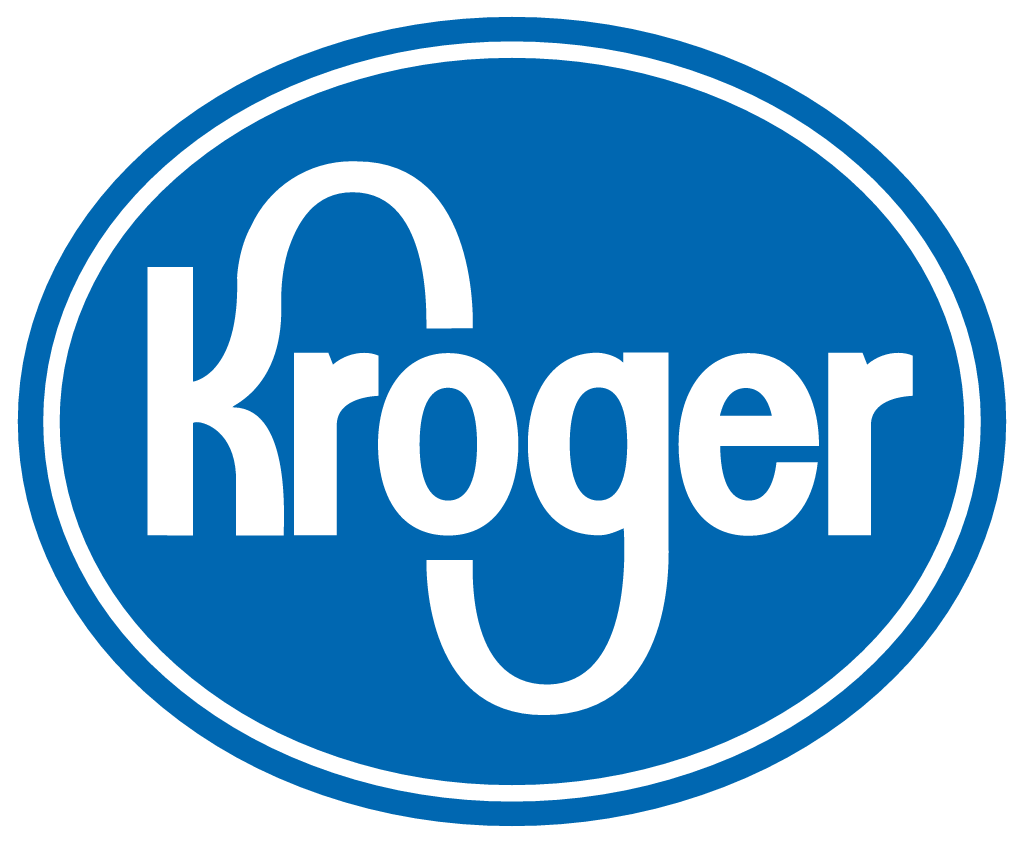
The white Kroger wordmark set inside a blue oval was replaced by a free-standing blue wordmark in a rounder, lighter typeface. The long sweep joining the K to the G was kept. The free-standing wordmark became the primary logo, and the oval lives on as a badge around the new wordmark.
Kroger logo before and after
BeforeUntil Nov 2019
Logo: Kroger. Source: kroger.com (archived)
AfterSince 6 Nov 2019
Kroger logo (2019 wordmark in the blue oval badge, without the Fresh Cart icon added in 2021), official kroger-logo.png from thekrogerco.com. Dark mode shows the same file with its white background keyed out, adapted by Rebrand Log. Source: thekrogerco.com
DownloadLightSVG not availablePNGDark mode version adapted by Rebrand Log
Key facts
Kroger launched a new logo on 6 Nov 2019, designed by DDB New York.
- Brand
- Kroger
- Launched
- What changed
- The white Kroger wordmark set inside a blue oval was replaced by a free-standing blue wordmark in a rounder, lighter typeface. The long sweep joining the K to the G was kept. The free-standing wordmark became the primary logo, and the oval lives on as a badge around the new wordmark.
- Sources
- prnewswire.com, adweek.com, grocerydive.com
Cite this Rebrand Log, "Kroger new logo (2019)", https://rebrandlog.com/rebrand/kroger-2019/, last updated .
The Kroger rebrand, explained
For generations Kroger's logo was a white wordmark inside a blue oval, with a long stroke curling from the top of the K over to the G. On 6 November 2019 the company "debuted today its new logo and brand transformation campaign," alongside a new tagline, Fresh for Everyone.
The release describes the logo as "a contemporary evolution" that "reflects the company's strong, food-rich heritage by retaining the shape and movement of the iconic 'K' and 'G' loved by generations of Kroger customers." The oval is gone, the letters are blue on white, and the typeface is rounder and lighter. Blue stayed as the signature colour because, the company said, it "signals safety and trust to customers."
The work came out of Kroger's new partnership with DDB New York, which it had named its first creative agency of record that July. The launch also brought the Kroji, a cast of animated emoji-style characters, and a mass media campaign. Grocery Dive noted that although the branding included a revamped logo, "the logo is largely absent from the new ads and creative materials." "Kroger chose Fresh for Everyone as our leading brand message because it is inclusive, clear and memorable," said chief operating officer Mike Donnelly.
The identity kept growing. In September 2021 Kroger added the Fresh Cart, a shopping cart drawn with the same swooping line and a citrus slice for a basket, which Supermarket News reported would sit next to the wordmark across its banners. "The cart speaks to the history and heritage of grocery," said marketing vice president Mandy Rassi.
On X, shoppers were not all convinced. "I saw the new #Kroger logo and thought of #ihop," one wrote, while another warned that "if the tentacle in this new Kroger logo gets any longer, it'll qualify as an eldritch horror."
In short: The K-to-G loop stayed; the oval did not.
Quotes
“Kroger's new brand launch is a unifying framework for our seamless shopping experience that is designed to deepen our connection with customers and associates today and into the future, support our business transformation and provide an elevated creative approach”
“Kroger chose Fresh for Everyone as our leading brand message because it is inclusive, clear and memorable”
“The cart speaks to the history and heritage of grocery”
Press
- PR Newswire6 Nov 2019Kroger Debuts New Logo and Launches Brand Transformation Campaign
- Adweek6 Nov 2019Kroger Has a New Look and Message for Shoppers
- Grocery Dive6 Nov 2019Kroger looks to transform with 'Fresh for Everyone' campaign
- Supermarket News9 Sep 2021Kroger rolls out the 'Fresh Cart' as part of logo
- AndNowUKnow9 Sep 2021Kroger Continues New Brand Identity Rollout With Updated The Fresh Cart Logo
Reactions
Sources
- 1. prnewswire.comhttps://www.prnewswire.com/news-releases/kroger-debuts-new-logo-and-launches-brand-transformation-campaign-300952618.html
- 2. adweek.comhttps://www.adweek.com/agencies/kroger-launches-new-brand-positioning-and-first-work-from-new-aor-ddb-new-york/
- 3. grocerydive.comhttps://www.grocerydive.com/news/kroger-looks-to-transform-with-fresh-for-everyone-campaign/566658/
- 4. supermarketnews.comhttps://www.supermarketnews.com/finance/kroger-rolls-out-the-fresh-cart-as-part-of-logo
- 5. andnowuknow.comhttps://www.andnowuknow.com/shop-talk/kroger-continues-new-brand-identity-rollout-updated-fresh-cart-logo-mandy-rassi/jenna-plasterer/75059