Kodak (2016)
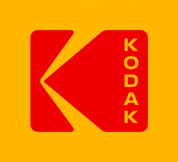
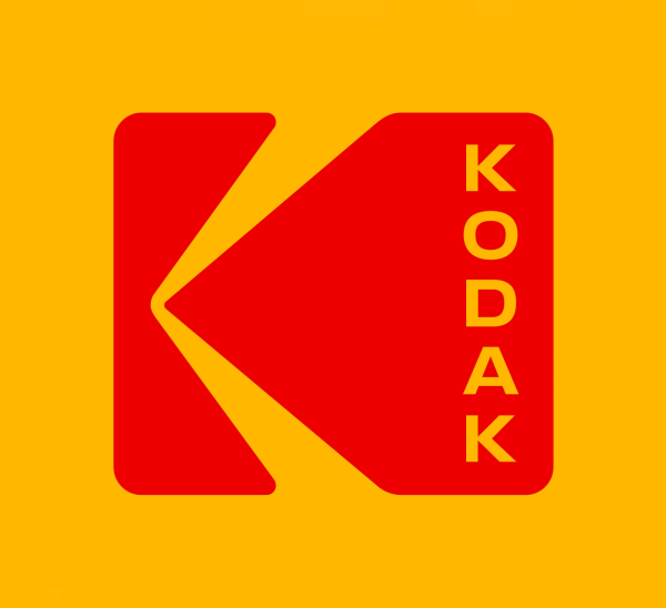
The plain red lowercase Kodak wordmark of 2006 gave way to the return of the 1971 K symbol, kept to its original proportions, with KODAK now stacked vertically in bold capitals inside it.
Kodak logo before and after
BeforeUntil Oct 2016
Logo: Kodak. Source: kodak.com (archived)
DownloadLightSVG not availablePNGDarkSVG not availablePNGDark mode version adapted by Rebrand Log
AfterSince Oct 2016
Kodak logo (2016), official Kodak-logo.png from kodak.com. Dark mode shows the header SVG filled with the brand red, adapted by Rebrand Log. Source: kodak.com
DownloadLightSVG not availablePNGDark mode version adapted by Rebrand Log
Key facts
Kodak launched a new logo in Oct 2016, designed by Work-Order.
- Brand
- Kodak
- Launched
- Source: wired.com
- What changed
- The plain red lowercase Kodak wordmark of 2006 gave way to the return of the 1971 K symbol, kept to its original proportions, with KODAK now stacked vertically in bold capitals inside it.
- Sources
- wired.com, itsnicethat.com, work-order.co
- Logo history
- 2 rebrands
Cite this Rebrand Log, "Kodak new logo (2016)", https://rebrandlog.com/rebrand/kodak-2016/, last updated .
The Kodak rebrand, explained
The Kodak K was drawn by Peter J. Oestreich and adopted in 1971. WIRED described its two arms as beams of light, pouring into a viewfinder or out onto a screen, "a mark with meaning hidden in plain sight." In 2006, in an attempt to modernise, Kodak replaced it with a plain red lowercase wordmark from Ogilvy & Mather. Six years later it filed for bankruptcy.
Under new leadership, Kodak asked the New York studio Work-Order to bring the symbol back. According to WIRED, the company never even sent a brief beyond going back to the K. "We said, ‘fantastic,’ because we would see no other way than to take it back to this symbol," said Work-Order partner Keira Alexandra. "It’s such a valuable asset, it would seem fruitless to begin again."
The original proportions of the K and its rounded rectangle were kept. What changed was the name. Kodak had always been set in lowercase; Work-Order switched to bold capitals and stacked them vertically, which it said is "reminiscent of film perforations and street signage" and lets the logo act "as a manufacturer’s stamp: the logo is the first read and the name is the supporting mark." At small sizes the name is simply dropped.
There was no big launch. Work-Order describes an organic roll-out using available resources, with the K appearing in brand materials over six to eight months "as a hint of things to come" before the full system arrived, built on Kodak's yellow. It's Nice That put Kodak alongside Co-op and NatWest in a wave of brands going back to their vintage identities.
On X the news mostly travelled as a simple fact. ParallaxPhotographic wrote: “Kodak have rebranded and the "K" is back.” That is probably the best review a returning logo can get.
In short: Ten years off, then the K came back.
Quotes
“We said, ‘fantastic,’ because we would see no other way than to take it back to this symbol. It’s such a valuable asset, it would seem fruitless to begin again.”
“The symmetry of the capital letterforms creates a molecular flexibility that allows the wordmark to be stacked”
Press
Reactions
Sources
- 1. wired.comhttps://www.wired.com/2016/10/kodak-revives-iconic-logo-gives-little-twist/
- 2. itsnicethat.comhttps://www.itsnicethat.com/news/kodak-rebrand-work-order-returns-to-1970s-symbol-211016
- 3. work-order.cohttps://work-order.co/project/kodak