Kodak (2006)
New logo.
Kodak logo before and after
BeforeUntil 2006
Kodak logo via Wikimedia Commons (author: Eastman Kodak). Source: commons.wikimedia.org
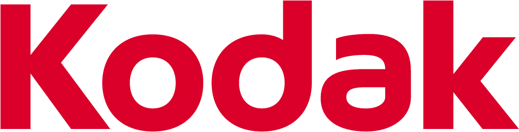
AfterSince 2006
Kodak logo via Wikimedia Commons (author: The original uploader was Svgalbertian at English Wikipedia.). Source: commons.wikimedia.org
Key facts
Kodak launched a new logo in 2006, designed by Ogilvy & Mather.
- Brand
- Kodak
- Launched
- What changed
- New logo.
- Why
- Kodak said the new wordmark was part of a broad brand transformation reflecting the multi industry, digital imaging leader it had become.
- Sources
- corporatebrandmatrix.com, engadget.com
- Logo history
- 2 rebrands
Cite this Rebrand Log, "Kodak new logo (2006)", https://rebrandlog.com/rebrand/kodak-2006/, last updated .
The Kodak rebrand, explained
Few brands owned a colour like Kodak owned yellow. So it was a statement when chief executive Antonio Perez, speaking at the Consumer Electronics Show in Las Vegas in January 2006, unveiled a logo that let the Kodak name out of its box. Engadget noted that the box had framed the corporate identity for roughly 70 years and the outgoing logo was itself about 50 years old.
Kodak's own news release, quoted by the Corporate Brand Matrix identity archive, described the change plainly. The new look moved the Kodak name out of the traditional yellow box for a more contemporary design, with a streamlined rounded form and distinctive letters. It was presented as the latest step in a broad brand transformation reflecting the multi industry, digital imaging leader Kodak had become.
The archive's account by identity critic Tony Spaeth adds texture. Brian Collins of Ogilvy's Brand Integration Group confirmed that his team had worked with Kodak for years and had been commissioned the previous year to develop a consumer brand identity strategy and visual system; the new mark was their work. An internal memo from chief marketing officer Carl Gustin admitted that guidelines, policies and practices were still being updated and that the wordmark was revealed before the rulebook was finished because it was ready and it was time to go. The mark was first shown between two yellow bars, which the designers did not consider part of the logo; future systems would keep yellow next to, but not behind, the red wordmark.
Engadget read the move as a pitch to younger consumers, quoting Kodak's line about breaking out of the box in a lot of ways.
The logic was sound. A company betting its future on digital imaging needed to look less like a film packet, and a freestanding wordmark travels far better onto cameras, phones and screens than a coloured badge. The drawing itself, soft and slightly bubbly, felt more like a consumer gadget brand than a heritage giant, which was exactly the point. The problem was never the logo. Shipping a mark before its system, as Gustin's memo concedes, is a small sign of a company in a hurry, and the hurry was justified.
In short: Out of the box, into the digital fight.
Sources
- 1. wikidata.orghttps://www.wikidata.org/wiki/Q486269
- 2. commons.wikimedia.orghttps://commons.wikimedia.org/wiki/File:Logo_of_the_Eastman_Kodak_Company_%282006%E2%80%932016%29.svg