Meetup
New logo and identity.
Meetup logo before and after
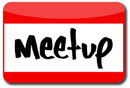
BeforeUntil Oct 2016
Meetup logo via Wikimedia Commons (author: unknown). Source: commons.wikimedia.org

AfterSince Oct 2016
Meetup logo via Wikimedia Commons (author: Jennifer Gergen, on behalf of Meetup, Inc.). Source: commons.wikimedia.org


Key facts
Meetup launched a new logo in Oct 2016, designed by Sagmeister & Walsh.
- Brand
- Meetup
- Launched
- Source: underconsideration.com
- What changed
- New logo and identity.
- Sources
- fastcompany.com, logolounge.com
Cite this Rebrand Log, "Meetup new logo (2016)", https://rebrandlog.com/rebrand/meetup-2016/, last updated .
The Meetup rebrand, explained
Key people: Jen Gergen (Design director, brand identity, Meetup) · Stefan Sagmeister (Co-founder, Sagmeister & Walsh) · Jessica Walsh (Co-founder, Sagmeister & Walsh)
Meetup had 27 million members and 250,000 groups but, as Fast Company put it, was the popular social network nobody talked about. Its logo for 14 years was a handwritten name on a 'Hello, my name is' sticker. It had equity, but it was crammed off-centre into iOS icons, illegible on watches and, Stefan Sagmeister noted, not widely understood outside the US.
Jen Gergen, Meetup's design director for brand identity, named the real clincher: the logo represented the worst part of meeting new people, the awkward moment with a sticker on your lapel. It stood for social anxiety, not friendship.
Sagmeister & Walsh, working with Meetup's in-house team, was originally hired for a logo but argued the bigger job was a system that helped people find their community on a small screen. Sagmeister and Jessica Walsh directed; Felipe Rocha and Walsh were lead designers. The pair attended a range of meetups for research. The red and the handwritten feel stayed, but the tag went: the new wordmark is a thick, quirky script, and in motion its dots swarm together into the M, the idea of people gathering. The slanted M stands alone on round icons. Bright colours, a small set of symbolic photographs and easily generated duotone images let thousands of categories, and individual organisers, build their own look within the system. Typographic directions were tried and rejected as too cold.
It launched on 28 September 2016 with a redesigned app built in tandem.
Killing the name tag took nerve, and Gergen's reasoning is the best rebrand rationale of the year. The swarm is a lovely idea in motion. Static, though, the blobby script reads more like a toy brand than a place to meet adults, and it gave up a symbol everybody understood for one that needs animation to make sense.
In short: The name tag goes, the anxiety with it.
Press
Sources
- 1. underconsideration.com · paywalledhttps://www.underconsideration.com/brandnew/archives/new_logo_and_identity_for_meetup_by_sagmeister_walsh.php
- 2. medium.comhttps://medium.com/meetup/meetup-rebrand-22087674d546
- 3. andwalsh.comhttps://andwalsh.com/work/all/meetup/