Kia
Jan 6 2021: red oval Kia badge replaced by free-floating handwritten-style rhythmic Kia wordmark
Kia logo before and after
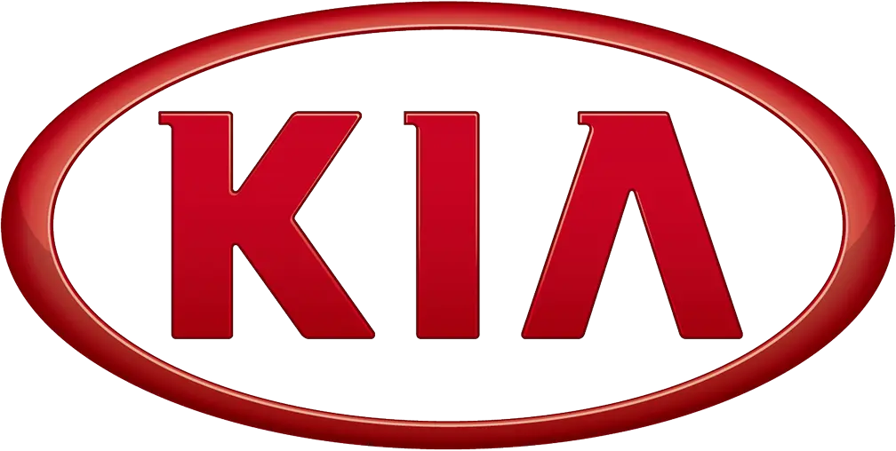
BeforeUntil Jan 2021
Kia logo from official source (Kia Heritage Archive (official), red oval logo in use until Jan 2021, cropped from the official logo-history image). Source: worldwide.kia.com
AfterSince Jan 2021
Kia logo via Wikimedia Commons (author: Kia Corporation). Source: commons.wikimedia.org


Key facts
Kia launched a new logo in Jan 2021, designed by Kia in-house and Blackspace.
- Brand
- Kia
- Launched
- Source: kiamedia.com
- What changed
- Jan 6 2021: red oval Kia badge replaced by free-floating handwritten-style rhythmic Kia wordmark.
- Why
- Kia's new logo was part of a business reorganisation under its Plan S strategy, which focused on electric vehicles and mobility services.
- Sources
- kiamedia.com, en.yna.co.kr, formtrends.com
Cite this Rebrand Log, "Kia new logo (2021)", https://rebrandlog.com/rebrand/kia-2021/, last updated .
The Kia rebrand, explained
Key people: Ho Sung Song (President and CEO, Kia) · Karim Habib (Head of Kia Global Design)
Kia unveiled its new logo on 6 January 2021, as part of a broader business reorganisation following its Plan S strategy, which focused on electric vehicles and mobility services. The company also dropped Motors from its name and introduced the slogan Movement that inspires. The reveal was staged with 303 drones launching fireworks in sync, which set a Guinness World Record.
Visually, the change is total. The familiar KIA in a red oval disappears, replaced by a free-floating wordmark drawn as one rhythmic, unbroken line. Kia says the shape is meant to resemble a handwritten signature, with symmetry for confidence and rising strokes for ambition. The letters are angular and connected, and there is no enclosing shape at all.
Kia's president and chief executive Ho Sung Song said the logo represented the company's commitment to becoming an icon for change and innovation, and its desire to inspire customers as their mobility needs evolve. Karim Habib, head of Kia Global Design, said the inspiration came from Seoul, a city where new and old coexist and where incredible energy and speed sit beside pockets of calm. The reveal took place in the sky over Incheon. Paul Tan noted that the new logo had already appeared on the 2019 Imagine concept car, and that it ditched the oval that had framed the Kia badge since 1994, with letters built only from vertical and diagonal lines.
Credits here go to Kia's in-house design team under design chief Luc Donckerwolke, with Blackspace.
The aftermath proved the legibility worry right. Many people read the tightly drawn letters as KN, and by late 2022 searches for KN car were running at around 30,000 a month, a figure MotorTrend reported Kia itself acknowledged alongside about 1.8 million searches for Kia. A Kia spokesperson told the magazine the logo was modern, easy to read and very premium, and that KN mentions had since returned to pre-criticism levels. The company also dropped Motors from its regional names, so Kia Motors America became Kia America. Creative Bloq argued that removing the crossbar from the A was the decision that made the letters so hard to read.
It is a far more distinctive mark than the generic oval it replaced, and it looks right on the nose of a modern car. The cost is legibility: the stylised letterforms trade instant reading for gesture, and a brand still building recognition in some markets is asking a lot of people to decode it. As a badge, it works. As a name, it takes a second look.
In short: A bold, badge-ready signature that sometimes asks to be read twice.
Sources
- 1. kiamedia.comhttps://www.kiamedia.com/us/en/media/pressreleases/16869/kia-unveils-new-logo-and-global-brand-slogan-to-ignite-its-bold-transformation-for-the-future
- 2. en.yna.co.krhttps://en.yna.co.kr/view/AEN20210106006900320