GSK
Jun 9 2022: white lowercase gsk in orange egg shape replaced by orange uppercase GSK 'signal' wordmark (Wolff Olins)
GSK logo before and after
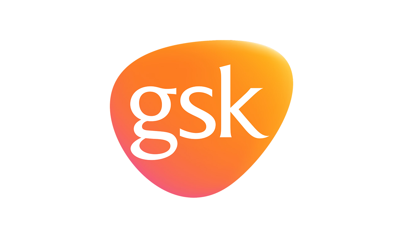
BeforeUntil Jun 2022
Logo: GSK. Source: gsk.com (archived)
DownloadLightSVG not availablePNGDisplay versions adapted by Rebrand Log
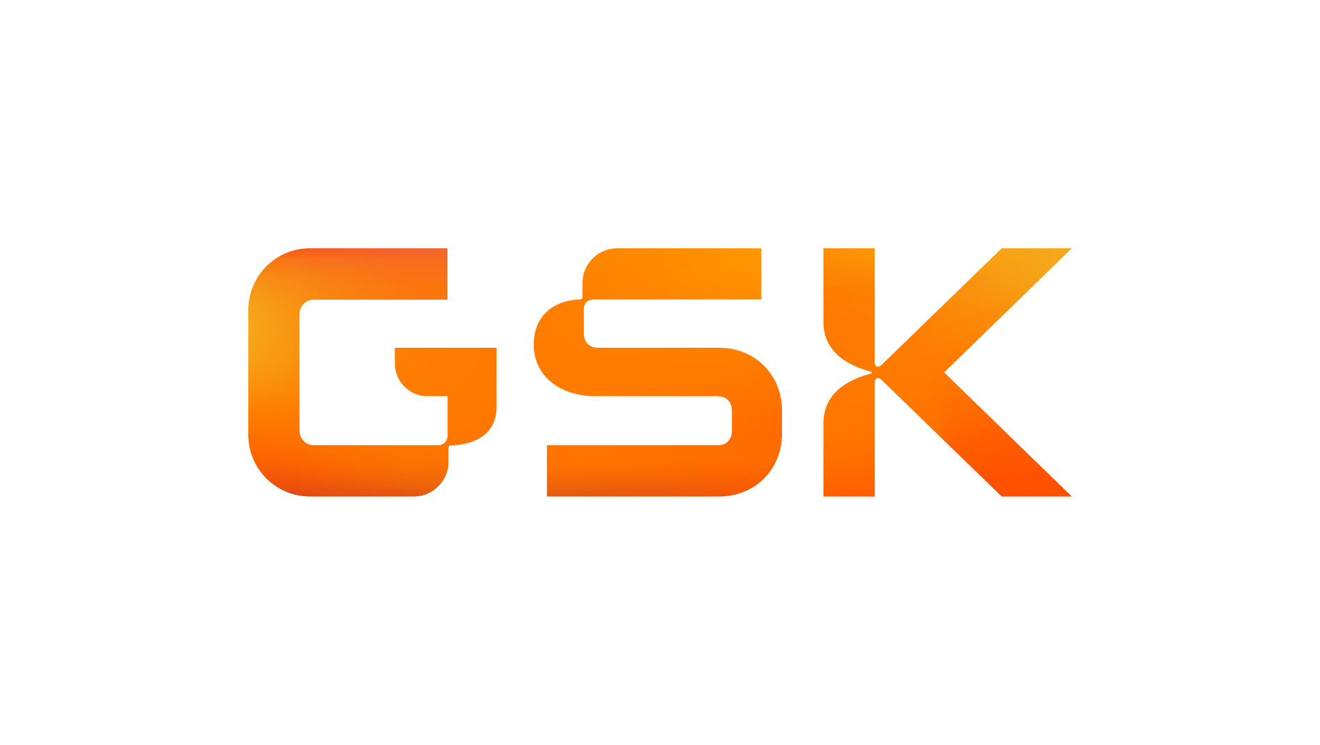
AfterSince Jun 2022
Logo: GSK. Source: gsk.com (archived)
Key facts
GSK launched a new logo in Jun 2022, designed by Wolff Olins.
- Brand
- GSK
- Launched
- Source: designweek.co.uk
- What changed
- Jun 9 2022: white lowercase gsk in orange egg shape replaced by orange uppercase GSK 'signal' wordmark (Wolff Olins).
- Why
- GSK refreshed its brand as it separated its consumer business to become a company purely focused on biopharma innovation.
Cite this Rebrand Log, "GSK new logo (2022)", https://rebrandlog.com/rebrand/gsk-2022/, last updated .
The GSK rebrand, explained
Key people: Emma Barratt (Global ECD, Wolff Olins) · Emma Walmsley (CEO, GSK)
GlaxoSmithKline was formed when Glaxo Wellcome and SmithKline Beecham merged at the start of the millennium. In 2022 it split off its consumer business, Sensodyne and Panadol included, as Haleon, and in May changed its name to plain GSK. CEO Emma Walmsley called it the most significant corporate change in 20 years: the remaining company would be purely focused on biopharma innovation, with a new purpose, to unite science, technology and talent to get ahead of disease together. The new identity launched on 9 June 2022.
London consultancy Wolff Olins designed it. Global executive creative director Emma Barratt said the idea was extraordinary adaptability, in the immune system, technology and GSK's people, balancing a feeling of constant innovation with a need for warmth. Curved forms evoking the adaptable immune system run across staff apparel, print and screens, and the system was built to flex and move across digital, social and physical environments.
The logo keeps the orange, in a darker hue, but inverts it: where the old mark set white lowercase letters inside an orange egg shape, the new one is orange uppercase GSK with no background, housed in a shape called the signal that is designed to always point ahead. Fierce Pharma judged it stronger-looking than the softer predecessor. Accessibility was a major focus, with assets tested for legibility, and a Manchester type foundry created a bespoke typeface; a suite of motion graphics completed it.
Design Week readers were unusually warm, calling it sophisticated, meaningful, distinctive and memorable. Walmsley later named the launch week among her highlights of the year. Fierce Pharma placed it alongside Sanofi's tech-flavoured simplification months earlier.
Design Week placed the rebrand between the demerger of the consumer business into Haleon and the switch from GlaxoSmithKline to GSK. The orange survives but is inverted and housed in a new shape called the signal, the name moves to uppercase, and curved forms meant to evoke the adaptable immune system run across apparel and print. A bespoke typeface and a motion suite were tested for legibility as part of an accessibility focus. Reader comments called it sophisticated and meaningful. The signal shape risks being just another rounded tab, but the inversion gives it real presence.
This is the best of the 2022 pharma wave. The immune-system idea gives the curves a reason to exist, and keeping orange preserves real equity. The uppercase wordmark is sturdier than the egg, if more generic.
In short: Pharma simplification with an actual idea behind the curves.
Sources
- 1. designweek.co.ukhttps://www.designweek.co.uk/issues/7-13-june-2022/gsk-rebrand/
- 2. fiercepharma.comhttps://www.fiercepharma.com/marketing/gsk-unveils-new-branding-and-logo-showcase-transformed-business
- 3. lbbonline.comhttps://lbbonline.com/news/wolff-olins-redesigns-global-brand-identity-for-gsk