X, the moonshot factory
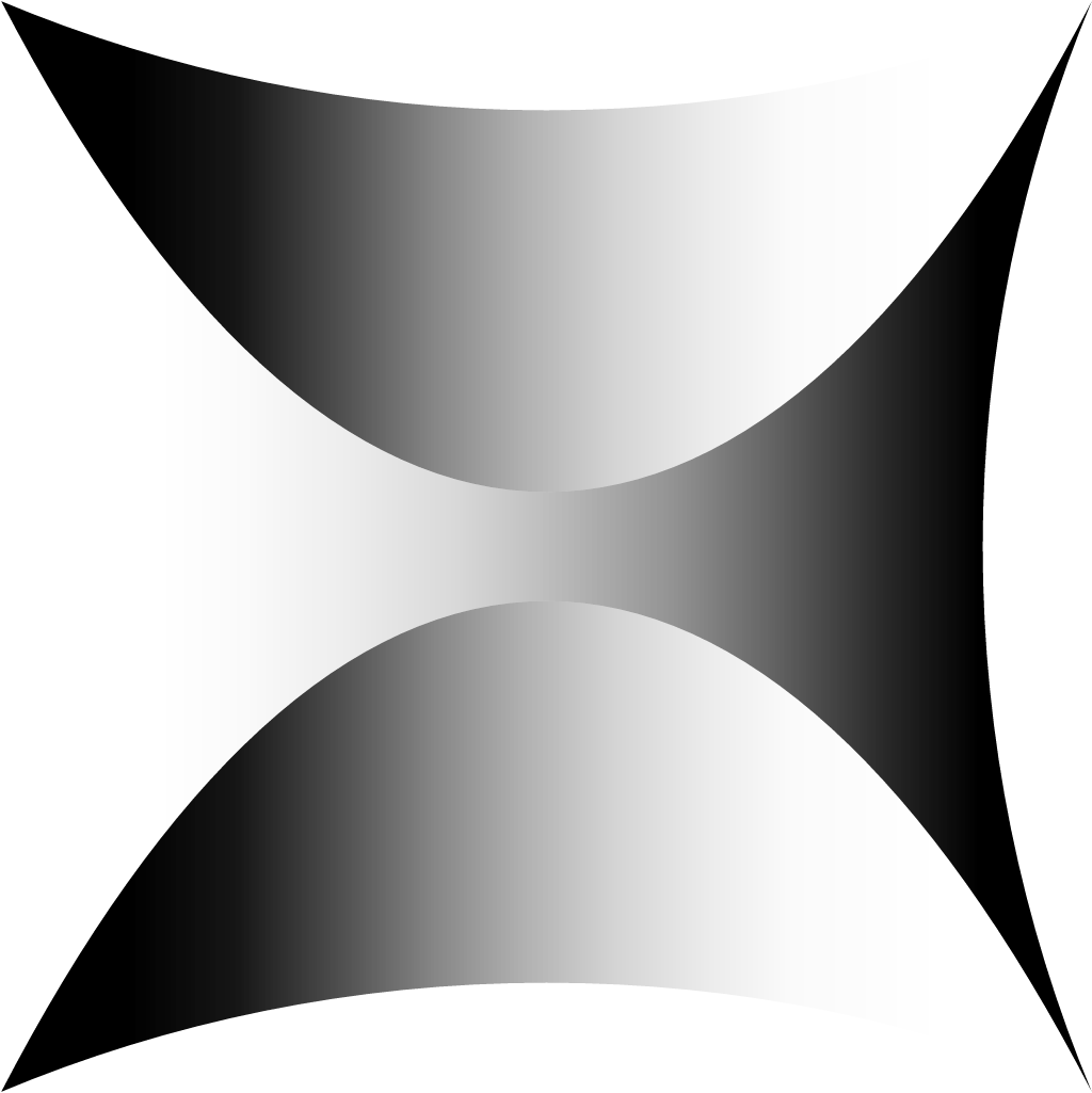
New standalone geometric "X" lettermark built from sharp lines and negative space, animated across the homepage and a "Journey of a Moonshot" film
X, the moonshot factory logo before and after
BeforeUntil May 2025
X, the moonshot factory logo via Wikimedia Commons (uploader/author: Alvandria). Source: commons.wikimedia.org
DownloadLightSVG not availablePNGDark mode version adapted by Rebrand Log
AfterSince May 2025
X, the moonshot factory logo via Wikimedia Commons (uploader/author: X Development LLC). Source: commons.wikimedia.org

Key facts
X, the moonshot factory launched a new logo in May 2025, designed by X in-house and Never Sit Still.
- Brand
- X, the moonshot factory
- Launched
- What changed
- New standalone geometric "X" lettermark built from sharp lines and negative space, animated across the homepage and a "Journey of a Moonshot" film.
- Sources
- designcompass.org, behance.net
Cite this Rebrand Log, "X, the moonshot factory new logo (2025)", https://rebrandlog.com/rebrand/google-x/, last updated .
Identity · 4 images
© X, the moonshot factory, via designcompass.org
Rationale
Captures the organisation's spirit of challenge and journey, distinct from the core Google brand.
Reception
r/logodesign was split: some called it neat and fitting for a moonshot lab, others impractical at small sizes. · reddit.com
Press
Sources
- 1. designcompass.orghttps://designcompass.org/en/2025/07/18/googlex-moonshot-project/
- 2. behance.nethttps://www.behance.net/gallery/228297995/X-Motion-Branding