Google Drive
The green, yellow and blue Drive triangle, whose three colours stood for Docs, Sheets and Slides, was redrawn with rounded corners in Google's four colours, adding red and darker shades where the bands meet.
Google Drive logo before and afterRefinement
BeforeUntil Oct 2020
Google Drive product logo (before 2020) from Google's official product logo set, gstatic.com/images/branding/productlogos (drive/v13), the set Google's own workspace.google.com product pages load. Source: gstatic.com
AfterSince 6 Oct 2020
Google Drive product logo (2020) from Google's official product logo set, gstatic.com/images/branding/productlogos (drive_2020q4/v10), the set Google's own workspace.google.com product pages load. Source: gstatic.com
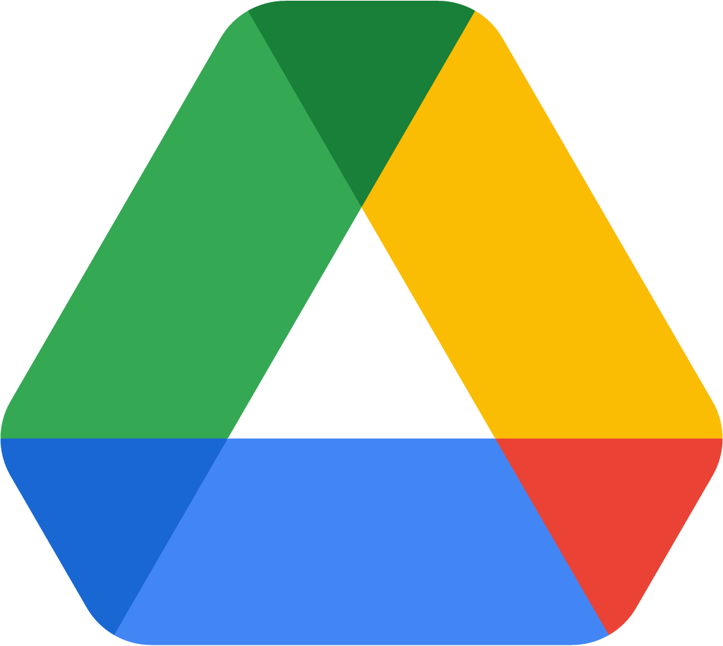
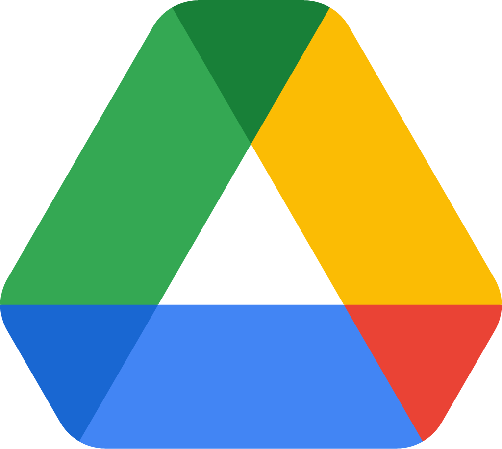
Refinement: the mark keeps its form. The refresh also covers colour.
Key facts
Google Drive launched a new logo on 6 Oct 2020.
- Brand
- Google Drive
- Launched
- Studio
- Not recordedAdd it
- What changed
- The green, yellow and blue Drive triangle, whose three colours stood for Docs, Sheets and Slides, was redrawn with rounded corners in Google's four colours, adding red and darker shades where the bands meet.
Cite this Rebrand Log, "Google Drive new logo (2020)", https://rebrandlog.com/rebrand/google-drive-2020/, last updated .
The Google Drive rebrand, explained
Google renamed G Suite as Google Workspace on 6 October 2020 and said Gmail, Drive, Calendar, Meet and the Docs editors would get "new four-color icons" from "the same family" over the following weeks. The aim, wrote Javier Soltero, VP and GM of Google Workspace, was a brand that "reflects this more connected, helpful, and flexible experience, and our icons will reflect the same."
For Drive, that meant losing a small piece of logic. Ars Technica pointed out that the old triangle "used to be cleverly colored to represent the three main Google Docs file types: Google Docs (blue), Google Sheets (green), and Google Slides (yellow)." The new version keeps the triangle but softens the corners and adds red and darker overlaps, in what Ars called a "drab four-color icon."
The bigger complaint about the whole set was that it "strips icons of any unique color identity, which makes them harder to tell apart," Ars wrote, predicting that in an app drawer every Google app would be "the same four colors and will be hard to tell apart." Drive, at least, kept a shape nobody could mistake.
On X, reactions to the Drive icon were split in the bluntest possible way, from "New google drive logo is nice" to "New google drive logo is trash" within a day of each other.
In short: The triangle stayed, the colour code went.
Quote
“In the coming weeks, you will see new four-color icons for Gmail, Drive, Calendar, Meet, and our collaborative content creation tools like Docs, Sheets, Slides that are part of the same family.”
Press
- Google Workspace Blog6 Oct 2020Announcing Google Workspace, everything you need to get it done, in one location
- Google Cloud Press Corner6 Oct 2020Introducing Google Workspace: Everything You Need to Get Anything Done, Now In One Place
- Ars Technica6 Oct 2020Behold the new icons for Gmail, Drive, Calendar, and Meet
- The Verge6 Oct 2020Gmail has a new logo that’s a lot more Google
Reactions
Sources
- 1. workspace.google.comhttps://workspace.google.com/blog/product-announcements/introducing-google-workspace
- 2. googlecloudpresscorner.comhttps://www.googlecloudpresscorner.com/2020-10-06-Introducing-Google-Workspace-Everything-You-Need-to-Get-Anything-Done,-Now-In-One-Place
- 3. arstechnica.comhttps://arstechnica.com/gadgets/2020/10/google-rebrands-g-suite-as-google-workplace-ships-new-multi-colored-icons/
- 4. theverge.comhttps://www.theverge.com/2020/10/6/21503835/gmail-new-logo-design-google-workspace-features