Glide
New symbol of two opposing curved shapes, refined black wordmark, new palette, typography, iconography and website
Glide logo before and after
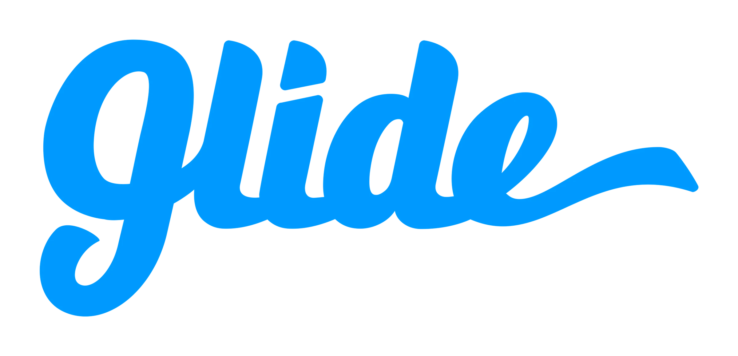
BeforeUntil Sep 2021
Glide logo via Wikimedia Commons (uploader/author: Glide Talk Ltd.). Source: commons.wikimedia.org
DownloadLightSVG not availablePNGDarkSVG not availablePNGDark mode version adapted by Rebrand Log
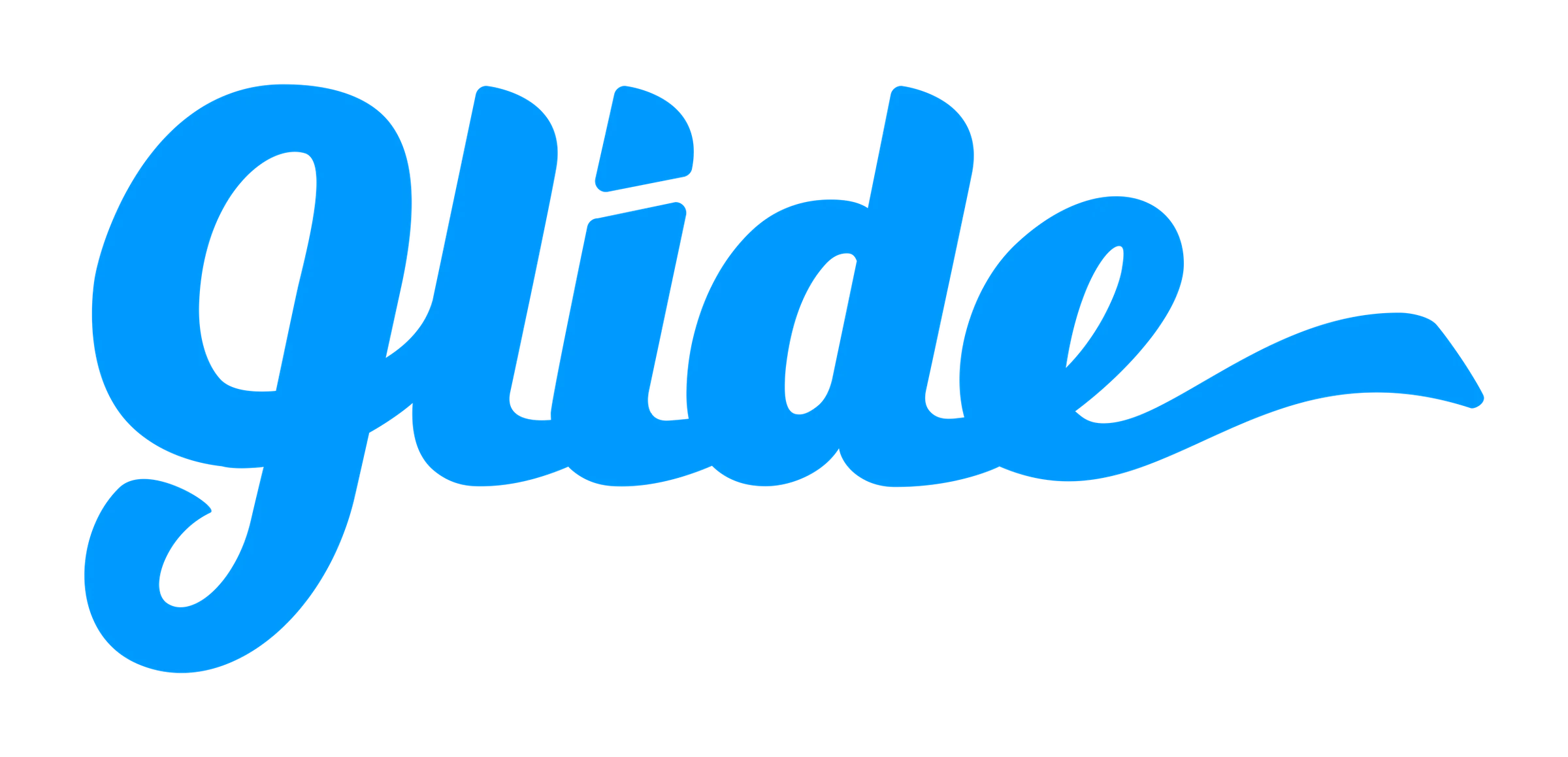


AfterSince 16 Sep 2021
© Glide, via the company's website (archived). Source: glideapps.com (archived)
DownloadLightSVG not availablePNGDarkSVG not availablePNGDark mode version adapted by Rebrand Log


Key facts
Glide launched a new logo on 16 Sep 2021, designed by Glide in-house.
- Brand
- Glide
- Launched
- Studio
- In-house at Glide
- What changed
- New symbol of two opposing curved shapes, refined black wordmark, new palette, typography, iconography and website.
- Sources
- glideapps.com
Cite this Rebrand Log, "Glide new logo (2021)", https://rebrandlog.com/rebrand/glide/, last updated .
Identity · 9 images
Glide / Glide in-house, image from glideapps.com · © Glide, via glideapps.com
Rationale
Portray Glide as visionary, uplifting and intelligent and become the most recognisable no-code brand.
Quote
“The symmetry of the two shapes feels coordinated and mathematical, while the tension of opposing curves suggests electricity or magnetism.”
Press
Reactions
- David Siegel@dvdsgl on XSo excited to roll out a fresh look for @glideapps 😍 We fumbled our rebrand for two years, and finally took a giant step in the right direction.20 Sep 2021 · 73 likes
- Tom Parkes@tompparkes on XIncredibly excited to Launch our new Glide website! Many months of hard work and learning has gone into this. Check our the fresh new rebrand to boot. More to come 👏 @_Tristan 👏 @KingNamedJohnny @glideapps17 Sep 2021 · 17 likes
- Spencer Barfuss ˗ˏˋ 🚀@RocketEdTech on X@dvdsgl @jackmsvaughan @glideapps Loving the new logo, too.18 Sep 2021 · 2 likes
Sources
- 1. glideapps.comhttps://www.glideapps.com/blog/fresh-look