GitLab
Tanuki iterated and set at the centre of the DevOps infinity loop; refreshed look
GitLab logo before and after
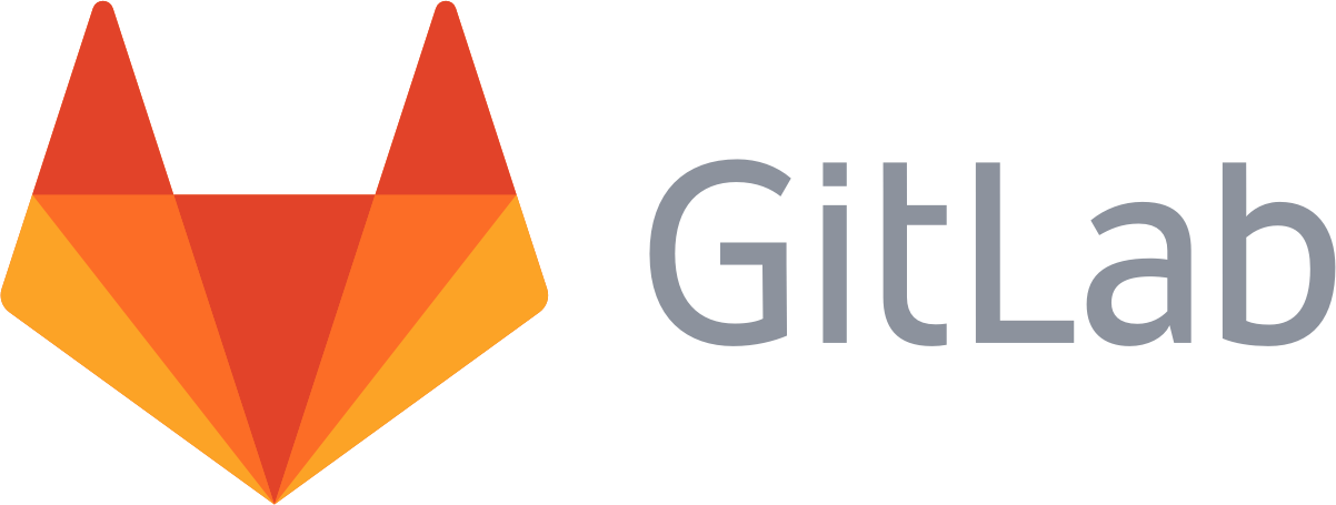
BeforeUntil Apr 2022
GitLab wordmark lockup from the official gitlab-artwork repository (pre-2022 commit 9b07772f). Source: gitlab.com
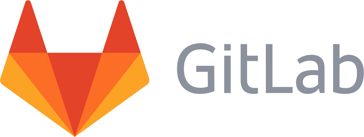
AfterSince 27 Apr 2022
© GitLab, via the company's website. Source: about.gitlab.com




Key facts
GitLab launched a new logo on 27 Apr 2022, designed by GitLab in-house.
- Brand
- GitLab
- Launched
- Studio
- In-house at GitLab
- What changed
- Tanuki iterated and set at the centre of the DevOps infinity loop; refreshed look.
- Why
- GitLab built the DevOps infinity loop into its logo because DevOps was central to the company and its pitch as The One DevOps Platform.
Cite this Rebrand Log, "GitLab new logo (2022)", https://rebrandlog.com/rebrand/gitlab/, last updated .
The GitLab rebrand, explained
GitLab's logo has always been a tanuki, a creature the company says symbolises trustworthiness, agility and preparedness. In April 2022 the company iterated on it, in keeping with its own value of iteration, and launched a refreshed look.
The change is conceptual as much as visual. GitLab said DevOps was so central to the company that it built the DevOps infinity loop into the logo, and the tanuki now sits at its centre. The company described the mark as standing for adaptability, iteration, development and momentum, like the loop itself. Its design guidelines allow flexible colour, for example an orange tanuki for browser favicons or a purple one on merchandise.
GitLab tied it to its pitch as The One DevOps Platform, one interface, data store and permissions model, and to its value of iteration: the announcement said the company chose to iterate rather than make a step change.
The work was done by GitLab's own team.
Hacker News was split. Some praised the smoother, simpler tanuki; others said it still read as a fox, looked aggressive, or was less clever than the old angular mark, which one commenter called the cleverest rendering of a fox in very few lines.
The launch post made the business argument plainly. Since GitLab was incorporated in 2014, it said, many companies had ended up with Do It Yourself DevOps, point solutions digitally duct taped together that grow harder to integrate and maintain, and GitLab pitched itself as The One DevOps Platform that brings them into one place, citing customers such as Siemens, T-Mobile and UBS. Putting the infinity loop inside the logo is the visual version of that pitch. It is literal, but for a company selling consolidation, a mark that says one loop, one platform is exactly on message.
There is something charming about a developer tools company keeping an animal as its logo, and the refreshed tanuki is clean and confident. Folding the infinity loop in is the weaker idea. It puts a piece of marketing positioning, One DevOps Platform, directly into the symbol, which tends to date a mark as quickly as the slogan it serves. The tanuki was distinctive enough without it.
In short: A cleaner tanuki, saddled with a strategy diagram.
Identity · 3 images
GitLab / GitLab in-house, image from about.gitlab.com · © GitLab, via about.gitlab.com
Rationale
Puts GitLab's One DevOps Platform positioning, and its value of iteration, into the logo.
Quote
“In fact, DevOps is so central to GitLab that we have incorporated the DevOps infinity loop into our logo.”
Press
Reactions
- Roland 🐺@skofgar on X@gitlab Most important question: does the new logo still animate when clicking around on GitLab😊?27 Apr 2022 · 2 likes
- AlternativeTo@AlternativeTo on XGitLab has just announced a new logo and look.29 Apr 2022 · 4 likes
- Emilio Martin Lundgaard Lopez@emilioidk on XUpdated my Albert Launcher GitLab plugin with the new logo... I LOVE IT! Thanks, @gitlab28 Apr 2022 · 1 like
- J. Latrice@ItsMissMie on X😍 @gitlab the new logo!27 Apr 2022 · 6 likes
- Chuck Norris@chuckchucknock on XGitLab is getting kinda aggressive with marketing their new logo #100DaysOfCode1 May 2022 · 4 likes
Sources
- 1. about.gitlab.comhttps://about.gitlab.com/blog/devops-is-at-the-center-of-gitlab/
- 2. design.gitlab.comhttps://design.gitlab.com/brand-logo/logomark/