Detroit Pistons
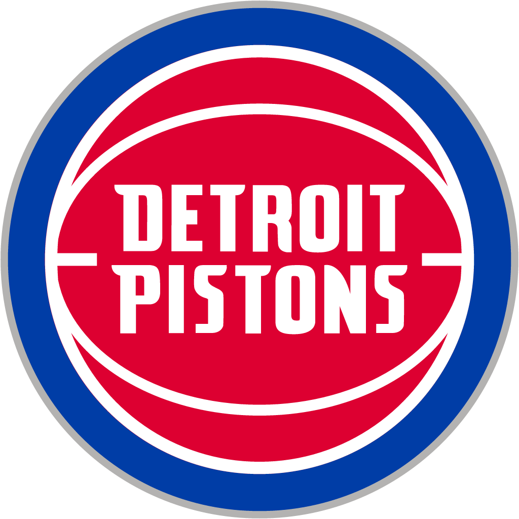
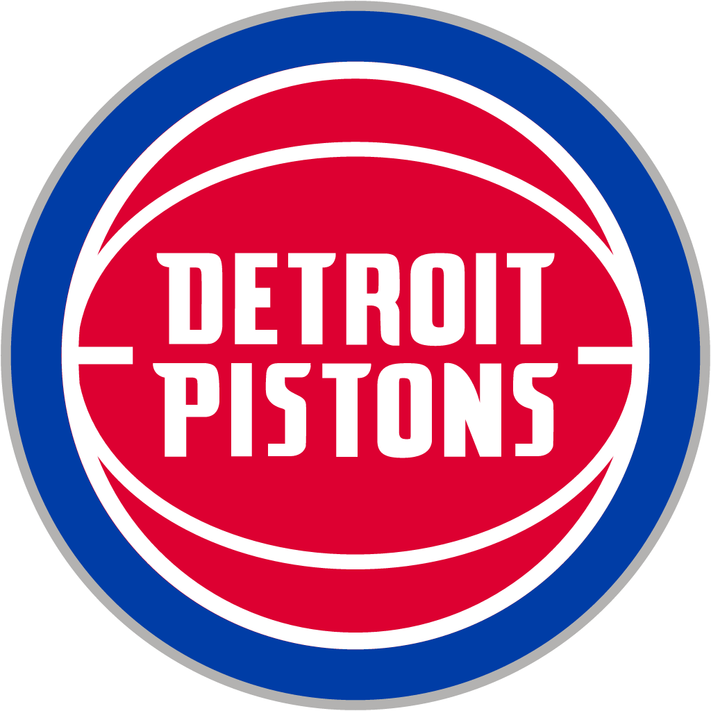
16 May 2017: 2005 ball logo with arched "DETROIT PISTONS" in a blue ring replaced by an updated version of the 1979-96 "Bad Boys" red ball with blue wordmark.
Detroit Pistons logo before and after
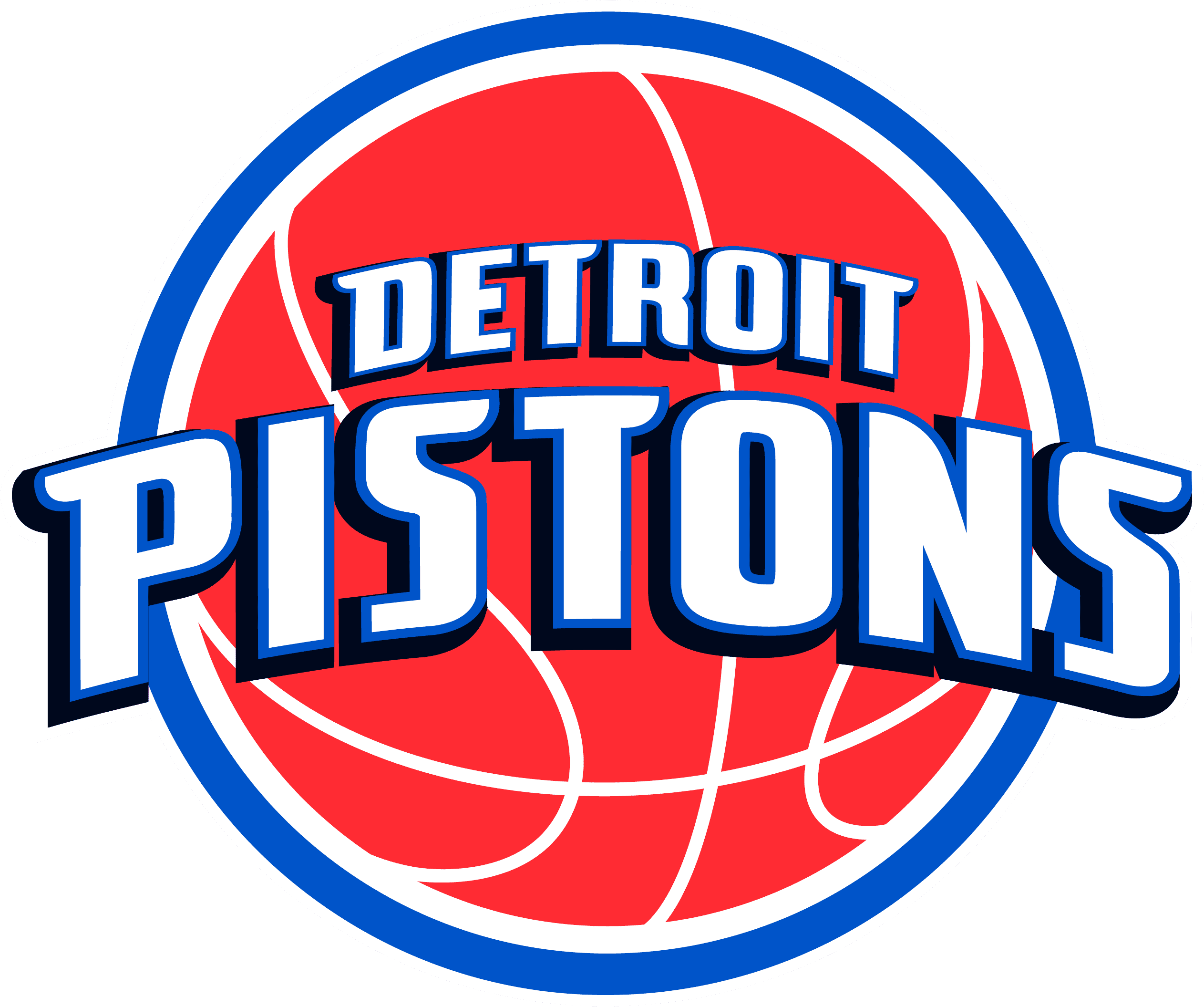
BeforeUntil May 2017
Detroit Pistons logo via Wikimedia Commons (author: Detroit Pistons). Source: commons.wikimedia.org
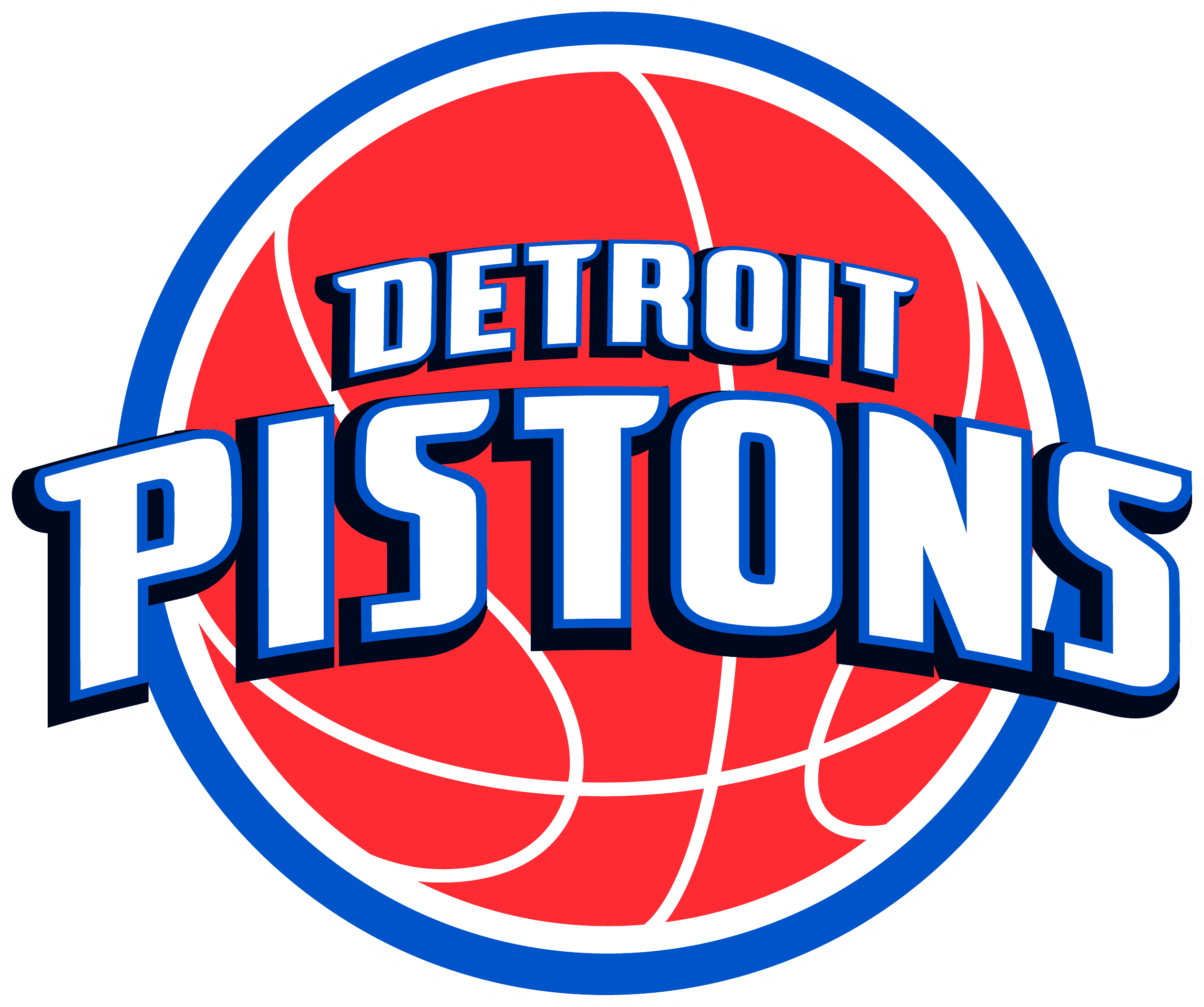
AfterSince May 2017
Detroit Pistons logo via Wikimedia Commons (author: Unknown authorUnknown author). Source: commons.wikimedia.org
Key facts
Detroit Pistons launched a new logo in May 2017, designed by Detroit Pistons in-house.
- Brand
- Detroit Pistons
- Launched
- Source: nba.com
- What changed
- 16 May 2017: 2005 ball logo with arched "DETROIT PISTONS" in a blue ring replaced by an updated version of the 1979-96 "Bad Boys" red ball with blue wordmark.
- Why
- The Detroit Pistons said their new logo celebrated the club's long history in Detroit sport while giving it a modern design for the future.
- Sources
- transformmagazine.net, metrotimes.com
Cite this Rebrand Log, "Detroit Pistons new logo (2017)", https://rebrandlog.com/rebrand/detroit-pistons-2017/, last updated .
The Detroit Pistons rebrand, explained
Key people: Charlie Metzger (EVP, chief marketing and communications officer, Detroit Pistons)
The Pistons' red, white and blue ball defined the Bad Boys teams of the late 1980s. In 1996 the club dumped it for a flaming stallion with a fiery exhaust under the name, chasing the flashier NBA of the Jordan era. After lean playoff years and fan pressure it retreated in 2005 to a ball with the name arched in a blue ring, which Metro Times dismissed as a word-art monstrosity.
With the team moving downtown to Little Caesars Arena, the Pistons spent six months redesigning the primary logo in-house with Nike and the NBA. Charlie Metzger, executive vice-president and chief marketing and communications officer, called it a new chapter and said the mark celebrated the club's long history in Detroit sport while giving it a modern design for the future.
The result, unveiled on 16 May 2017, is essentially the 1979-96 logo again. Transform described the current wordmark's typeface set on the traditional backdrop of the old identity. The club's release listed the changes: sleek, accurate groove lines, a bold team uniform font and a chrome outline. It rolled out across kits, the arena and merchandise for the 2017-18 season.
Metro Times could barely spot the difference and called the release a fancy way to dress up a chrome rim and a new font, while conceding it beat what came before.
Detroit's Metro Times was unimpressed: after a six month collaboration with the league and its uniform partner, the team released a logo it could barely distinguish from the one worn in the Bad Boys era of the 1980s and 1990s. The release insisted it was a modern version, with sleeker groove lines, a bold team font and a chrome outline, and the chief marketing officer said it honoured the club's history while reflecting its future. Nostalgia is a legitimate strategy for a team moving downtown to a new arena; it just makes the six months hard to see.
That is the fair verdict. Six months for a near-identical logo sounds absurd, but the job was really to admit a mistake and return to the mark fans never stopped buying. The chrome outline is the one unforced error: a 2017 gloss detail on a logo whose strength is its plain 1980s confidence.
In short: The Bad Boys ball returns, with unnecessary chrome.
Sources
- 1. nba.comhttps://www.nba.com/pistons/news/detroit-pistons-unveil-newly-updated-primary-logo
- 2. espn.comhttps://www.espn.com/nba/story/_/page/170516QTP_PistonsLogo/detroit-pistons-announce-new-team-logo-bad-boy-look-it
- 3. freep.comhttps://www.freep.com/story/sports/nba/pistons/2017/05/16/detroit-pistons-logo/324953001/