Bershka
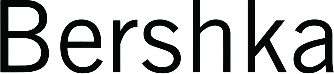
Apr 2023 (25th anniversary, Inditex): light mixed-case Bershka wordmark replaced by bold all-caps Bershka in ABC Whyte
Bershka logo before and after
BeforeUntil Apr 2023
Bershka logo via Wikimedia Commons (author: Bershka). Source: commons.wikimedia.org
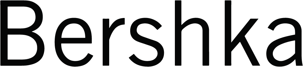
AfterSince Apr 2023
Bershka logo via Wikimedia Commons (author: Industria de Diseño Textil, S.A.). Source: commons.wikimedia.org


Key facts
Bershka launched a new logo in Apr 2023, designed by Dinamo Typefaces.
- Brand
- Bershka
- Launched
- Source: theindustry.fashion
- What changed
- Apr 2023 (25th anniversary, Inditex): light mixed-case Bershka wordmark replaced by bold all-caps Bershka in ABC Whyte.
- Why
- Bershka refreshed its identity to mark its 25th anniversary, aiming for a cleaner aesthetic that works across its products, campaigns, social networks and e-commerce.
- Sources
- fashionunited.com, highxtar.com
Cite this Rebrand Log, "Bershka new logo (2023)", https://rebrandlog.com/rebrand/bershka-2023/, last updated .
The Bershka rebrand, explained
Bershka turned 25 in 2023 and marked the occasion with its first makeover since its founding in 1998. FashionUnited reported that, after a string of rebrands across Inditex's portfolio, the group had turned to the fast fashion chain, which ranked second in the group behind Zara.
The new logo and corporate image aim for a cleaner aesthetic, with bold typography created alongside the Berlin type foundry Dinamo. Highxtar added that, for the first time in its history, the brand's typography was transformed to coexist with the variety of its products, campaigns, social networks and e-commerce, and that the typeface chosen with Dinamo was ABC Whyte. Bershka also brought back its emblematic BSK logo, which Highxtar called a teenage icon par excellence.
The identity debuted in physical retail on 6 April, with the reopening of the Lisbon store in the Colombo shopping centre. FashionUnited described a store concept that, like those of Zara, Stradivarius and Pull&Bear, leans heavily on digitalisation and neutral tones, with industrial details and LED screens, and a phygital Wearable Art collection whose garments carried QR codes linking to augmented reality versions. Highxtar counted 860 stores in 69 countries.
FashionUnited added that the Lisbon store housed the Bershka, Bershka Man and teen-focused BSK lines, and that the updated fitting rooms would let shoppers try on virtual garments through smart mirrors and share the images to social media. Lisbon was the first store in the network to carry the new image, which Inditex intended to extend across physical and online channels at every point where it meets customers. The technology is the real youth signal here; the typography is there to stay out of its way.
The pattern is now clear. Inditex is moving every chain toward minimal, editorial wordmarks, an approach that makes the group feel coherent and premium. For Bershka, a brand built on youth and noise, that is a curious fit.
The new wordmark is well made and versatile, as a good Dinamo face should be. But it is hard to tell from a distance which Inditex brand you are looking at. Reviving BSK is the clever counterweight: a loud, nostalgic mark for the teenagers who grew up with it, while the main logo politely grows up.
In short: Grown up, mostly.
Sources
- 1. theindustry.fashionhttps://www.theindustry.fashion/bershka-celebrates-25th-birthday-with-rebrand-and-new-logo/
- 2. us.fashionnetwork.comhttps://us.fashionnetwork.com/news/Bershka-marks-25th-anniversary-by-unveiling-new-logo-updated-corporate-identity,1509831.html
- 3. fashionunited.comhttps://fashionunited.com/news/business/bershka-receives-brand-refresh-for-25th-anniversary/2023042553505