AVROTROS
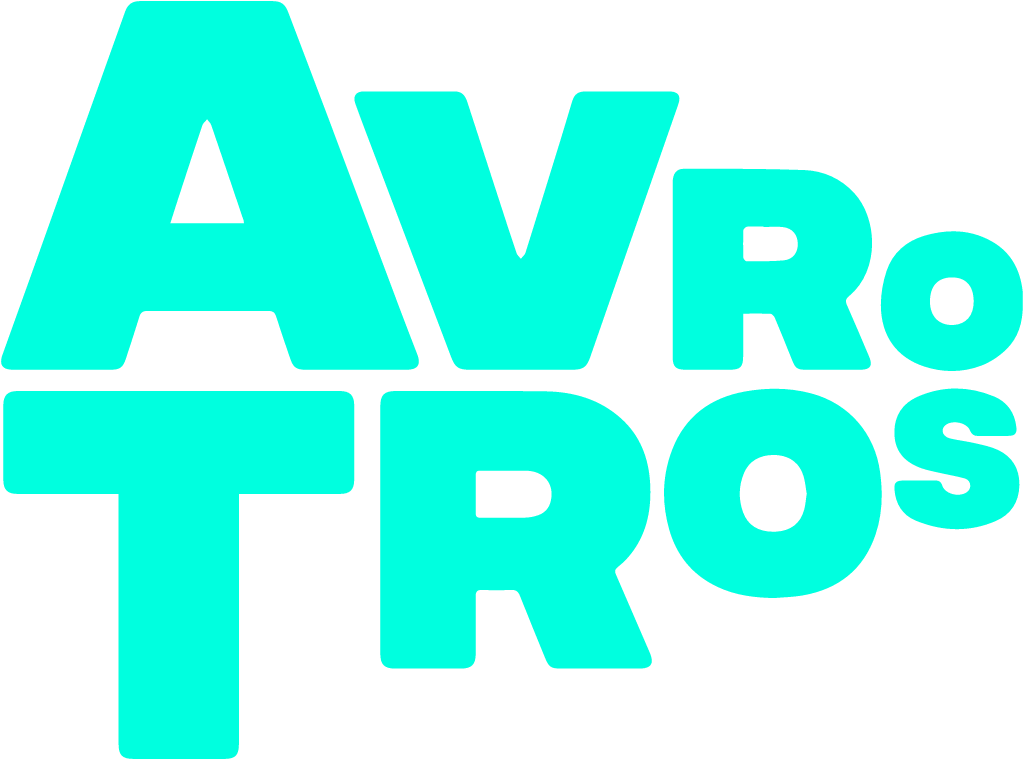
Oct 1 2020: black circle 'a' symbol + lowercase wordmark replaced by stacked mint-green AVROTROS wordmark (Studio Dumbar)
AVROTROS logo before and after
BeforeUntil Oct 2020
AVROTROS logo via Wikimedia Commons (author: avrotros). Source: commons.wikimedia.org

AfterSince Oct 2020
AVROTROS logo via Wikimedia Commons (author: AVROTROS). Source: commons.wikimedia.org


Key facts
AVROTROS launched a new logo in Oct 2020, designed by Studio Dumbar/DEPT®.
- Brand
- AVROTROS
- Launched
- Source: adformatie.nl
- What changed
- Oct 1 2020: black circle 'a' symbol + lowercase wordmark replaced by stacked mint-green AVROTROS wordmark (Studio Dumbar).
- Why
- AVROTROS wanted a clearer face for the broadcaster amid dynamic changes in the media landscape and in media use.
- Sources
- adformatie.nl, marketingtribune.nl
Cite this Rebrand Log, "AVROTROS new logo (2020)", https://rebrandlog.com/rebrand/avrotros-2020/, last updated .
The AVROTROS rebrand, explained
AVROTROS, the Dutch public broadcaster, introduced a new logo and visual identity on 1 October 2020. Adformatie and MarketingTribune both reported that it was developed with Studio Dumbar, part of Dept, and that the aim was to give the broadcaster a clearer face amid dynamic changes in the media landscape and in how people use media. Adformatie set this against new would-be broadcasters such as Omroep Zwart and Omroep X, which had just announced plans to join the public system.
Studio Dumbar's explanation is refreshingly direct. Viewers should know at once that they are watching an AVROTROS programme, even if they register the logo only from the corner of an eye. Small or large, the logo has to pop off the screen in form and colour. The studio chose mint, a clear, fresh colour, and checked that no other broadcaster already used it. The logo is a wordmark with no extra symbol or icon, which keeps it simple and clear, while its perspective gives it dynamism, so that AVROTROS literally comes toward the viewer. Typography in motion also forms the space in which programme footage is presented.
MassiveMusic designed the matching sound logo. Music producer Job Poels said the strategy, translated as What we share makes us more, stresses inclusiveness and perspective, carried into type and sound through spatial reverb, a dynamic panning effect and a human touch in the form of a finger snap. The style rolled out across television, YouTube, radio and the members' magazine, with a multi-year campaign. Both sources noted that the association paid for the identity and campaign itself, not out of public money.
This is a sensible piece of broadcast design. Dropping the symbol in favour of a single wordmark suits a brand that lives mostly as a corner bug on screen, and choosing a colour specifically because no rival owns it is the kind of discipline most rebrands skip. Mint is an unusual choice for a broadcaster, which is the point. The perspective trick is the risk: it reads well in motion and may look merely tilted in print. The finger snap is charming, if a little pleased with itself.
In short: A wordmark built for the corner of the eye.
Sources
- 1. adformatie.nlhttps://www.adformatie.nl/creatie/design/nieuwe-branding-en-soundlogo-voor-omroep-avrotros
- 2. broadcastmagazine.nlhttps://www.broadcastmagazine.nl/online/avrotros-lanceert-nieuwe-huisstijl/
- 3. radiofreak.nlhttps://www.radiofreak.nl/avrotros-vernieuwt-logo-mikt-op-duidelijk-gezicht/