Atlanta Hawks
The navy and red hawk with spread wings clutching a basketball under an "Atlanta Hawks" wordmark was replaced by a red roundel around an updated version of the team's earlier "Pac-Man" hawk head, ringed by "Atlanta Hawks Basketball Club".
Atlanta Hawks logo before and after
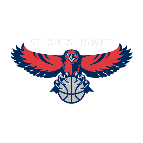
BeforeUntil Jun 2015
Logo: Atlanta Hawks. Source: i.cdn.turner.com (archived)
DownloadLightSVG not availablePNGDarkSVG not availablePNGDark mode version adapted by Rebrand Log
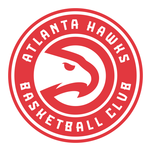
AfterSince 1 Jun 2015
Logo: Atlanta Hawks. Source: i.cdn.turner.com (archived)
Key facts
Atlanta Hawks launched a new logo on 1 Jun 2015.
- Brand
- Atlanta Hawks
- Launched
- Studio
- Not recordedAdd it
- What changed
- The navy and red hawk with spread wings clutching a basketball under an "Atlanta Hawks" wordmark was replaced by a red roundel around an updated version of the team's earlier "Pac-Man" hawk head, ringed by "Atlanta Hawks Basketball Club".
- Sources
- nba.com, espn.com, news.sportslogos.net
Cite this Rebrand Log, "Atlanta Hawks new logo (2015)", https://rebrandlog.com/rebrand/atlanta-hawks-2015/, last updated .
The Atlanta Hawks rebrand, explained
The circular hawk head nicknamed "Pac-Man" was an earlier Hawks logo. In February 2015, SportsLogos.Net reported that the club would adopt it as its primary logo from the 2015-16 season.
The new set was unveiled on 1 June 2015. The primary logo sets an evolved Pac-Man head inside a red roundel lettered "Atlanta Hawks Basketball Club", replacing the spread-winged hawk. ESPN reported a new secondary logo alongside it, a hawk lifting a flaming basketball, which fans called the Firebird.
In short: Pac-Man came home.
Press
Sources
- 1. nba.comhttps://www.nba.com/hawks/welcome-club
- 2. espn.comhttps://www.espn.com/blog/nba/post/_/id/3885/hawks-unveil-new-primary-secondary-logos
- 3. news.sportslogos.nethttps://news.sportslogos.net/2015/02/09/atlanta-hawks-will-adopt-pac-man-logo-as-primary-maybe-get-new-uniforms-too/basketball/