Android (2019)
New logo and identity.
Android logo before and after
BeforeUntil Aug 2019
Android logo via Wikimedia Commons (Android logo (2015-2019).svg). Source: commons.wikimedia.org

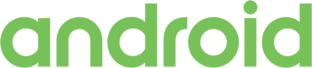

AfterSince 22 Aug 2019
Android logo via Wikimedia Commons (Android logo (2019-2023).svg). Source: commons.wikimedia.org


Key facts
Android launched a new logo on 22 Aug 2019, designed by Huge.
- Brand
- Android
- Launched
- Source: theverge.com
- Studio
- HugeAll rebrands by Huge
- What changed
- New logo and identity.
- Why
- Google turned the Android wordmark from green to black because the green was hard to read, particularly for people with visual impairments.
- Sources
- blog.google, theverge.com, 9to5google.com
- Logo history
- 2 rebrands
Cite this Rebrand Log, "Android new logo (2019)", https://rebrandlog.com/rebrand/android-2019/, last updated .
The Android rebrand, explained
Key people: Aude Gandon (Global brand director, Android) · Sameer Samat (VP product management, Android)
By 2019 Android ran on more than 2.5 billion active devices, from phones to cars, watches and TVs, and was used by more people in India and Brazil than in the US. Google announced on 22 August that the brand would become more inclusive and accessible, starting with the name.
For ten years releases had been named after desserts in alphabetical order. Google said the names were not understood everywhere: L and R are indistinguishable when spoken in some languages, pie is not a dessert in some places, and marshmallows are not a popular treat in much of the world. So Android Q became Android 10, and future versions would be numbered. Sameer Samat, VP of product management, told The Verge that desserts leave part of the world out every time, while numbers are universal. He acknowledged the skepticism that a Q dessert was simply too hard to find.
The logo was redesigned by Google's Android brand team under global brand director Aude Gandon. The robot, which she said makes Android human, fun and approachable, was given what Google called a special place in the logo. The robot's eyes were moved down and its antennae tweaked. The wordmark was modernised and turned from green to black, because Google found the green hard to read, particularly for people with visual impairments; Gandon said the old lettering failed the acid test in very small spaces. The green lost some yellow, and secondary colours were added so Android is more than green and grey, with only the blue shared with Google's primaries.
The Verge's Dieter Bohn saw it as the latest in a long line of companies turning quirky wordmarks into blandified brands.
9to5Google admitted up front that it looks the same, and the detail explains why that was the point. The wordmark borrowed curved corners from the robot while keeping other edges sharp, and it was thinned because the old rounder, fatter letters struggled on small screens. The robot, never before paired with the name, would now always sit beside or above it, eyes lowered because, Aude Gandon said, set high they did not feel human. The green lost yellow and gained blue, with a neon edge that is the most eye catching change, and the old green and grey palette, which Gandon called basically no colours, finally gained company.
He had a point about the wordmark, which is generic. But the accessibility case was real, and giving the robot a formal place in the logo is the right call: the robot was always the brand, and now the logo admits it.
In short: A blander wordmark redeemed by finally putting the robot in charge.
Press
Sources
- 1. underconsideration.com · paywalledhttps://www.underconsideration.com/brandnew/archives/new_logo_and_identity_for_android_by_huge.php
- 2. blog.googlehttps://blog.google/products/android/evolving-android-brand/
- 3. theverge.comhttps://www.theverge.com/2019/8/22/20827231/android-10-q-google-name-officially-announced-new-logo-wordmark-desserts