Aldi Süd
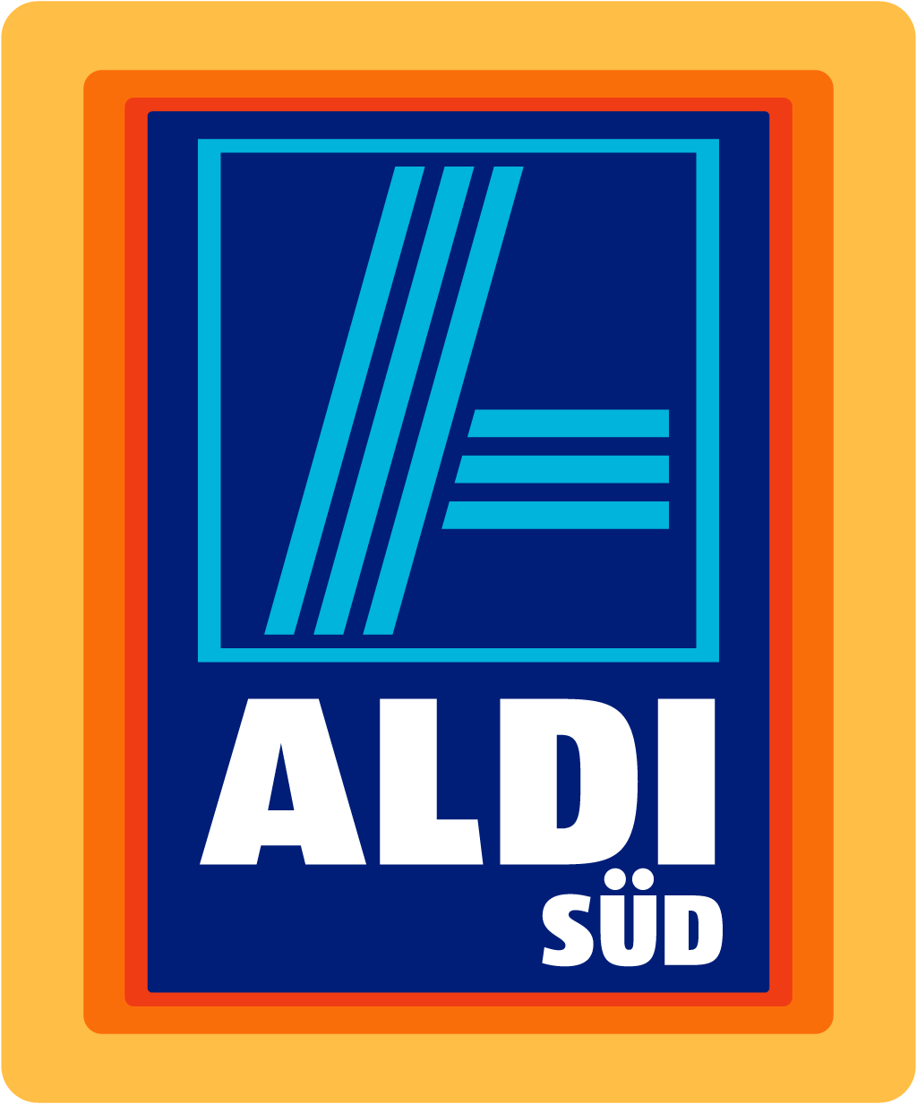
2017: framed square with striped A redrawn: new stylised A, gradient blue, rounded lettering, SÜD centred
Aldi Süd logo before and afterRefinement
BeforeUntil Mar 2017
Aldi Süd logo via Wikimedia Commons (author: ALDI SÜD Dienstleistungs-GmbH & Co. oHG). Source: commons.wikimedia.org

AfterSince Mar 2017
Aldi Süd logo via Wikimedia Commons (author: Unknown authorUnknown author). Source: commons.wikimedia.org

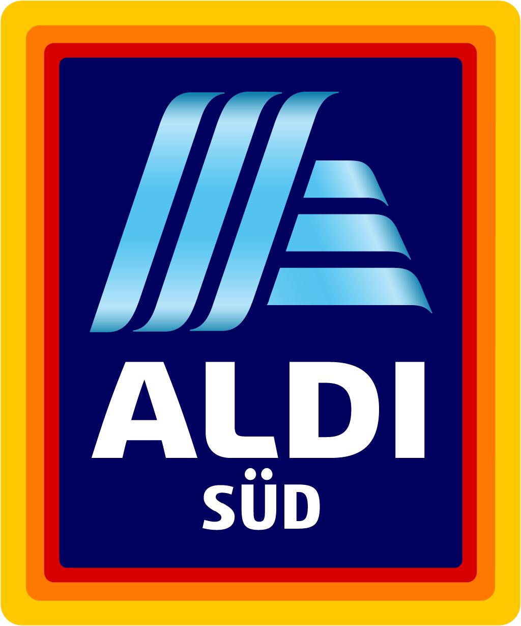

Refinement: the mark keeps its form.
Key facts
Aldi Süd launched a new logo in Mar 2017.
- Brand
- Aldi Süd
- Launched
- Source: presseportal.de
- Studio
- Not recordedAdd it
- What changed
- 2017: framed square with striped A redrawn: new stylised A, gradient blue, rounded lettering, SÜD centred.
- Why
- Aldi Süd said the refreshed logo was meant to make the discounter look more contemporary and future-proof, fitting its wider modernisation.
- Sources
- horizont.net, merkur.de
Cite this Rebrand Log, "Aldi Süd new logo (2017)", https://rebrandlog.com/rebrand/aldi-sud-2017/, last updated .
The Aldi Süd rebrand, explained
Aldi Süd changed its logo in 2017, about eleven years after its previous update in 2006. Horizont reported that the signet, in the discounter's traditional red, blue, cyan, yellow and orange, was getting a fresh coat of paint meant to make the brand look more contemporary and future-proof. The company worked with a branding consultancy on the redesign.
The redesign stayed true to the brand core. The colours remain, and so does the familiar light blue A, which in the modernised design can also appear as an independent element so that the logo keeps its strong recognition. Merkur described what changed: slightly more rounded lettering, a blue background with a gentle gradient, and the stylised A with at least a suggestion of a 3D effect.
The rollout began in an unexpected place. The new logo appeared first in China, where Aldi Süd was starting to sell selected products on the Tmall Global marketplace from 20 March. There the signet is joined by Chinese characters that loosely translate as a place of discovery and happiness and sound like the German brand name. Other Aldi Süd countries, including Germany with its 1,870 stores, were to follow gradually from June 2017.
Horizont placed the update within a wider modernisation: the first television advertising with Aldi Nord the previous year, refurbished stores and a revised range. The company's statement, which Merkur mocked as marketing German, said the fresh visual design suited the modernisation process perfectly. Merkur also recalled that the basic design dated from 1984, with earlier versions simply spelling Aldi or Albrecht.
Horizont put the refresh in a longer line. The Albrecht brothers drew a first logo for their food shops in the late 1940s, red with Karl Albrecht Lebensmittel in white, and the move to discounting brought a white ALDI on a blue band in 1963. In 2017, Horizont noted, the change was part of a broader modernisation: the year before, Aldi Süd had joined Aldi Nord in TV advertising, and it had also refurbished stores and reworked its range. Seen that way, the logo is the last piece of a renovation rather than its start, which is the safer order for a discounter.
This is a cautious update to a logo that works precisely because it never changes. The gradient and faux depth are the weakest decisions, very much of their era. Freeing the A to work alone is the smartest. For a discounter, familiarity is the brand promise, and Aldi Süd kept it.
In short: The A, freed.
Sources
- 1. presseportal.dehttps://www.presseportal.de/pm/108584/3575010
- 2. horizont.nethttps://www.horizont.net/marketing/nachrichten/Discounter-Das-ist-das-neue-Markenlogo-von-Aldi-Sued-156291
- 3. merkur.dehttps://www.merkur.de/wirtschaft/ist-neue-logo-von-aldi-sued-zr-7450062.html