Zara
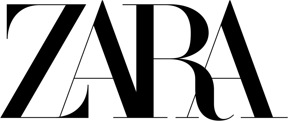
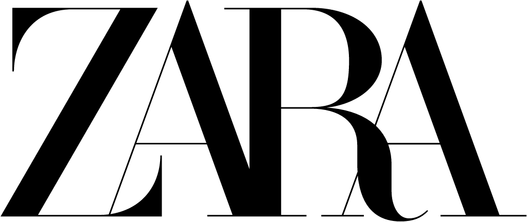
Jan 2019: the widely spaced Didone capitals ZARA replaced by a tightly kerned, overlapping version with curled flourishes on the Z and R (Baron & Baron, Fabien Baron), launched with the SS19 campaign and widely criticised for its kerning.
Zara logo before and after
BeforeUntil Jan 2019
Zara logo via Wikimedia Commons (author: Inditex S.A.). Source: commons.wikimedia.org


AfterSince Jan 2019
Zara logo via Wikimedia Commons (author: Inditex S.A.). Source: commons.wikimedia.org
Key facts
Zara launched a new logo in Jan 2019, designed by Baron & Baron.
- Brand
- Zara
- Launched
- Source: dezeen.com
- What changed
- Jan 2019: the widely spaced Didone capitals ZARA replaced by a tightly kerned, overlapping version with curled flourishes on the Z and R (Baron & Baron, Fabien Baron), launched with the SS19 campaign and widely criticised for its kerning.
Cite this Rebrand Log, "Zara new logo (2019)", https://rebrandlog.com/rebrand/zara-2019/, last updated .
The Zara rebrand, explained
Key people: Fabien Baron (Founder, Baron & Baron; artistic director, Zara)
Zara's previous logo, from 2011, set its name in serif capitals with generous gaps between the letters. In January 2019, with its Spring/Summer campaign, the Spanish fashion chain unveiled a replacement by French agency Baron & Baron, whose founder Fabien Baron was also Zara's artistic director, Dezeen and Creative Bloq reported.
The typeface stays close to the old one, but the spacing is gone. Letters are pushed together so that parts overlap and others merge, and details are exaggerated, with new curved flourishes on the Z and the R. Both outlets noted the strong resemblance to the type Baron used when he overhauled Harper's Bazaar in the 1990s. Dezeen read it as a hint that Zara wanted to sit closer to high-end houses such as Dior and Maison Margiela, both brands Baron has art-directed. Creative Bloq noted that Baron & Baron's site showed the logo across mobile screens, posters and lookbooks, where it looked rather more elegant.
Reaction was harsh. German typographer Erik Spiekermann called it the worst piece of type he had seen in years and asked whether one of the robots set to replace humans had done it. Other designers called it claustrophobic, and one mocked it with a meme of a future logo with all four letters stacked on top of one another. Creative Bloq said the letterforms were overlapped so enthusiastically they were barely legible, though it gave Zara credit for not joining the fashion world's rush to bland sans-serif wordmarks.
TheIndustry.fashion supplied the context the design press skipped. This was only the second logo update since Zara's founding in the mid-1970s, and it bucked 2018's run of bland sans serif rebrands across fashion. The sharpest complaint was practical: at small sizes the feet of the R and A collided so the name read as Zaba. The site noted the irony that the previous 2010 update had drawn complaints of too much space between the letters, that commentators linked the cramped style to Baron's 1990s Harper's Bazaar covers, and that Zara, which does little traditional advertising, was unlikely to lose customers over it.
That is the fair verdict. The logo is a fashion editorial gesture, built to look striking at poster size on a campaign. As a retail mark that has to work on a shopping bag or a phone, the cramming is a problem of its own making.
In short: Kerned until the letters collide.
Sources
- 1. dezeen.comhttps://www.dezeen.com/2019/02/04/zara-logo-controversial-rebrand-baron-baron/
- 2. fastcompany.comhttps://www.fastcompany.com/90298669/zaras-new-logo-may-be-the-future-of-branding-love-it-or-hate-it/
- 3. creativebloq.comhttps://www.creativebloq.com/news/new-zara-logo-has-been-kerned-into-oblivion