West Ham United
Summer 2016 (move to London Stadium): the 1999 crest with the Boleyn castle above crossed hammers replaced by a ship-bow shield (after HMS Warrior) with crossed gold hammers, a modern typeface and the word "LONDON"; designed by WTF Creative, fan-polled in 2014.
West Ham United logo before and after
BeforeUntil Jul 2016
Logo: West Ham United. Source: whufc.com (archived)
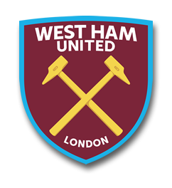
AfterSince Jul 2016
Logo: West Ham United. Source: whufc.com (archived)
Key facts
West Ham United launched a new logo in Jul 2016.
- Brand
- West Ham United
- Launched
- Source: whufc.com
- Studio
- Not recordedAdd it
- What changed
- Summer 2016 (move to London Stadium): the 1999 crest with the Boleyn castle above crossed hammers replaced by a ship-bow shield (after HMS Warrior) with crossed gold hammers, a modern typeface and the word "LONDON"; designed by WTF Creative, fan-polled in 2014.
- Why
- West Ham updated its crest to coincide with its move away from Upton Park, removing the castle and adding the word London to attract a wider market.
- Sources
- standard.co.uk, skysports.com
Cite this Rebrand Log, "West Ham United new logo (2016)", https://rebrandlog.com/rebrand/west-ham-2016/, last updated .
The West Ham United rebrand, explained
West Ham's crest change was really a story about leaving home. The club spent 110 years at the Boleyn Ground in Upton Park, and the castle on its badge referred to that place. With a move to the Olympic Stadium in Stratford, later the London Stadium, set for 2016, the club decided two years ahead that the badge had to move too. The London Evening Standard reported in 2014 that the new design removed the castle and added the word London, in an attempt to attract a wider market, after small changes made in response to fan feedback.
The process leaned heavily on supporters. The Standard reported that the club ran online polls on a modern, simpler design to coincide with leaving Upton Park, and quoted the club's statement on an independent poll by SMG YouGov. In the first stage, 77 percent of fans supported evolving the crest, which the club called a clear mandate for change. Among fans who backed change, 72 percent then voted for the new design, and across the second stage, which drew new respondents, an overall 56 percent majority said yes.
The design keeps the crossed hammers, the heart of West Ham's identity, and sets them in a new shield with a modern typeface and the word London beneath. The shield is shaped like the bow of a ship, after HMS Warrior. The club said full colour, flat and mono versions would be the most widely used and would appear on the playing shirt from 2016, while the popular blue shield with claret hammers would continue as a secondary colourway. Sky Sports listed West Ham among clubs showing new badges for 2016 to 2017, noting the updated crest's debut against Chelsea at Stamford Bridge in August.
The Standard called the new crest another step away from tradition for the east London club, and that tension never really went away.
Strategically, the move is easy to understand. A castle that pointed to a ground the club was leaving made little sense, and London is a word with global commercial pull. The ship shape is a clever way to swap one piece of history for another. But adding the city name to a badge is a marketing decision fans can see straight through, and a 56 percent majority is hardly a landslide. The crest is cleaner and more legible than its predecessor, yet it trades a specific sense of place for a generic one, which is exactly what many supporters feared about the stadium move itself.
In short: Losing the castle, gaining the city.
Sources
- 1. whufc.comhttps://www.whufc.com/news/articles/2017/june/29-june/west-ham-united-crest-through-years
- 2. claretandhugh.infohttps://www.claretandhugh.info/new-west-ham-crest-unveiled-at-os/