Volkswagen
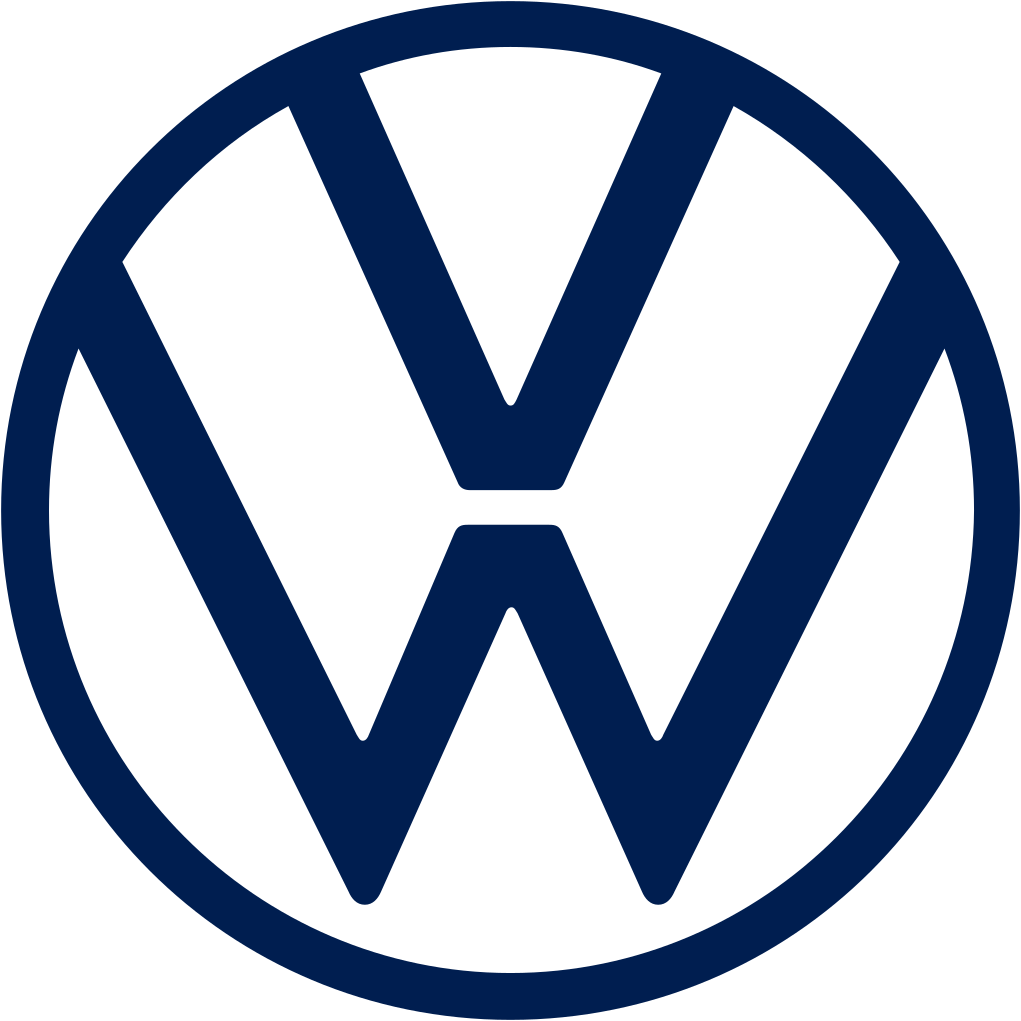
Sep 9 2019 (IAA): chrome 3D VW roundel with wordmark replaced by flat 2D line roundel
Volkswagen logo before and after
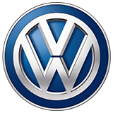
BeforeUntil Sep 2019
Logo: Volkswagen. Source: volkswagen.co.uk (archived)
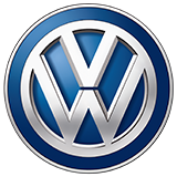
AfterSince Sep 2019
Volkswagen logo via Wikimedia Commons (author: Volkswagen). Source: commons.wikimedia.org
Key facts
Volkswagen launched a new logo in Sep 2019, designed by Volkswagen in-house.
- Brand
- Volkswagen
- Launched
- Source: volkswagen-newsroom.com
- Studio
- In-house at Volkswagen
- What changed
- Sep 9 2019 (IAA): chrome 3D VW roundel with wordmark replaced by flat 2D line roundel.
- Why
- Volkswagen said the aim of its new brand design was more human, authentic storytelling built around the customer.
- Sources
- dezeen.com, web.archive.org, marketingweek.com
Cite this Rebrand Log, "Volkswagen new logo (2019)", https://rebrandlog.com/rebrand/volkswagen-2019/, last updated .
The Volkswagen rebrand, explained
Key people: Jochen Sengpiehl (CMO, Volkswagen) · Klaus Bischoff (Head of design, Volkswagen)
Volkswagen unveiled its new brand design on the eve of the 2019 Frankfurt motor show, pitching it as the start of a new era tied to its first generation of fully electric cars. The ID.3 was the first production model to carry the new badge.
The subtext was the emissions scandal. Marketing Week framed the overhaul, which VW called New Volkswagen, as an attempt to put dieselgate behind the brand. Chief marketing officer Jochen Sengpiehl said the aim was more human, authentic storytelling built around the customer.
The VW roundel had been rendered since 2000 as a shiny, three-dimensional chrome object with shading. The new version is reduced to its basic elements: a flat, two-dimensional line drawing in a single dark blue. Head of design Klaus Bischoff's focus was making the W float, separated from the outer ring to give the mark a sense of lightness. The flat design was explicitly framed as digital-first, part of a wider wave of car brands abandoning skeuomorphic badges.
The identity went beyond the badge. VW added a sound logo and replaced the male voice that had long spoken for the brand with a female voice in most markets. The rollout began at the Frankfurt show and was meant to reach every market by mid-2020.
Dezeen reported it was developed by Volkswagen's own design and marketing teams, a collaboration between 19 internal teams and 17 external agencies.
Marketing Week placed the redesign squarely in the aftermath of the 2015 emissions scandal. Chief marketing officer Jochen Sengpiehl promised the brand would stop showing a perfect advertising world and become more human, and the work, conceived in nine months, involved 19 internal teams and 17 outside agencies. A sound logo replaced a slogan, and a female voice would present the cars. The rollout covered 171 markets and around 70,000 logos at 10,000 dealer and service sites, starting in Europe, reaching China in October and finishing by mid-2020. YouGov data cited by the magazine showed the brand's index score still below its pre-scandal level, though purchase intent had already recovered.
That committee was the target of the sharpest criticism. Type designer Erik Spiekermann said Volkswagen had rightly abandoned the embarrassing pseudo-chrome but that the new version was not necessarily an improvement, adding that a type designer would have known what to do. He has a point about the details; the detailing feels generic. Still, the flat mark is an honest translation of a classic badge for screens.
In short: Right direction, slightly underdrawn. The chrome had to go.
Sources
- 1. volkswagen-newsroom.comhttps://www.volkswagen-newsroom.com/en/press-releases/volkswagen-unveils-new-brand-design-and-logo-5337
- 2. dezeen.comhttps://www.dezeen.com/2019/09/12/volkswagen-rebrands-2d-logo-id3-electric-car/
- 3. designweek.co.ukhttps://www.designweek.co.uk/issues/23-29-september-2019/it-is-a-deep-crisis-one-which-we-are-still-in-volkswagens-re-design-aims-for-a-brighter-future/