Unity
Flat cube mark redrawn as a fully 3D cube with three directional arrows; product logos unified
Unity logo before and after
BeforeUntil Oct 2021
Unity logo via Wikimedia Commons (uploader/author: Unity Technologies). Source: commons.wikimedia.org
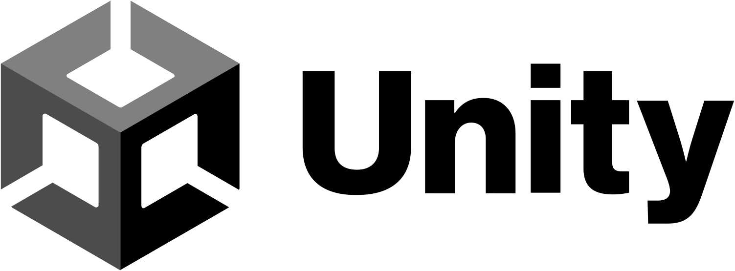
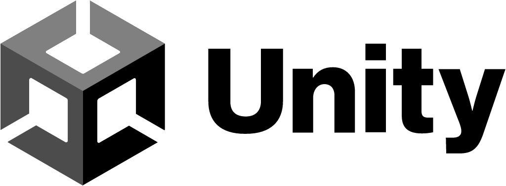
AfterSince 5 Oct 2021
Unity logo via Wikimedia Commons (uploader/author: Unity Technologies). Source: commons.wikimedia.org
Key facts
Unity launched a new logo on 5 Oct 2021, designed by Unity in-house.
- Brand
- Unity
- Launched
- Studio
- In-house at Unity
- What changed
- Flat cube mark redrawn as a fully 3D cube with three directional arrows; product logos unified.
- Why
- Unity's rebrand reflected its growth from a single product into a company with dozens of tools and services.
- Sources
- cgchannel.com, gamedeveloper.com
Cite this Rebrand Log, "Unity new logo (2021)", https://rebrandlog.com/rebrand/unity/, last updated .
The Unity rebrand, explained
Unity had made only incremental changes to its logo since adopting the name Unity Technologies in 2007. In October 2021 it introduced its most significant redesign yet, for the company and the game engine, CG Channel and Game Developer reported. Unity said the time was right for a full revamp to show who it was, how its products had evolved and where it was going.
The geometric cube that appears on the splash screens of countless games was completely redesigned while keeping its essence. It is now fully 3D, and Unity assigned meaning to each axis: its technology on X, creators on Y, and the experiences they make on Z. CG Channel noted that the new mark keeps the general form of the old cube but rotates and thickens the axes, which now read as three directional arrows representing, in Unity's words, the infinite possibilities it puts in creators' hands. The wordmark changed more subtly, chiefly with a capital U meant to give it more maturity.
The other aim was to reflect Unity's growth from a single product into a company with dozens of tools and services, many from recent acquisitions. Products such as Unity Forma, Metacast, Mars and Backtrace got unified logos. CG Channel described hexagonal marks derived from the cube's silhouette, carrying two-letter product codes much like Adobe's, which rotate to reveal a 3D form suited to each product. Unity said this would make it easier to find products and understand how they relate, and that the animated logos would be limited to its primary products. Rollout was planned over the following months.
CG Channel reported a divided response: some welcomed it, some preferred the old logo, and some felt the money would have been better spent on the product.
CG Channel tied the rebrand to scale: Unity's product page by then listed well over 30 tools and services, from CAD data import and material generation to in-game advertising and multiplayer server hosting. It also recorded a split reaction. Some commenters welcomed the logo, others preferred the old one, and others thought the money would have been better spent on product development. That last complaint is the one every developer brand hears, and with 30 products under one roof, a system that can hold them together is product work of a kind.
The cube was already one of the best marks in software, and the redraw is respectful. The Adobe-style product codes are the more consequential move, turning a game engine into a suite, which was exactly the point.
In short: A cube with arrows.
Rationale
The cube marks the intersection of Unity's technology, its creators and the experiences they create, and the system clarifies how Unity's products relate.
Quote
“It’s now fully 3D; symbolically, it’s where our technology (the X axis), Unity creators (the Y axis), and the incredible experiences they create (Z axis) intersect.”
Press
Reactions
- b r e a d 🏳️🌈🎗️@MellowBread on Xi dont know if its because i used unity for so long but even if the new logo is nice its quite like weird7 Oct 2021 · 0 likes
- meerkat@SerbianMeerkat on X@unity ah i see, the new logo is pretty cool i just didnt understand why it had to change. thanks for the response! :)5 Oct 2021 · 2 likes
- Tyler Glaiel@TylerGlaiel on Xunity's new logo is fine IMO. still very identifiable as "unity", actually less simplified than their old one was lol6 Oct 2021 · 54 likes
- ChaoticBrain Studios 🧠⚡️Neon Blood out now! 🕵🌃@ChaoBrainStudio on X@unity @unitygames We really like the new logo, sure It Will look amazing in our new projects!🔥6 Oct 2021 · 0 likes
- FR4CT1ONS@fr4ct1ons on XUnity making the new logo:5 Oct 2021 · 150 likes
- Josh Naylor@JoshNaylor on XNo Unity, what the hell is that new logo.5 Oct 2021 · 3 likes
Sources
- 1. gamedeveloper.comhttps://www.gamedeveloper.com/marketing/unity-s-big-branding-revamp-brings-new-logos-for-it-and-its-products
- 2. cgchannel.comhttps://www.cgchannel.com/2021/10/unity-gets-a-new-logo/
- 3. cinqmars.cahttps://www.cinqmars.ca/work/unity-rebrand