TV Brasil
Apr 2019 (shown to staff 25 Mar): blue 3D interlocking-ribbon sphere over "TV BRASIL" replaced by a flat green "tv Brasil" wordmark with a green-and-yellow wing evoking the map of Brazil; became the matrix for the Nov 2019 EBC identity.
TV Brasil logo before and after
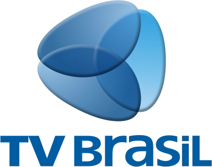
BeforeUntil Apr 2019
TV Brasil logo via Wikimedia Commons (author: Direção de Artes Empresa Brasil de Comunicação). Source: commons.wikimedia.org
AfterSince Apr 2019
TV Brasil logo via Wikimedia Commons (author: Empresa Brasil de Comunicação). Source: commons.wikimedia.org




Key facts
TV Brasil launched a new logo in Apr 2019.
- Brand
- TV Brasil
- Launched
- Source: kogut.oglobo.globo.com
- Studio
- Not recordedAdd it
- What changed
- Apr 2019 (shown to staff 25 Mar): blue 3D interlocking-ribbon sphere over "TV BRASIL" replaced by a flat green "tv Brasil" wordmark with a green-and-yellow wing evoking the map of Brazil; became the matrix for the Nov 2019 EBC identity.
- Sources
- kogut.oglobo.globo.com, rd1.com.br
Cite this Rebrand Log, "TV Brasil new logo (2019)", https://rebrandlog.com/rebrand/tv-brasil-2019/, last updated .
The TV Brasil rebrand, explained
TV Brasil, the Brazilian public television channel, unveiled a new logo to staff on Monday 25 March 2019. O Globo's Patrícia Kogut column, in a report by Rafaela Santos, said the management presented it to employees that day: the blue was gone, replaced by green and yellow, the colours of the national flag. Posters carried the line Chegou a hora da TV Brasil brilhar e você faz parte desta mudança, roughly: the time has come for TV Brasil to shine, and you are part of this change.
RD1's newsroom, reporting two days later, added the context. The public channel had initially been caught up in rumours that it would be shut down once Jair Bolsonaro's government took office, and it now appeared to have won a reprieve and a new look. The new logo was debuting that week as part of changes under the new management. The blue that had dominated since the channel's launch was dropped in favour of green and yellow, which RD1 noted was exhaustively used by the Bolsonaro government. The mark also became simpler, in a flat style.
RD1 placed the logo among wider changes since the start of 2019, in programming and in the leadership of the channel, including the announced return of Sem Censura, a talk show that had been a success at the broadcaster and had been cancelled. Neither report gave an official explanation for the design beyond the staff poster's call to shine.
Going flat was an overdue technical update, and simpler marks do work better on screens of every size, from phones to the studio wall. The colour choice is the problem. Green and yellow are Brazil's colours, but in 2019 they were also the visual signature of a particular government, as RD1 pointed out. A public broadcaster's independence is signalled partly through its identity, and adopting the ruling administration's favourite palette in the same season it changed leadership sends exactly the wrong message, however patriotic the intent. A national broadcaster should look like the country, not like the cabinet, and it should still look right after the next election, whoever wins it. This one was designed for a single season.
In short: Flag colours, at an awkward moment.
Sources
- 1. kogut.oglobo.globo.comhttps://kogut.oglobo.globo.com/noticias-da-tv/noticia/2019/03/tv-brasil-muda-seu-novo-logotipo.html
- 2. tvbrasil.ebc.com.brhttps://tvbrasil.ebc.com.br/tv-brasil-tera-programacao-com-mais-acessibilidade-cultura-e-educacao
- 3. agenciabrasil.ebc.com.brhttps://agenciabrasil.ebc.com.br/geral/noticia/2019-11/ebc-ganha-nova-identidade-visual
- 4. rd1.com.brhttps://rd1.com.br/em-reformulacao-tv-brasil-ganha-novo-logotipo-e-slogan/