TaskRabbit
New logo.
TaskRabbit logo before and after

BeforeUntil May 2022
Logo: TaskRabbit. Source: taskrabbit.com (archived)


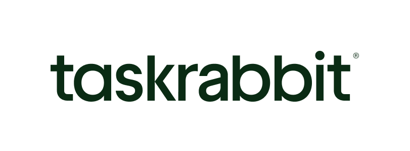
AfterSince 27 May 2022
Logo: TaskRabbit. Source: taskrabbit.com (archived)
Key facts
TaskRabbit launched a new logo on 27 May 2022.
- Brand
- TaskRabbit
- Launched
- Source: youmark.it
- Studio
- Not recordedAdd it
- What changed
- New logo.
- Why
- Taskrabbit said it rebranded because it had evolved from a service for quick errands into a platform connecting people with skilled Taskers, and wanted a human first brand rather than a rabbit forward one.
Cite this Rebrand Log, "TaskRabbit new logo (2022)", https://rebrandlog.com/rebrand/taskrabbit-2022/, last updated .
The TaskRabbit rebrand, explained
Taskrabbit's name was born from speed. The company explained in its own account of the refresh that it started in 2008 as a way to get household errands done in a pinch, which is where the rabbit came from. Italian trade site YouMark added that the platform began life in the United States as Run My Errand. By 2022 it had become something different: a marketplace connecting people with skilled independent contractors for furniture assembly, electrical work, moving and repairs, operating in eight countries after more than nine million completed tasks, according to YouMark, and nine years after its previous brand update.
Taskrabbit framed the change as a fresh coat of paint in line with the times and where the company was heading. Its blog post was blunt about the mascot: the rabbit would remain part of company lore, and the name was not changing, but the business is about connection and tasks, not rabbits. Moving beyond the icon would let the brand show human interactions and the people it empowers, a shift the company summed up as going from rabbit forward to human first.
The new wordmark sets both task and rabbit in lowercase to create balance and signal that both sides of the marketplace matter equally. Its two different a characters represent clients and Taskers, noticeably distinct but of equal importance, a detail YouMark also highlighted. The palette runs from deep green to beige and white, with shades named after house plants such as Monstera, Fern, Pampas and Lily; YouMark noted the plant names stress the link to the home, while Taskrabbit said they evoke the feeling of a job well done. Body type moved from Proxima Nova to Inter, chosen as versatile, accessible and web safe. A single call to action, Just Task, now speaks to both customers and workers.
The company insisted the foundations stayed put: the same task categories, and Taskers still setting their own rates and keeping all of them, including tips.
Killing the rabbit was brave and, in strategic terms, right. A sprinting bunny promised speed, while the business now sells trust and skill. The two a's are a genuinely clever touch, a piece of typographic storytelling that most people will never notice but that rewards those who do. The cost is personality. Lowercase sans serif wordmarks in calm greens are everywhere in consumer tech, and without its mascot Taskrabbit risks looking like any other marketplace. That the brand later brought back a simplified rabbit as a secondary mark, as one of its designers has written, suggests it felt that loss too.
In short: From rabbit forward to human first.
Press
Sources
- 1. underconsideration.com · paywalledhttps://www.underconsideration.com/brandnew/archives/new_logo_for_taskrabbit.php
- 2. youmark.ithttps://youmark.it/ym-interactive/il-marketplace-taskrabbit-aggiorna-il-marchio-e-sceglie-un-nuovo-logo/