Slack
New logo and identity.
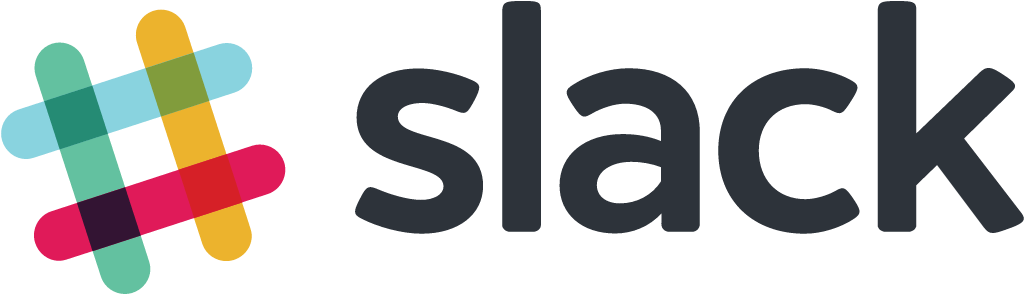
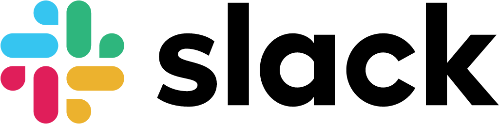
Slack logo before and after
BeforeUntil Jan 2019
Logo: Slack. Source: slack.com (archived)

AfterSince Jan 2019
Logo: Slack. Source: slack.com (archived)

Key facts
Slack launched a new logo in Jan 2019, designed by Pentagram and Slack in-house.
- Brand
- Slack
- Launched
- Source: underconsideration.com
- What changed
- New logo and identity.
- Why
- Slack replaced its logo because the old mark used 11 colours, had to sit at a precise angle and fell apart on anything but white.
- Sources
- slack.com, pentagram.com, newsweek.com
Cite this Rebrand Log, "Slack new logo (2019)", https://rebrandlog.com/rebrand/slack-2019/, last updated .
The Slack rebrand, explained
Key people: Michael Bierut (Partner, Pentagram)
Slack's first logo, made before the company launched in 2013, was a tilted octothorpe in overlapping translucent colours, echoing the hash in front of every channel name. Slack's own post on the change was candid about the problem: the mark used 11 colours, had to sit at a precise 18-degree angle, and fell apart on anything but white. Workarounds multiplied until app icons and the logo no longer matched.
The 2019 mark keeps the hash idea but rebuilds it on a grid. The tilt is gone. Four pairs of rounded bars and small speech-bubble shapes form a symmetrical pinwheel, and those two pieces, the speech bubble and the lozenge, can be lifted out as graphic elements and icons. The palette drops to four colours, light blue, magenta, green and yellow, tuned for screens, with Slack's aubergine purple kept as an accent.
Slack's in-house design and brand team made it with Michael Bierut and Pentagram, which says it explored directions from connect-the-dots to knots and people-like shapes before keeping the hashtag equity.
The backlash arrived within hours of the January 2019 launch. Newsweek collected users calling it a colourful swastika, and BuzzFeed News reported how the conversation turned to swastikas and genitalia. Bierut was unbothered. He told Design Week that Slack had known 95 percent of people would hate any change, and that the team had planned for that reaction.
In an interview with Design Week, Michael Bierut explained the case for change. The old hashtag used eight transparent colours that had to be managed on every application and could not sit on photographs or backgrounds; Slack fell back on a one-colour version that looked like a generic hashtag, and its phone icon was not even a hashtag but an S on plaid. Working with founder Stewart Butterfield, Pentagram set the parallel lines at right angles and broke them so they appear to weave together. Bierut said Slack, grown from five to 1,200 employees in five years, had anticipated that 95 percent of its audience would hate the change, likening it to a football club changing its crest.
Beyond the backlash, some coverage called the result reminiscent of a hospital or a games console, and questioned whether it was really simpler. Judged on its stated goal, though, the redesign works: it reproduces consistently at any size and on any background, which the old one never did. What it lost was a little of the hand-made charm that made the original feel like a startup.
In short: Less charming, far more robust. A fix for a logo that kept breaking.
Press
Sources
- 1. underconsideration.com · paywalledhttps://www.underconsideration.com/brandnew/archives/new_logo_and_identity_for_slack_by_pentagram_and_in_house.php
- 2. slack.comhttps://slack.com/blog/news/say-hello-new-logo
- 3. pentagram.comhttps://www.pentagram.com/work/slack