Serie A
Announced May 9 2019, used from 2019–20 season: Serie A wordmark replaced by faceted blue diamond 'A' with tricolour line (Ragù Communication)
Serie A logo before and after
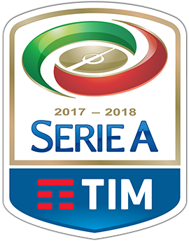
BeforeUntil Aug 2019
Logo: Serie A. Source: legaseriea.it (archived)
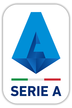
AfterSince Aug 2019
Logo: Serie A. Source: legaseriea.it (archived)
Key facts
Serie A launched a new logo in Aug 2019, designed by Ragù Communication.
- Brand
- Serie A
- Launched
- Source: tuttosport.com
- What changed
- Announced May 9 2019, used from 2019, 20 season: Serie A wordmark replaced by faceted blue diamond 'A' with tricolour line (Ragù Communication).
- Why
- Serie A's new logo aimed to make the A the distinctive sign at the centre of the brand, unlike any other major league's mark.
- Sources
- tuttosport.com, brand-news.it, engage.it
Cite this Rebrand Log, "Serie A new logo (2019)", https://rebrandlog.com/rebrand/serie-a-2019/, last updated .
The Serie A rebrand, explained
Italy's top flight unveiled its new look at the league's Milan headquarters on 9 May 2019, with the season nearly over, for use from 2019-20. The league called it global, modern and iconic. The same event introduced MVP awards for the best player in each position, the best young player and the best overall.
The work went to Ragù Communication, a Rome agency, as the start of a broader rebranding brief that also covered creative direction for the new identity. Brand News reported the aim: make the A the distinctive sign at the centre of the brand, unlike any other major league's mark.
The A becomes a blue diamond with many facets, meant to suggest the many actors, clubs and players, needed to stage the show. Its base is an inverted pyramid, the shape intended to project solidity and strength and carry Italian football beyond its borders. A tricolour line follows. The logo would appear, as before, on every club's sleeves, and its first application was the MVP trophy, produced by Iaco Group to Ragù's design.
Engage, reporting the launch, put the ambition plainly: the A-shaped diamond was to be the symbol of Italian football all over the world.
Tuttosport described the mark as presented at the league's headquarters: a capital A drawn as a blue diamond on an inverted pyramid base, followed by a tricolour line, billed as global, modern and iconic and destined for every club's sleeve. It arrived alongside new MVP awards ranked by performance data, which says something about the league's mood that year. A diamond is an easy metaphor for value, and the tricolour stripe does the national work without fuss. Restrained, then, but more a badge for broadcasters than a symbol anyone would chant about.
The diamond is a strong, ownable idea and far more flexible than a typed Serie A. But faceted, gemlike geometry was already a cliché of sports branding by 2019, and the result sits uneasily between luxury goods and esports. It is a solid sleeve badge; it is not yet a symbol of Italian football the way the old scudetto shield is.
In short: A diamond for a league that wanted to look valuable again.
Sources
- 1. tuttosport.comhttps://www.tuttosport.com/news/calcio/serie-a/2019/05/09-56728939/serie_a_annunciati_nuovo_logo_e_premio_mvp
- 2. engage.ithttps://www.engage.it/agenzie/lega-serie-a-al-via-con-il-nuovo-logo-firmato-ragu-communication.aspx
- 3. socialmediasoccer.comhttps://www.socialmediasoccer.com/it/articolo/serie-a-tim-e-loperazione-di-rebranding-con-ragu-communication.html