Sacramento Kings
The heraldic shield with a crown, crossed lances and an arched "Kings" was retired for a modern take on the team's 1985 logo: a purple crown sitting on a grey basketball, with "Sacramento" now set across the crown above "Kings".
Sacramento Kings logo before and after
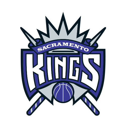
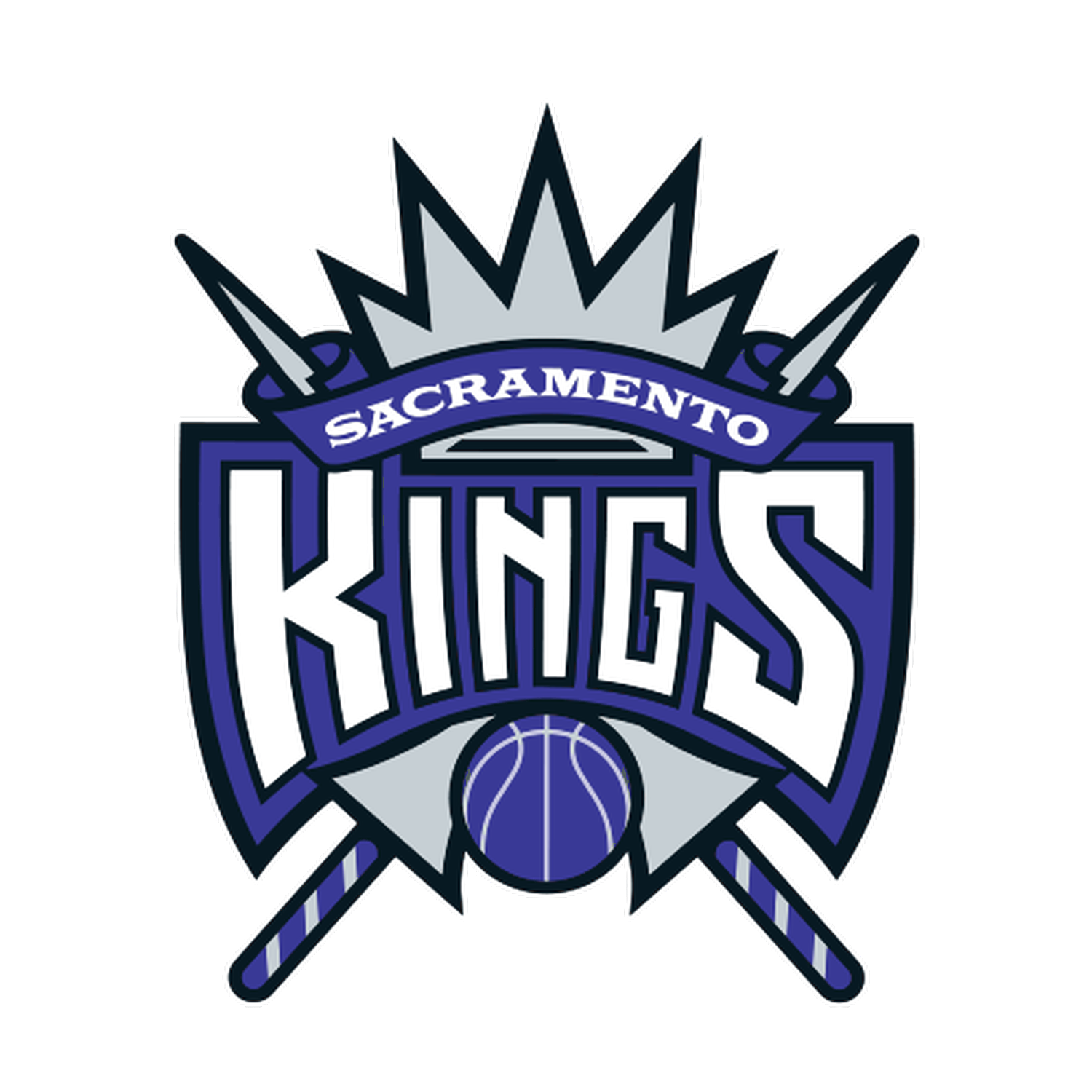
BeforeUntil Apr 2016
Logo: Sacramento Kings. Source: i.cdn.turner.com (archived)
DownloadLightSVG not availablePNGDarkSVG not availablePNGDark mode version adapted by Rebrand Log
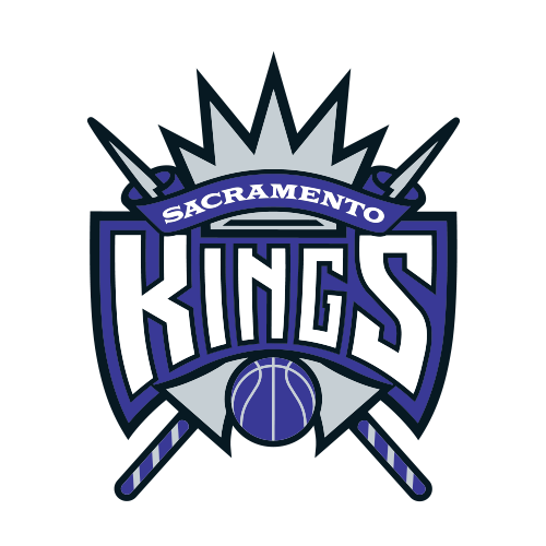
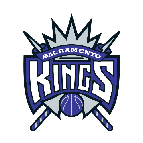
AfterSince 26 Apr 2016
Logo: Sacramento Kings. Source: i.cdn.turner.com (archived)
DownloadLightSVG not availablePNGDarkSVG not availablePNGDark mode version adapted by Rebrand Log
Key facts
Sacramento Kings launched a new logo on 26 Apr 2016, designed by RARE Design.
- Brand
- Sacramento Kings
- Launched
- What changed
- The heraldic shield with a crown, crossed lances and an arched "Kings" was retired for a modern take on the team's 1985 logo: a purple crown sitting on a grey basketball, with "Sacramento" now set across the crown above "Kings".
- Sources
- nba.com, sacbee.com, news.sportslogos.net
Cite this Rebrand Log, "Sacramento Kings new logo (2016)", https://rebrandlog.com/rebrand/sacramento-kings-2016/, last updated .
The Sacramento Kings rebrand, explained
The Kings shared the identity on 26 April 2016 at a preview of Golden 1 Center, then under construction. The Sacramento Bee reported that the shield, crown, basketball and jousting lances logo was retired after 22 years.
The team says the primary emblem is inspired by its classic logo, the one it brought from Kansas City in 1985, now with "a reshaped crown, refined basketball and new typeface that puts Sacramento front and center." Purple stayed as the primary colour; in focus groups the team ran, "purple" and "pride" were the words fans named most.
RARE Design founder Rodney Richardson, previously lead designer for Nike's global basketball division, led the work. He said the team considered thousands of sketches before returning to the old mark, which says "the kings of basketball" as simply as possible. A lion, a "Sac" badge, a crown and a heraldic lion crest made up the rest of the family.
In short: The shield and lances went; the 1985 crown came back.
Quote
“This brand kicks off a new era for our franchise as we move into the most technologically-advanced, most environmentally-friendly arena in the world.”
Press
Sources
- 1. nba.comhttps://www.nba.com/kings/news/kings-unveil-new-branding
- 2. sacbee.comhttps://www.sacbee.com/news/business/article73945512.html
- 3. news.sportslogos.nethttps://news.sportslogos.net/2016/04/26/sacramento-kings-officially-unveil-new-logos/
- 4. nba.comhttps://www.nba.com/kings/blog/making-kings-new-logos
- 5. rare.designhttps://rare.design/portfolio_page/sacramento-kings/