Qwant (2018)
New logo.
Qwant logo before and after
BeforeUntil Jul 2018
Qwant logo via Wikimedia Commons (Qwant-v3.png). Source: commons.wikimedia.org
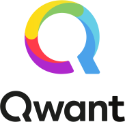
AfterSince Jul 2018
Qwant logo via Wikimedia Commons (Qwant new logo 2018.svg). Source: commons.wikimedia.org
Key facts
Qwant launched a new logo in Jul 2018.
- Brand
- Qwant
- Launched
- Source: underconsideration.com
- Studio
- Not recordedAdd it
- What changed
- New logo.
- Why
- Qwant said the three beams of light symbolise the variety and neutrality of the answers it provides.
- Sources
- presse-citron.net, dailyonline.it
- Logo history
- 3 rebrands
Cite this Rebrand Log, "Qwant new logo (2018)", https://rebrandlog.com/rebrand/qwant-2018/, last updated .
The Qwant rebrand, explained
Qwant, the search engine that does not track its users, launched version 4 in July 2018. Presse-citron's Laurent Potelet reported that it drew on user feedback, community input and lab testing to improve design and add features: the desktop results dropped the traditional three columns of web, news and social for two complementary columns, Instant Answers moved to the right, specialised verticals for music, video games and soon sport got their own navigation, and a design system brought consistency across desktop, tablet and mobile.
The identity evolved rather than changed. Presse-citron wrote that the logo keeps its metaphor of the light spectrum and its construction around three spots of light, red, green and blue, while the typography was revised to make reading and identifying the brand easier. Dailyonline, interviewing Italy country manager Fabiano Lazzarini, quoted chief design officer Pierrick Thébaut on the idea: the logo is built around three beams of light which, combined, produce an unlimited number of colours, a multiplicity that symbolises the variety and neutrality of answers on Qwant. The design team also worked on the letterforms to emphasise the magnifying glass formed by the Q and make the name more intuitive, since it was sometimes misread as Q-Want.
Lazzarini framed it as maturity. Things at Qwant were evolving quickly, with users and services growing and email and maps on the way, and that maturation was now supported by its image too. He said the Cambridge Analytica scandal and GDPR had drawn attention to privacy and to Qwant, and that the company aimed for 5 percent of the Italian market by 2020.
The best detail here is the most practical one. A brand name that people pronounce as Q-Want has a real problem, and fixing it in the letterforms is the sort of unglamorous design work that actually helps. The RGB light metaphor is neat on paper, but three coloured dots are a familiar tech cliché and do little to say privacy, which is Qwant's entire reason to exist. The logo looks like a search engine; it does not yet look like the alternative to one. For a company whose own country manager credits a privacy scandal with its growth, that is a missed opportunity.
In short: Three lights, one fixed Q.
Press
Sources
- 1. underconsideration.com · paywalledhttps://www.underconsideration.com/brandnew/archives/new_logo_for_qwant.php
- 2. presse-citron.nethttps://www.presse-citron.net/qwant-passe-sa-v4-et-en-profite-pour-se-refaire-une-beaute/