Proximus
New logo and identity.
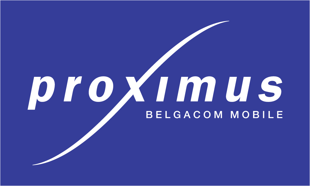
Proximus logo before and after
BeforeUntil Sep 2014
Proximus logo via Wikimedia Commons (author: Unknown authorUnknown author). Source: commons.wikimedia.org
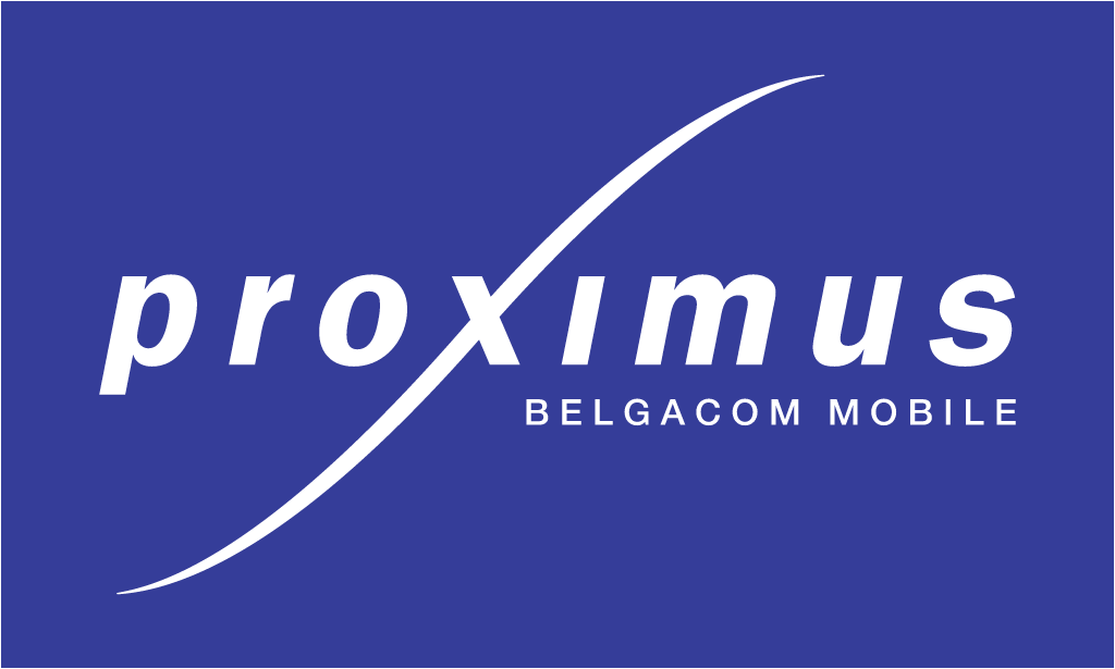
AfterSince 29 Sep 2014
Proximus logo via Wikimedia Commons (author: Proximus). Source: commons.wikimedia.org

Key facts
Proximus launched a new logo on 29 Sep 2014, designed by Saffron Brand Consultants.
- Brand
- Proximus
- Launched
- Source: telecompaper.com
- What changed
- New logo and identity.
- Why
- Belgacom said it chose a single brand for simplicity because customers no longer distinguish between devices and networks, and picked Proximus for its meaning of closeness.
- Sources
- telecompaper.com, rtbf.be
Cite this Rebrand Log, "Proximus new logo (2014)", https://rebrandlog.com/rebrand/proximus-2014/, last updated .
The Proximus rebrand, explained
Belgacom, the Belgian state owned operator, ran two consumer brands: Belgacom for fixed services and Proximus for mobile. Telecompaper reported that new chief executive Dominique Leroy announced in March 2014 a plan to replace the Belgacom name in the market, and on 26 September the company confirmed that Proximus would cover all its services, fixed included, with a gradual rollout from 29 September. The tagline became Proximus, Always close, rendered as Altijd dichtbij in Dutch and Infiniment proche in French.
The logo keeps the name in purple, the mobile brand's colour, and drops a blue x into the middle as a reference to Belgacom's colours; Telecompaper noted that it looks rather like a hashtag. Belgacom said the x symbolises convergence between fixed and mobile, and between residential and business services. The identity is credited to Saffron.
Leroy explained the logic to RTBF. A single brand was chosen for simplicity, she said, because customers no longer distinguish between PC and tablet, or mobile and wifi. Proximus won because of its meaning of proximity: as close as possible, which is what the company wanted to be. The Belgacom name did not vanish entirely; the company and its listed share kept it, and staff contracts remained Belgacom contracts. RTBF put the cost of the rebrand at 20 million euros, split roughly into thirds between physical materials, IT applications and commercial activity. Leroy pointed out that the drivers of the company's 3,000 cars had removed the old stickers themselves. The website and app switched that weekend, with TV interface, bills and shop products following, and the operation due to finish by the end of the year.
Choosing the mobile brand over the corporate one was the right call; Proximus was the name with consumer warmth, while Belgacom sounded like a utility. The purple and blue x is less successful. Making a letter in the middle of a word carry a strategic message about convergence is a lot to ask, and the hashtag reading Telecompaper spotted is the one most people will see. Still, the brand architecture is now clean, the budget was modest, and the incumbent finally speaks with one voice.
In short: One brand, one x, one voice.
Press
Sources
- 1. underconsideration.com · paywalledhttps://www.underconsideration.com/brandnew/archives/new_logo_and_identity_for_proximus_by_saffron.php
- 2. telecompaper.comhttps://www.telecompaper.com/news/belgacom-launches-new-branding-under-proximus-name--1039467
- 3. tijd.behttps://www.tijd.be/ondernemen/telecom/nieuw-proximus-logo-verbindt-oud-en-nieuw/9548655.html