Polaroid
Mar 2020: Polaroid Originals dropped Originals
Polaroid logo before and after
BeforeUntil Mar 2020
Polaroid logo via Wikimedia Commons (author: Polaroid Originals). Source: commons.wikimedia.org
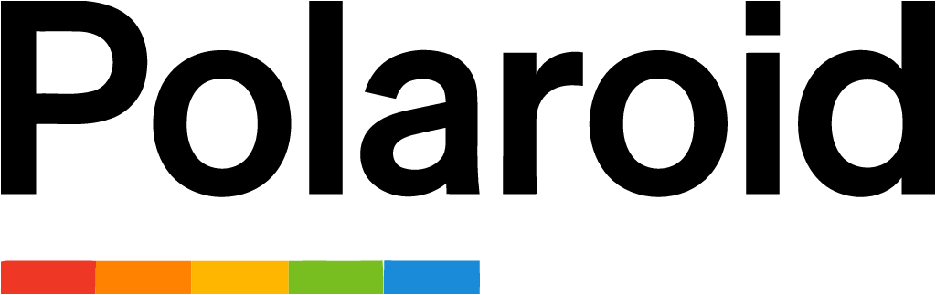
AfterSince Mar 2020
Polaroid logo via Wikimedia Commons (author: PLR IP Holdings, LLC). Source: commons.wikimedia.org

Key facts
Polaroid launched a new logo in Mar 2020, designed by Polaroid in-house.
- Brand
- Polaroid
- Launched
- Source: designweek.co.uk
- Studio
- In-house at Polaroid
- What changed
- Mar 2020: Polaroid Originals dropped Originals.
- Why
- Polaroid's rebrand aimed to modernise rather than lean on nostalgia.
Cite this Rebrand Log, "Polaroid new logo (2020)", https://rebrandlog.com/rebrand/polaroid-2020/, last updated .
The Polaroid rebrand, explained
Key people: Ozlem Birkalan (Brand director, Polaroid)
The name history is a tangle. Polaroid stopped making instant cameras around 2008 and then film. The Impossible Project saved the last factory in the Netherlands and kept film alive, bought the rights to the Polaroid name in 2017 and became Polaroid Originals, while the original Polaroid carried on with other products. In March 2020 the two were unified under one name, Polaroid, with a new camera, the Polaroid Now.
The identity was led by the in-house team under a new creative director, after 18 months of work according to Marketing Week. The colour spectrum, part of Polaroid branding since the 1970s apart from a monochrome spell in the 1990s, was reclaimed as a five-colour bar set under the left-aligned wordmark. In campaign visuals it drips from the logotype or swoops down as a stage for the cameras, and in motion it becomes op-art patterns. The typeface stayed the same: FF Real, the grotesk chosen for the Originals identity.
The creative director said the aim was to modernise rather than lean on nostalgia, revisiting the colours, geometric compositions and simplicity, with love for good typography. Brand director Ozlem Birkalan told Marketing Week that the point was clarity, ending the confusion between Polaroid and Polaroid Originals, and positioning the brand against a disposable culture.
Creative Bloq called it a rainbow-filled explosion of cheerfulness it could not stop looking at.
Marketing Week's interview with brand director Ozlem Birkalan put the problem plainly: the split between Polaroid and Polaroid Originals confused people, and after 18 months of work everything would be one Polaroid under a more modern logo built around the colour spectrum. Birkalan also argued the brand mattered more now than in its heyday. Then the excitement was watching a picture develop; in a disposable culture, the appeal is an object you keep and look at forever. The goal was to deepen love among existing fans while bringing in new ones, which is exactly what a heritage brand's spectrum stripe should do.
This is how to handle a heritage asset. Originals had treated the rainbow with reverent minimalism; this version lets it move, which makes it feel like a brand rather than an archive. The wordmark itself is nothing special, but it does not need to be when the spectrum carries that much recognition.
In short: One name again, and a rainbow finally allowed to have fun.
Sources
- 1. designweek.co.ukhttps://www.designweek.co.uk/issues/23-29-march-2020/polaroid-rebrand/
- 2. itsnicethat.comhttps://www.itsnicethat.com/news/polaroid-rebrand-graphic-design-260320
- 3. creativebloq.comhttps://www.creativebloq.com/news/polaroid-rebrand
- 4. marketingweek.comhttps://www.marketingweek.com/polaroid-rebrand-2020/