Lamborghini
The gold-on-black shield went flat. The raised, detailed bull became a pared-down silhouette, the Lamborghini lettering got a broader, thinner typeface, and the gold was toned down to a fine frame and a softer accent.
Lamborghini logo before and afterRefinement
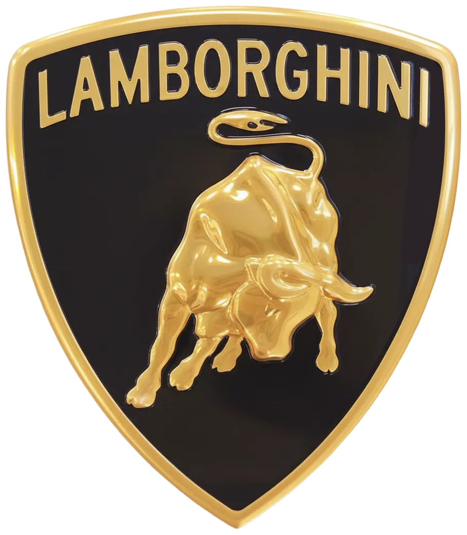
BeforeUntil Mar 2024
Lamborghini shield (1998) from the official logo history page lamborghini.com/history/logos, cropped. Source: lamborghini.com
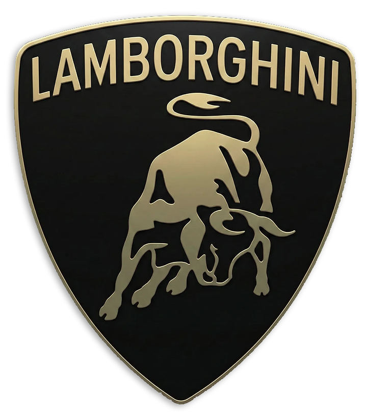
AfterSince 28 Mar 2024
Lamborghini shield (2024) from the official logo history page lamborghini.com/history/logos, cropped. Source: lamborghini.com
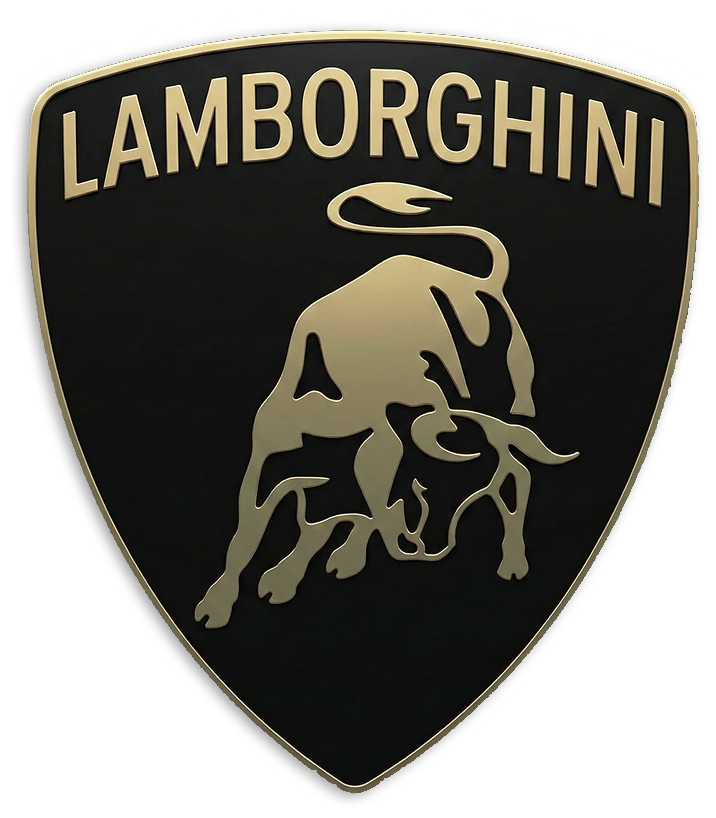
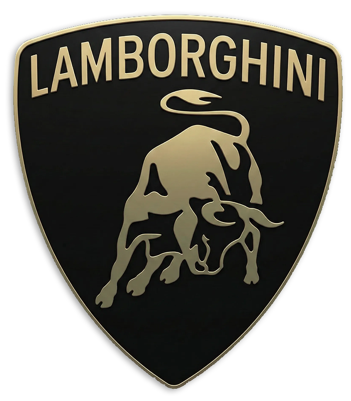
Refinement: the mark keeps its form. The refresh also covers typeface and colour.
Key facts
Lamborghini launched a new logo on 28 Mar 2024.
- Brand
- Lamborghini
- Launched
- Studio
- Not recordedAdd it
- What changed
- The gold-on-black shield went flat. The raised, detailed bull became a pared-down silhouette, the Lamborghini lettering got a broader, thinner typeface, and the gold was toned down to a fine frame and a softer accent.
Cite this Rebrand Log, "Lamborghini new logo (2024)", https://rebrandlog.com/rebrand/lamborghini-2024/, last updated .
The Lamborghini rebrand, explained
Lamborghini's bull goes back to Ferruccio Lamborghini's love of bullfighting. The shield had been redrawn before, with a blue and silver version for the Diablo in 1990, and in 1998, after the Audi takeover, the new in-house Centro Stile gave it gold lettering and a bull "meticulously rendered in gold against a black background." That was the badge for the next quarter century.
On 28 March 2024 Lamborghini unveiled a new corporate look. The shield keeps its shape, the bull keeps its charging pose, and the black and gold stay. Everything else is simpler. The bull is now a flat silhouette with very little inner detail, the lettering is set in what the company calls "a broader Lamborghini typeface than its predecessor", and the gold shrinks to a thin frame and a muted fill. For the first time the bull can also appear on its own, without the shield, on digital channels.
The redesign came with an official Lamborghini typeface that "echoes the unmistakable lines and angularity of the cars" and a new set of icons drawn with Lamborghini Centro Stile. The company tied it all to its Direzione Cor Tauri plan for hybrid and then electric cars, and said the logo would also appear on future models.
Lamborghini's own logo history page describes the result with a straight face: "It's called 3D. This is the logo that was unveiled in 2024", followed by a description of "a modern, minimalist design—featuring no raised elements and few details." Dezeen placed it alongside Volvo and Audi, which also went flat in the years before.
Reaction was mostly approving. One user on X called it a "Neatly done rebrand", and another took the lesson that you should "Look for what to take out of that logo to make it simpler and not what to add to it." It is a good flat logo. It is just quite hard to believe it is called 3D.
In short: The bull lost its shine, and its third dimension.
Quotes
“It's called 3D. This is the logo that was unveiled in 2024 and will soon be featured on Lamborghinis. With a modern, minimalist design—featuring no raised elements and few details”
“The new logo, unveiled today and used on all the company’s official channels, is redefined by a broader Lamborghini typeface than its predecessor and by colors that are minimal yet bold.”
Press
Reactions
- Martin Kesene.@MartinKesene on XLamborghini just rebranded and it’s quite an interesting rebrand, they went from a 3d logo to a flat logo. Just one lesson to learn from this. Look for what to take out of that logo to make it simpler and not what to…28 Mar 2024 · 1 like
- Zara Crypto@ZaraCrypt0 on XNeatly done rebrand for Lamborghini #design #branding #Lamborghini29 Mar 2024 · 2 likes
- Leasing.com@Leasingdotcom on XLamborghini has renewed its historic logo 🚗 Let us know your thoughts on the new logo 👇 #Lamborghini || #Cars28 Mar 2024 · 6 likes
Sources
- 1. lamborghini.comhttps://www.lamborghini.com/en-en/news/automobili-lamborghini-launches-its-new-corporate-look
- 2. automotiveworld.comhttps://www.automotiveworld.com/news/automobili-lamborghini-launches-its-new-corporate-look/
- 3. lamborghini.comhttps://www.lamborghini.com/en-en/history/logos
- 4. dezeen.comhttps://www.dezeen.com/2024/03/28/lamborghini-logo-change-2024/