LaLiga
Jun 5 2023: LaLiga becomes LALIGA, ball-and-petals mark + mixed-case wordmark replaced by angular LL monogram + caps wordmark (Grávita)
LaLiga logo before and after
BeforeUntil Jun 2023
LaLiga logo via Wikimedia Commons (author: LFP). Source: commons.wikimedia.org
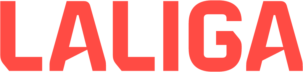
AfterSince Jun 2023
Logo: LaLiga. Source: laliga.com (archived)


Key facts
LaLiga launched a new logo in Jun 2023.
- Brand
- LaLiga
- Launched
- Source: newsletter.laliga.es
- Studio
- Not recordedAdd it
- What changed
- Jun 5 2023: LaLiga becomes LALIGA, ball-and-petals mark + mixed-case wordmark replaced by angular LL monogram + caps wordmark (Grávita).
- Why
- LaLiga said its new identity marked a new era built on ten years of international growth.
- Sources
- marca.com, expansion.com
Cite this Rebrand Log, "LaLiga new logo (2023)", https://rebrandlog.com/rebrand/laliga-2023/, last updated .
The LaLiga rebrand, explained
Key people: Ángel Fernández (Head of global brand and strategy, LaLiga)
Spain's league body unveiled the change on 5 June 2023, weeks before EA Sports replaced Banco Santander as title sponsor in a deal Expansión reported at 30 million euros in a five-year contract. The league described a new era built on ten years of international growth, with offices and delegates in 41 countries. Its own line was blunt: not an evolution, a revolution.
The rosette that had framed the old logo disappeared. LaLiga became LALIGA, one word in capitals, which Marca relayed as Spanish football no longer whispering but shouting with pride, set in a proprietary typeface. Coral, specified as Pantone Red 032C, became the corporate colour, standing for pride, passion, energy and emotion, with a palette of club colours for campaigns with individual teams. The brand team said the diagonals deliberately echoed the EA Sports logo.
The new symbol is a double L. One L comes from the player who slides to his knees after scoring, body forming the letter; the second comes from fans raising a clenched fist. Angel Fernández, head of global brand and strategy, called the new brand a symbol of the change and a way to reclaim pride in the competition. The slogan changed too, from No es fútbol, es LaLiga, often used ironically by critics when things went wrong, to La fuerza de nuestro fútbol, the strength of our football, stressing the unity of the 42 clubs.
Marca expected the slogan to draw the most debate, and it was right to: the old line had become a punchline.
Marca reported the league's own slogan for the change: not an evolution, a revolution. The ball shaped emblem disappeared and LaLiga became LALIGA, one word in capitals and coral, meant to show that Spanish football no longer whispers but shouts. The custom lettering kept, the league said, some sympathy in its diagonals with EA Sports, the new title sponsor replacing Santander, and each club got its own colour range for campaigns. The old line No es futbol, es LaLiga gave way to La fuerza de nuestro futbol. Shouting is a strategy; whether coral capitals amount to a voice is another matter.
The identity itself is cleaner and far more ownable than the rosette, and the coral stands out in a sport drowning in navy and gold. The LL story is a stretch that nobody will read in the mark, and the visual nod to the sponsor's logo is the kind of commercial compromise a league should avoid wearing on its badge.
In short: A louder, cleaner league brand that bends a little too eagerly towards its sponsor.
Sources
- 1. newsletter.laliga.eshttps://newsletter.laliga.es/global-futbol/laliga-launches-a-new-era-presenting-a-new-strategic-positioning-and-international-branding
- 2. marca.comhttps://www.marca.com/futbol/primera-division/2023/06/05/647b140346163f6e988b45c5.html
- 3. expansion.comhttps://www.expansion.com/directivos/deporte-negocio/2023/06/05/647dde88e5fdea6c4a8b4678.html