Google Play
The "Prism" play triangle softened and recoloured to Google's palette and turned into a dynamic, multi-sided identity
Google Play logo before and after
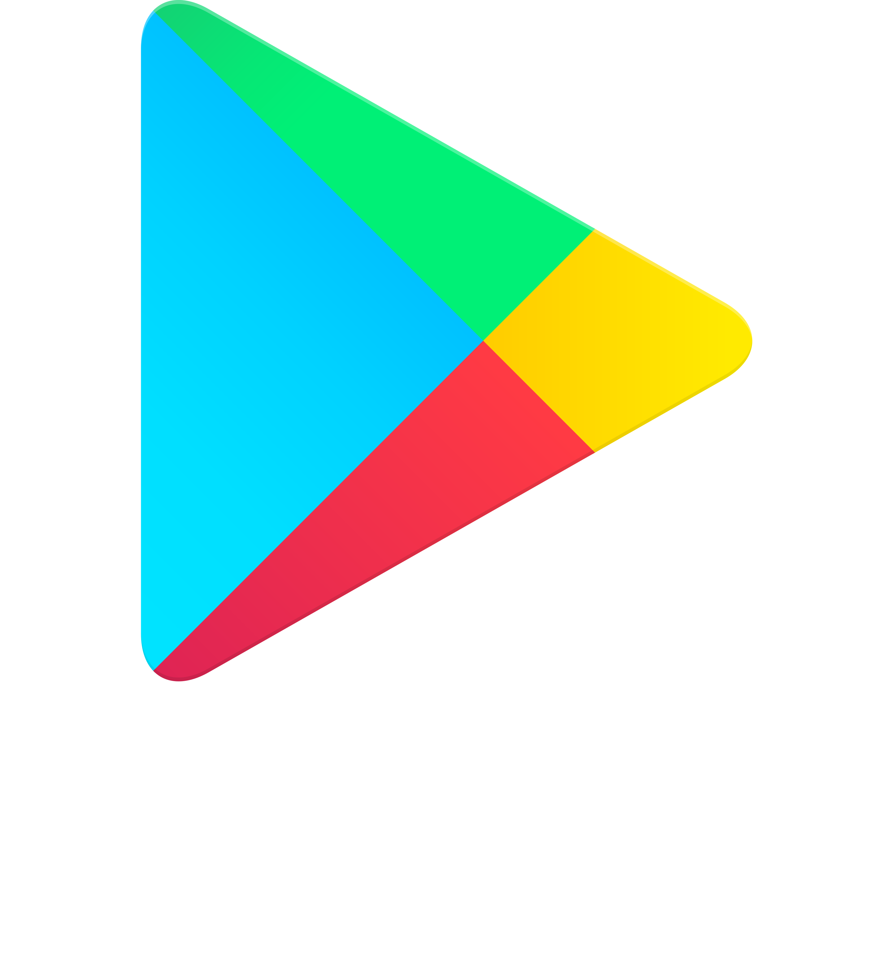
BeforeUntil Jul 2022
Google Play vertical lockup (2016 prism), developer.android.com landing image via Wayback 2021-12-24. Source: developer.android.com (archived)
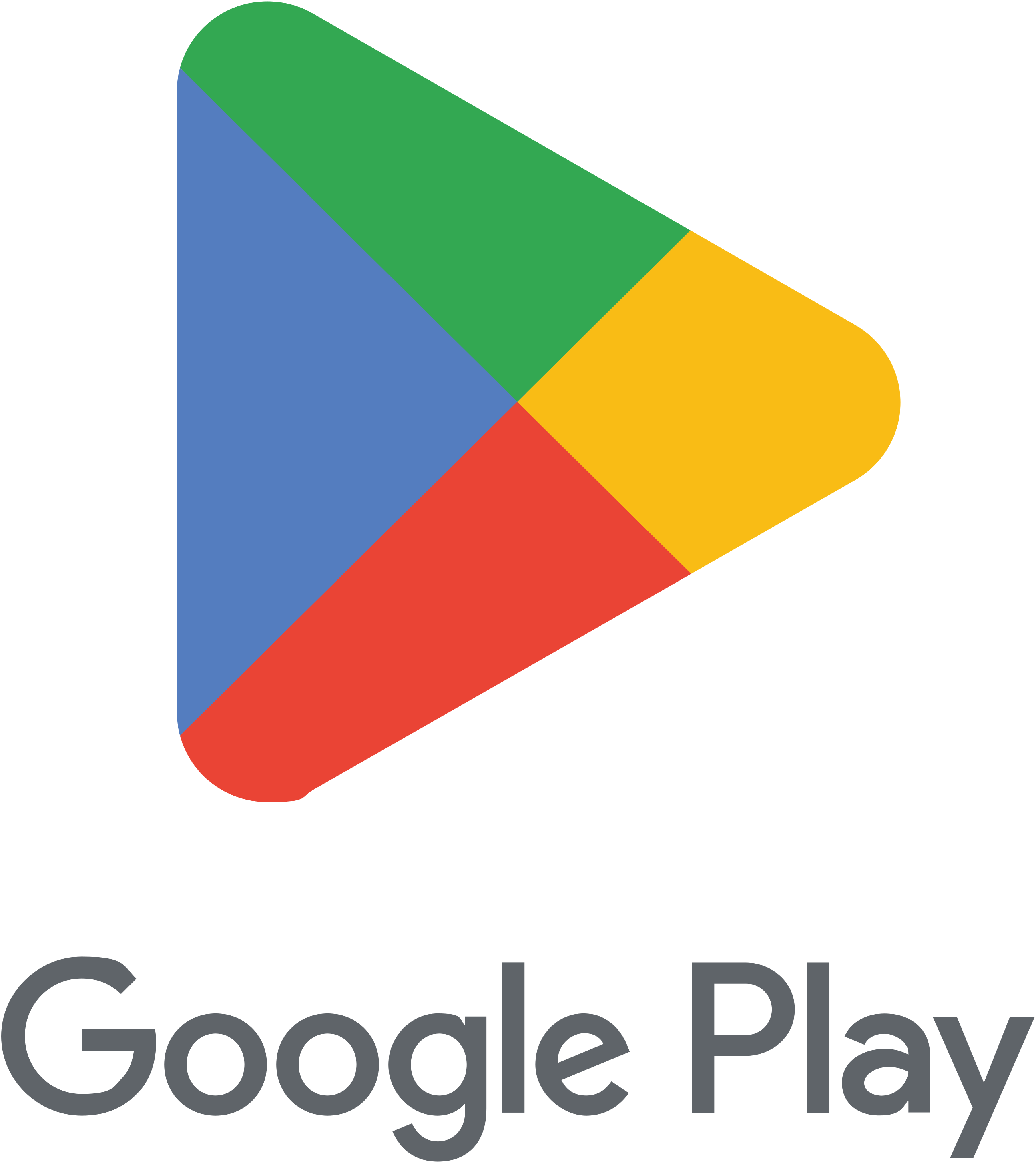
AfterSince Jul 2022
Google Play vertical lockup, Google Partner Marketing Hub brand kit. Source: play.google.com
Key facts
Google Play launched a new logo in Jul 2022, designed by R/GA.
- Brand
- Google Play
- Launched
- Studio
- R/GAAll rebrands by R/GA
- What changed
- The "Prism" play triangle softened and recoloured to Google's palette and turned into a dynamic, multi-sided identity.
- Why
- Google Play introduced a new logo in July 2022 to mark its tenth anniversary.
- Sources
- theverge.com, 9to5google.com, blog.google
Cite this Rebrand Log, "Google Play new logo (2022)", https://rebrandlog.com/rebrand/google-play/, last updated .
The Google Play rebrand, explained
Google Play introduced a new logo in July 2022 to mark its tenth anniversary. Google's anniversary post said the new logo better reflects the magic of Google and matches the branding shared by many of its products, such as Search, Assistant, Photos and Gmail.
The Verge described a subtle adjustment: the overall triangle shape was slightly tweaked, and the most notable change was the colour, less vibrant and closer to the green, yellow, blue and red Google uses across its services. It noted that the change complemented the new Chrome logo updated earlier that year. 9to5Google, which had tracked the redesign through a trademark filing, quoted the official description: a triangle with rounded corners divided into four coloured sections, blue at left, green at top, yellow at right and red at bottom.
9to5Google also pointed out that Google had last changed the Play icon in 2016, when Play Movies and TV, Music and Newsstand were still active, and that the new logo first went live on the Play website and developer site before reaching Android with an app update, alongside a new outline status bar icon.
The direction is consistent with everything else Google did in that period: fewer gradients, shared colours, one family look. The softened corners make the triangle friendlier, and the flatter colour avoids clashing with the hundreds of app icons the store displays.
The Verge noted that the shape barely moved; the real change was colour, toned down to the green, yellow, blue and red shared by Search, Assistant, Photos and Gmail, and matched to the Chrome update earlier in the year. Tian Lim said the mark better reflected the magic of Google, and tied it to ten years since Android Market became Google Play, with 2.5 billion monthly users in more than 190 countries. Consistency won again, at the cost of the one icon in the family that had felt a little brighter than the rest.
The cost is the same as with Google's other icons. Play once had a little visual energy of its own; now it is another four-colour Google mark. That suits a store whose job is to sit in the background and showcase other people's apps, so here the self-effacement is almost appropriate.
In short: Ten years, four colours.
Identity · 4 images
Google Play / R/GA, image from rga.com
Rationale
R/GA saw "untapped potential" in the legacy Prism and built a dynamic identity reflecting "all sides of play" to encourage discovery.
Quote
“We saw untapped potential in Google Play’s legacy logo, commonly referred to as “the Prism.””
Reception
2023 Webby Awards honoree, Best Art Direction. · winners.webbyawards.com
Press
Reactions
- 𝚔𝚒𝚛𝚞𝚝𝚒@kiruti on XGoogle Play gets a new logo every 5 years25 Jul 2022 · 4 likes
- Rakesh vaidya@VaidyaRakesh_11 on XGoogle Play Store icon changed...! #Google #playstore #GooglePlayStore Old icon New icon5 Aug 2022 · 4 likes
- Abhishek Yadav@yabhishekhd on XGoogle Play Store new icon.1 Aug 2022 · 885 likes
- Artem Russakovskii@ArtemR on XThe new icon for the Google Play Store is now live.27 Jul 2022 · 4 likes
- Technologistan@technologistpk on XGoogle Play celebrates its 10th anniversary by launching a new logo. The new logo for Google Play is similar to the older one but has some tweaks. For more: #google #anniversary #logo26 Jul 2022 · 0 likes
Sources
- 1. rga.comhttps://rga.com/work/google-play
- 2. 9to5google.comhttps://9to5google.com/2022/07/27/google-play-new-logo-2022/