Bauer Media Group
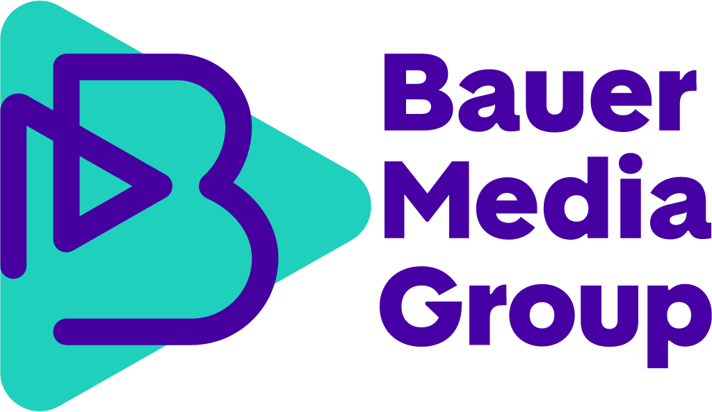
30 Nov 2023: blue square with a white diagonal fold over "BAUER" and thin "MEDIA GROUP" replaced by a rounded purple B wrapped around a teal forward-pointing play triangle with stacked purple "Bauer Media Group" in custom BauerMedia Sans (Mutabor).
Bauer Media Group logo before and after
BeforeUntil Nov 2023
Bauer Media Group logo via Wikimedia Commons (author: Unknown authorUnknown author). Source: commons.wikimedia.org
AfterSince Nov 2023
Bauer Media Group logo via Wikimedia Commons (author: Heinrich Bauer Verlag KG). Source: commons.wikimedia.org

Key facts
Bauer Media Group launched a new logo in Nov 2023, designed by Mutabor.
- Brand
- Bauer Media Group
- Launched
- Source: bauermedia.com
- What changed
- 30 Nov 2023: blue square with a white diagonal fold over "BAUER" and thin "MEDIA GROUP" replaced by a rounded purple B wrapped around a teal forward-pointing play triangle with stacked purple "Bauer Media Group" in custom BauerMedia Sans (Mutabor).
- Why
- Bauer Media Group said the new corporate brand reflects how the business has evolved and its ambition to further drive its transformation, with a clear focus on digitisation.
- Sources
- bauermedia.co.uk, page-online.de
Cite this Rebrand Log, "Bauer Media Group new logo (2023)", https://rebrandlog.com/rebrand/bauer-media-group-2023/, last updated .
The Bauer Media Group rebrand, explained
Bauer Media Group began as the Heinrich Bauer Verlag, a German publisher, and has spent recent years becoming an international media company with leading positions in publishing and audio across Europe, plus investments in newspapers and online comparison platforms. On 30 November 2023 it launched a new corporate brand design developed by the Hamburg agency MUTABOR. The company said the branding marked an important step in its transformation, aiming for a fresh look while keeping key elements of the existing brand in homage to its long history.
PAGE, the German design magazine, explained the main move. The arrow remained. In the old logo it pointed upward in blue and white; now it points horizontally forward, toward what comes next, and the new round, bold logo integrates it. It also appears across the system in yellow, turquoise, purple, pink and bright light blue, as a pattern and drawn like a frequency, and PAGE noted it can be read as a start symbol for video and other moving images. The new claim is Enriching everyday life, for a house of around 50 magazine titles from Bravo and Bella to Cosmopolitan and TV Movie.
PAGE described the typography as clear and expressive with a few extravagant details, and the colours, with their summery cheerfulness and light pastel touch, as unusual for a media house, signalling that entertainment is central. Chief executive Yvonne Bauer said the branding highlighted the transformation so far while celebrating a heritage of almost 150 years, and would raise the corporate profile and improve brand credibility. The company planned to roll it out over twelve months, starting with websites, social media accounts and offices, ahead of its 150th anniversary in 2025.
Turning the arrow from up to forward is a clean, readable piece of continuity, and the play button reading is a neat way to claim audio and video without saying so. The palette is the bolder decision, and the right one: a publisher of celebrity and lifestyle titles has no business looking like an insurer. The weaker part is the language. Enriching everyday life and a creative powerhouse that celebrates diversity are phrases any media group could print. The mark has a point of view; the copy does not.
In short: The arrow stops climbing and starts playing.
Sources
- 1. bauermedia.comhttps://www.bauermedia.com/news/press-release-new-corporate-brand
- 2. page-online.dehttps://page-online.de/kreation/mutabor-versieht-die-bauer-media-group-mit-neuem-branding/